
Portfolio. |

|
A Little About Myself.
|

|
Education:
|

BS Electrical
Engineering |

MS Engineering
Design Innovation |
Experience:
|
|
|

|

|
|
|
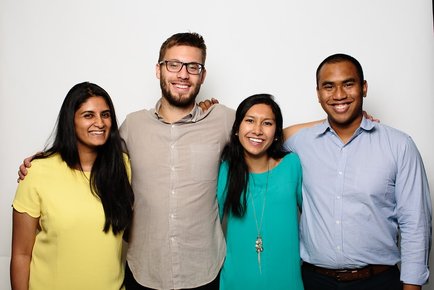
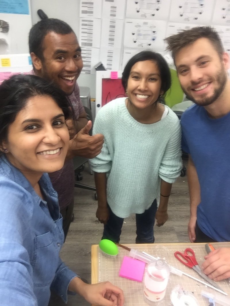
Collaborators:
|

|

|
|

|

|
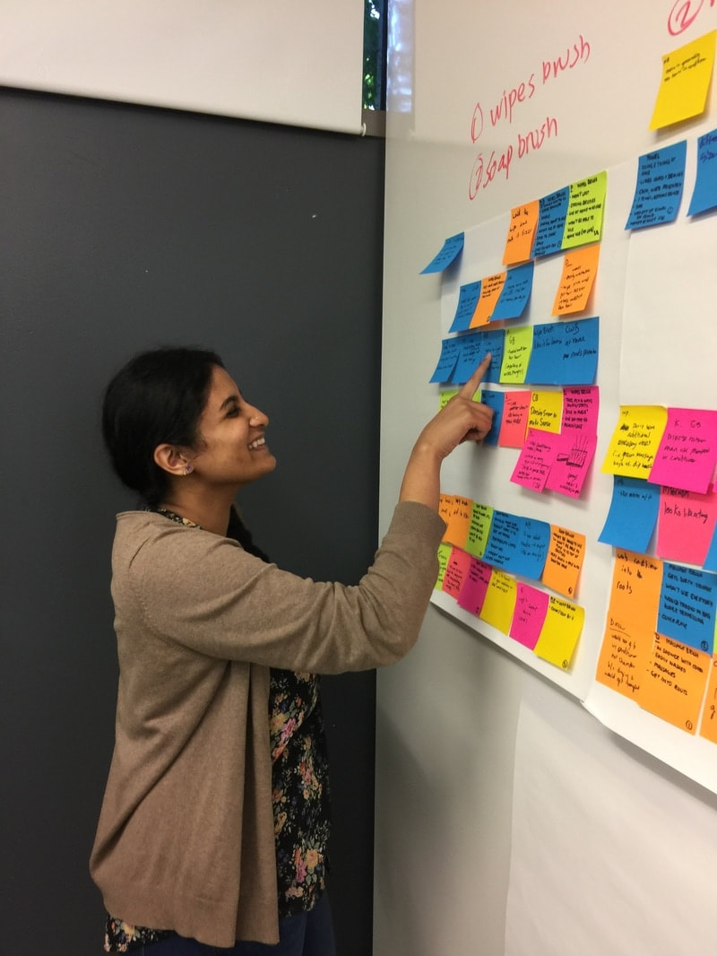
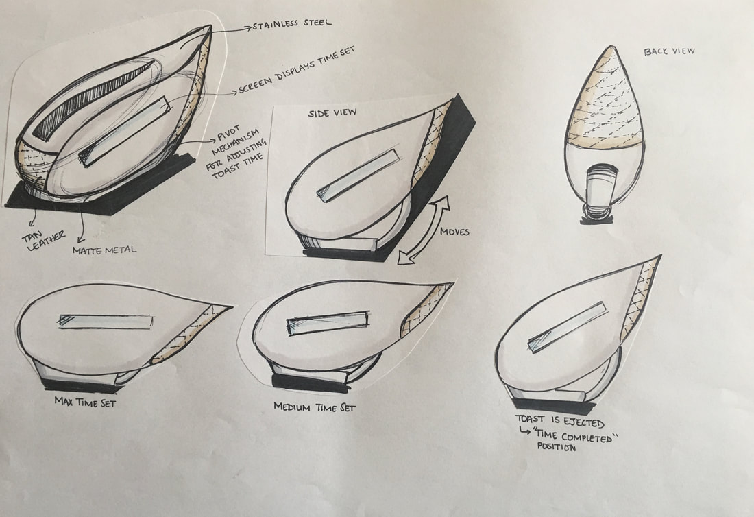
UX Design Challenge |
Amazon.com Home Page Redesign |
|
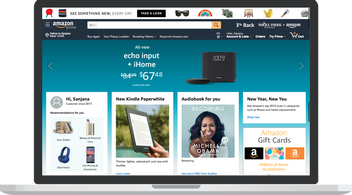
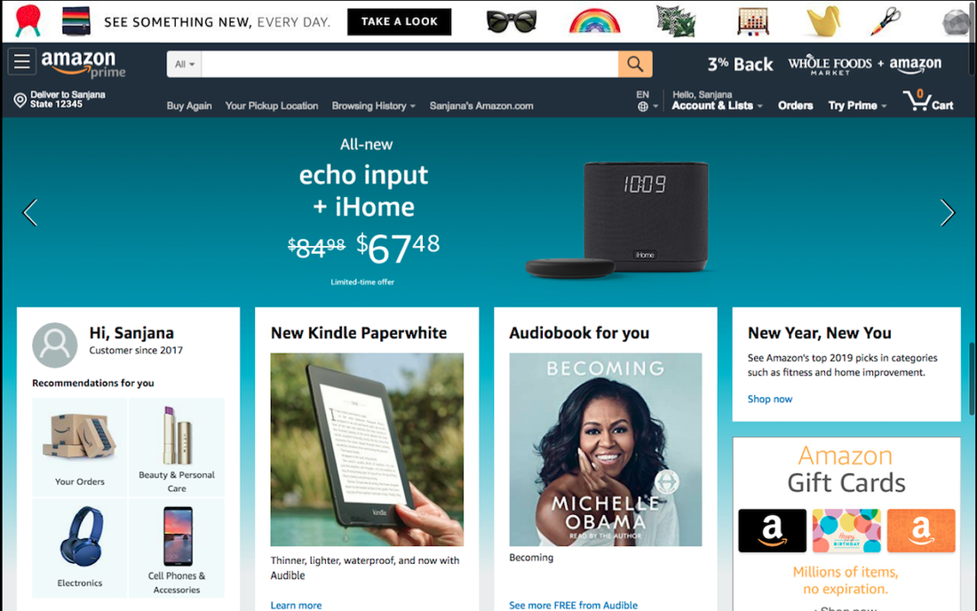
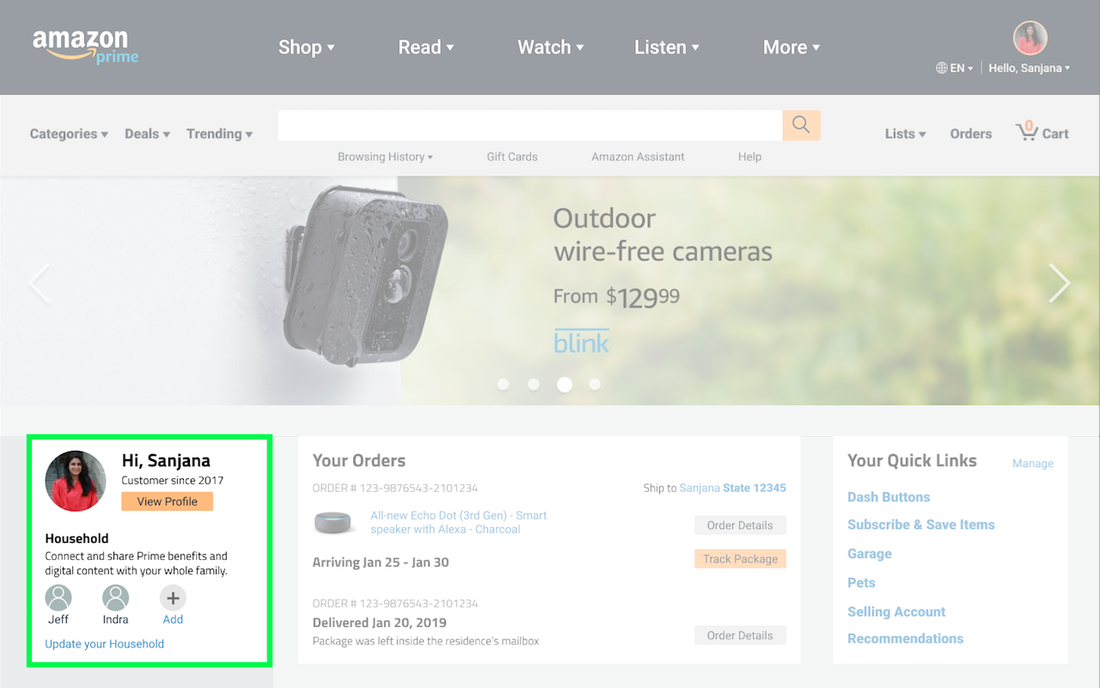
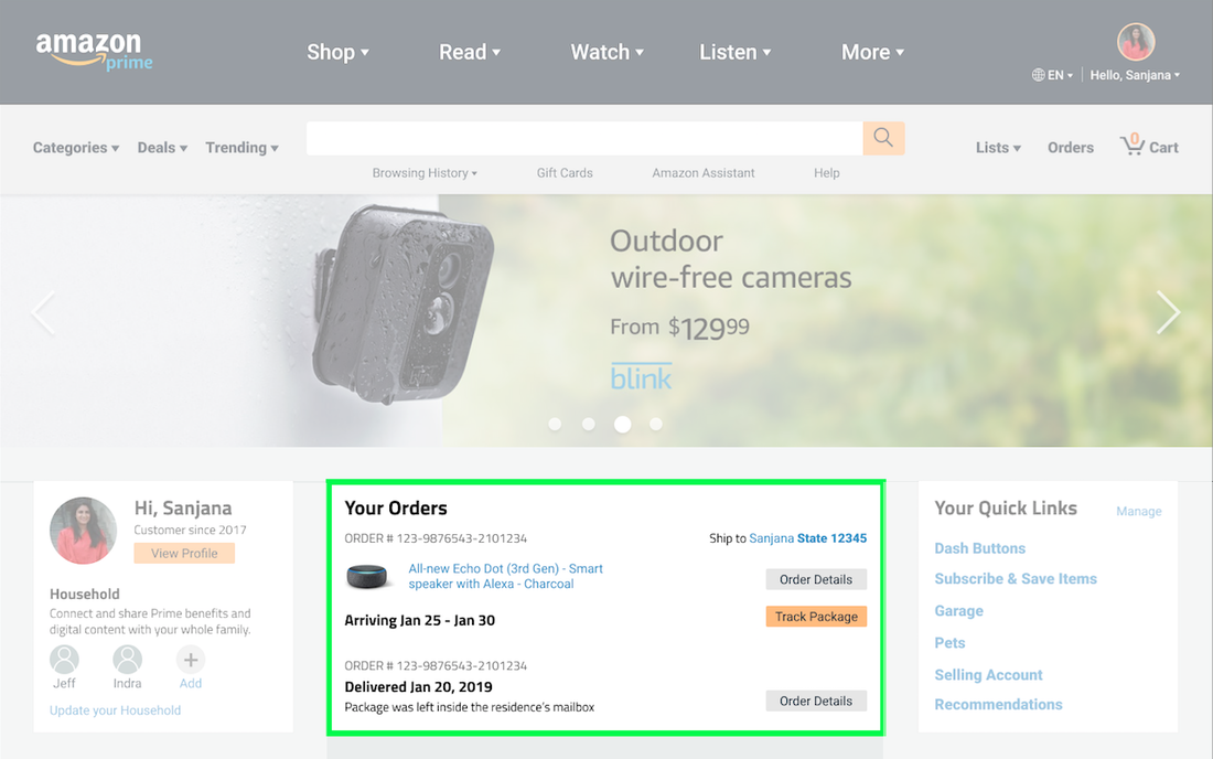
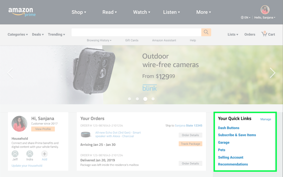
Redesigning the home page to allow for easy access to the vast number of features and services.
|
|
Amazon.com is one of the best platforms to shop on. This is due to the wide array of products and deals that are on offer. In addition to shopping, one can stream music and videos, read or listen to books, access services like house cleaning and maintenance, and much more.
For this redesign, I wanted to focus on improving the website's user experience to draw more attention to and bring forth the various features and offerings. Project Length 1 Week : Jan'19
My Role Research | Synthesis | Ideating | Prototyping |
|
Problem A major issue with the website is that useful features and services are buried within menus and not immediately apparent. This results in a more frustrating user experience. Additionally, Amazon is missing out on the opportunity to encourage users to make use of the numerous services.
|
Process and Outcome |
|
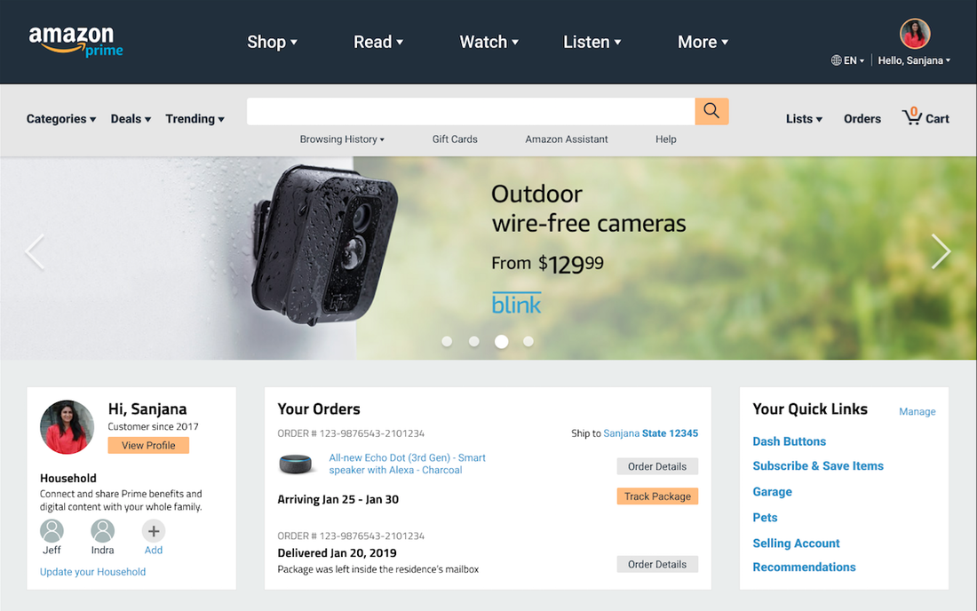
For my solution, I wanted to better organize and categorize the offerings. My design also brings forward some of the website’s features, by providing easy access - without the need to search through menus.
Amazon’s current website design looks cluttered and confusing. In spite of how busy the page looks, it is something I chose to preserve in my prototype. My reasoning for this is that it appeared to be an intentional design decision by Amazon. The website's current design is inspired by Gruen Transfer. This is intended to confuse customers, making them lose track of their original intentions and participate in impulse buying.
In order to strike a balance between maintaining the same amount of provided info (which lends to the cluttered current design) and the ability to process information with more ease, I provided more space between components, and made use of different shapes for different kinds of information.
Overall, my aim for the redesign is able to provide more visibility to useful features and services, without stripping down on the information provided within the current version, and to be able to allow users to view and process the onscreen information more easily.
View the redesign prototype. |

|
|
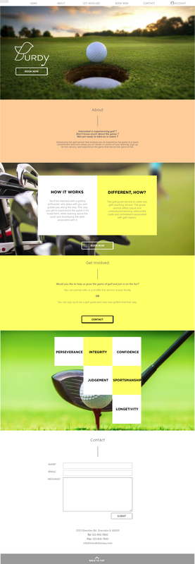
Thesis Project |
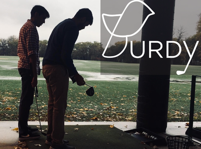
Burdy |
|
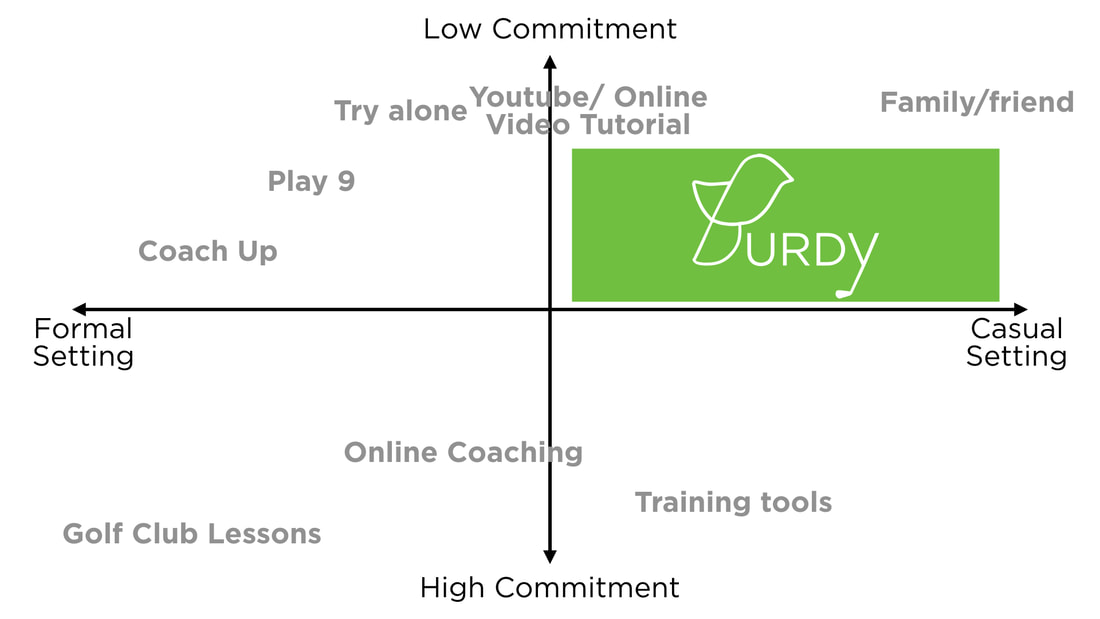
Lowering the barrier of entry to golf in order to encourage millennial participation.
|

|
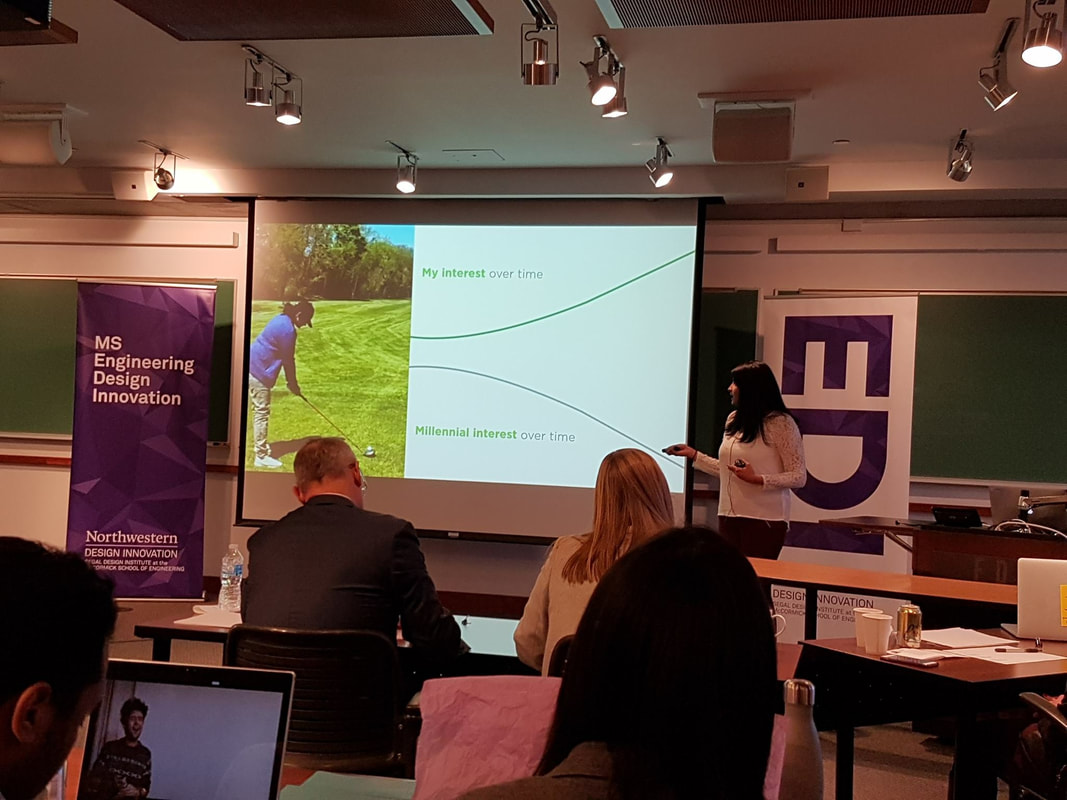
Over the past few years, golf participation has been on the decline. This has resulted in the closure of clubs and a rise in programs aimed at igniting an interest in the sport.
While these programs are targeting a school-going audience - whose parents tend to be the decision makers - I wanted to focus on understanding the participation problem from the millennial age group point-of-view. Project Length 2 Quarters : April'17 - Dec'17
My Role Research | Synthesis | Prototyping | User Testing |
|
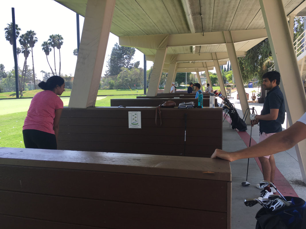
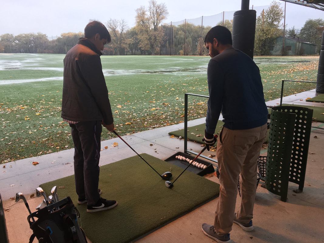
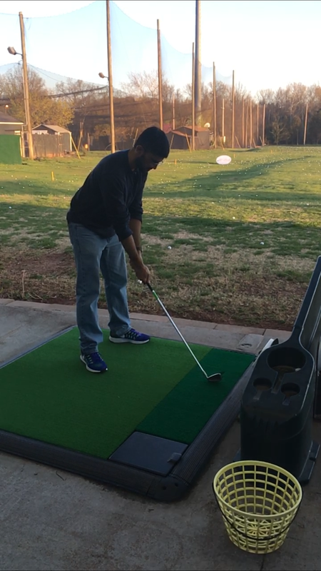
Problem Most golfers are introduced to the sport by a golfing enthusiast - who tends to be either a family member, or a friend. For those who do not have access to such an individual, they usually have to rely on a golf coach and enroll in training classes. This method results in a higher barrier to entry as it involves more of a commitment, with regards to time and money.
|

Process and Outcome |
|
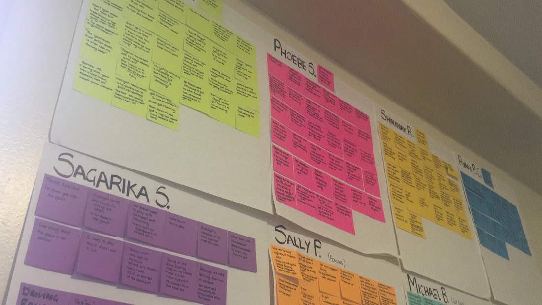
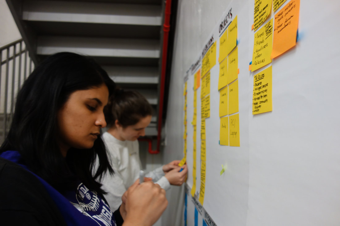
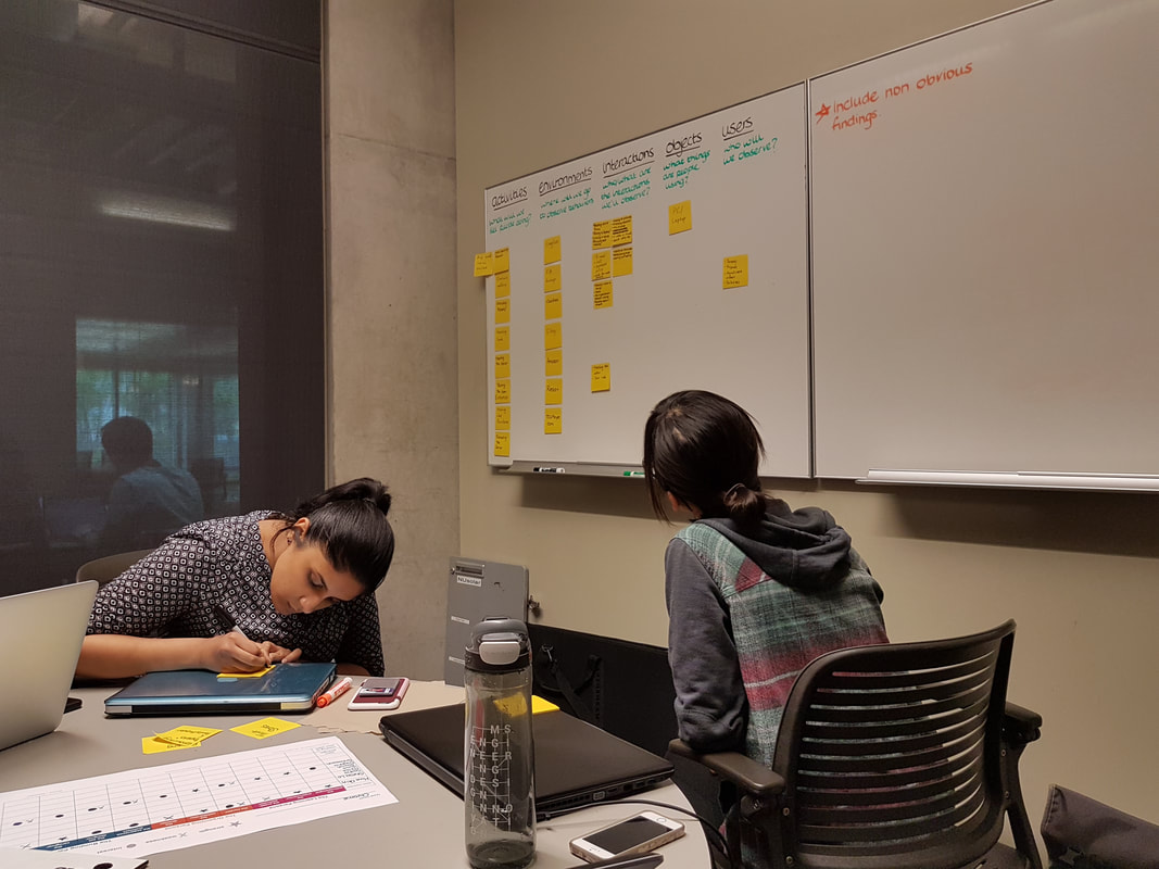
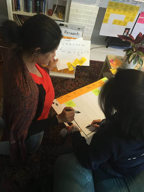
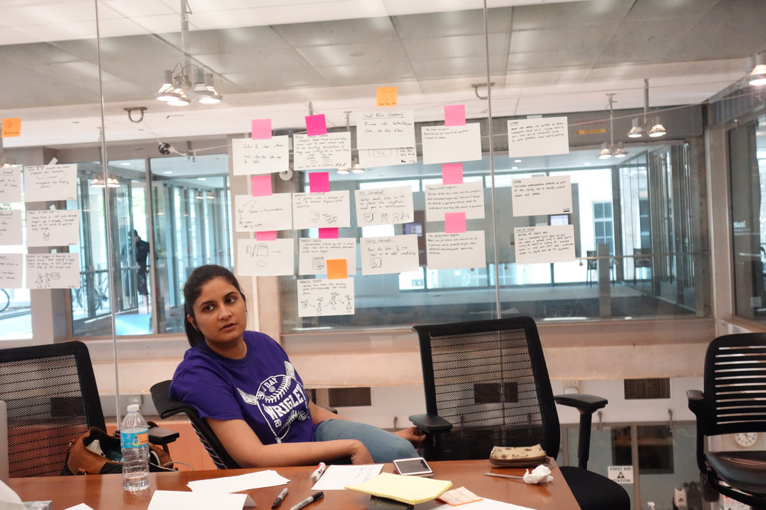
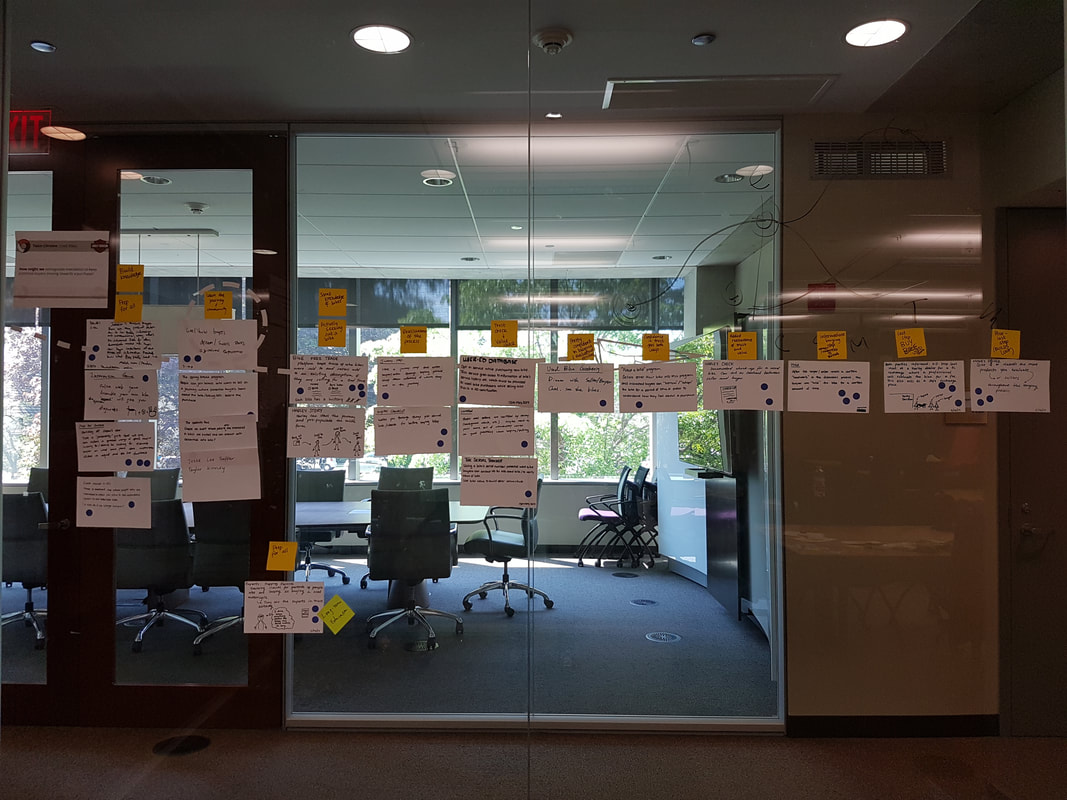
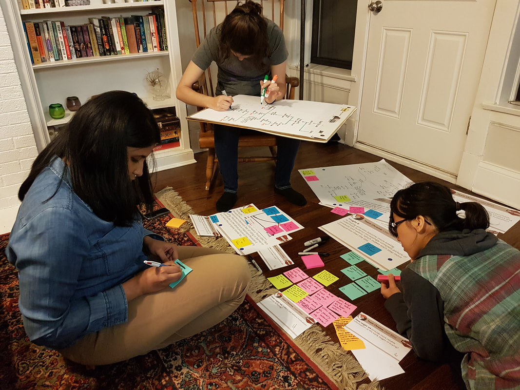
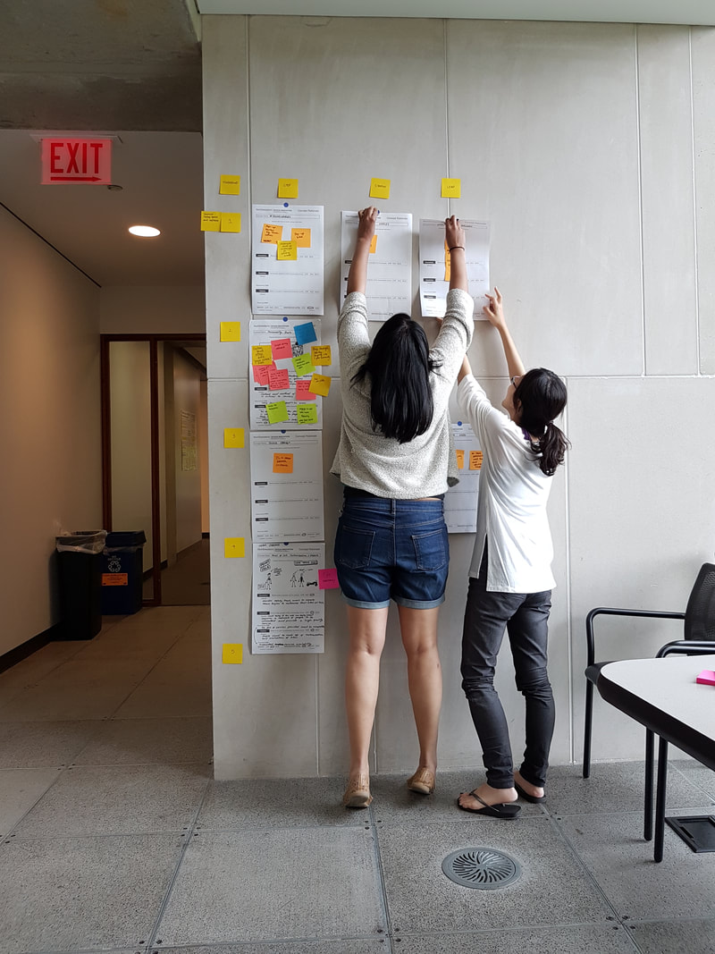
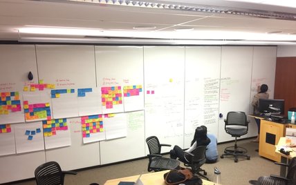
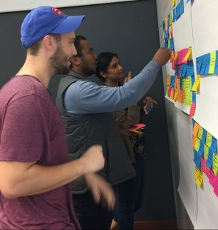
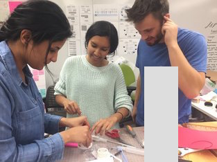
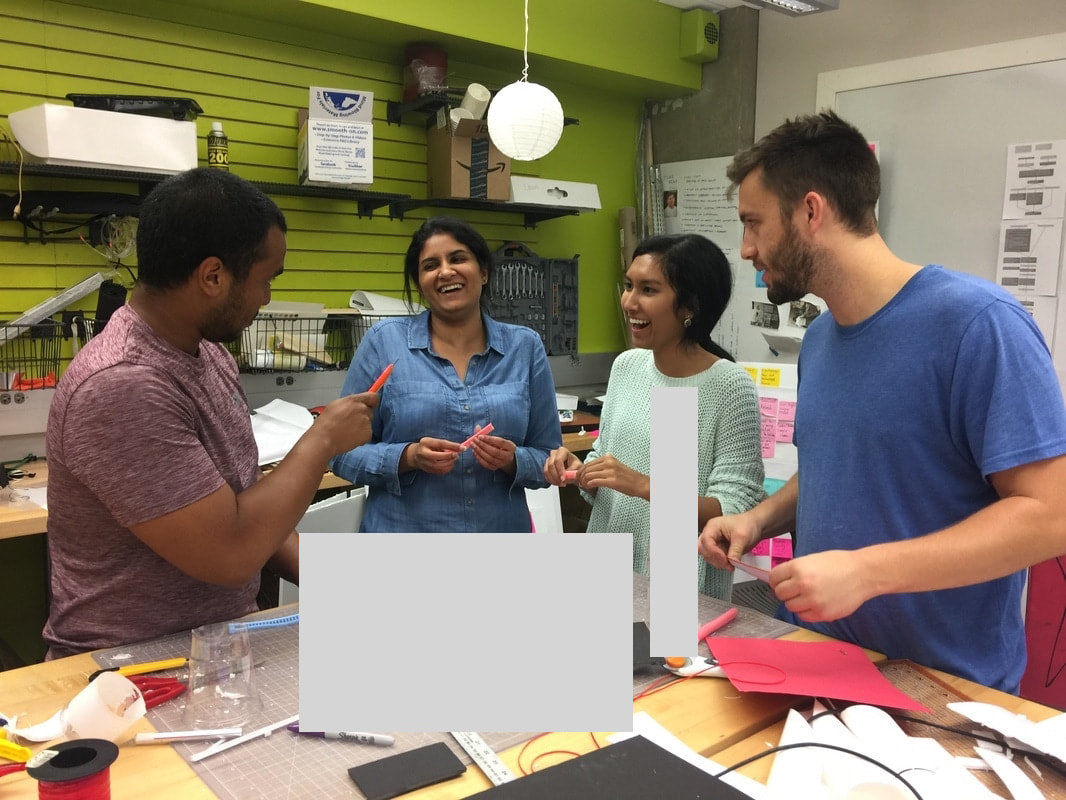
In order to gain an understanding of the golfing community, the learning process, influences, and the current problems being faced, I spoke to golf course managers and support staff, golf coaches, golfing program organizers, golfers (from novice to pro level golfers ), and non-golfers (those who are curious about the sport, people who had never thought to explore the game, and others who dislike it). Additionally, I created and sent out surveys that enabled me to gain a better understanding of the golf journey (from understanding the game to playing).
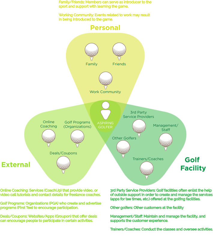
Stakeholder Map
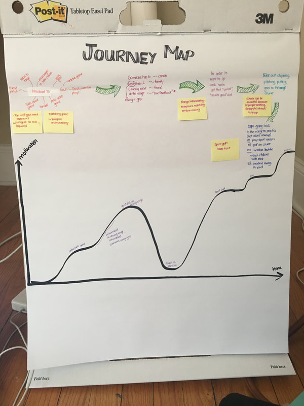
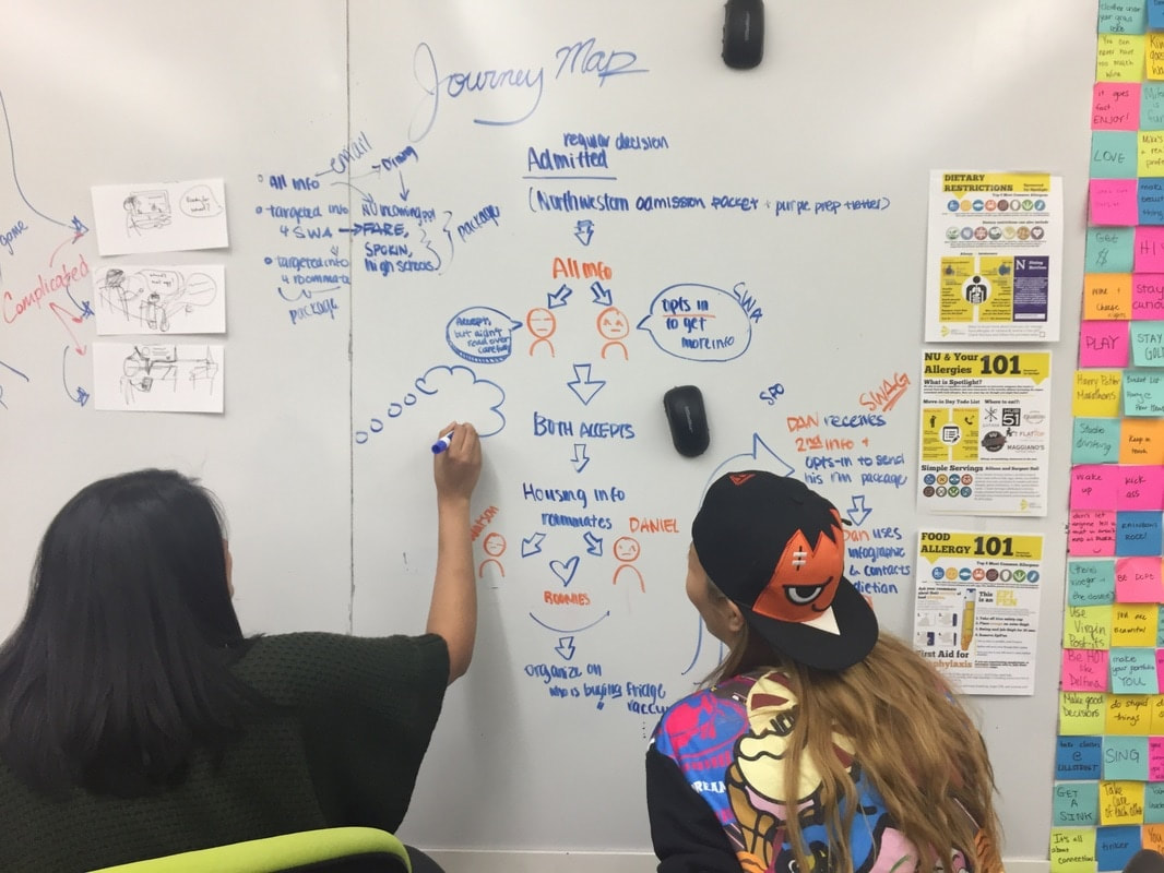
Journey Map
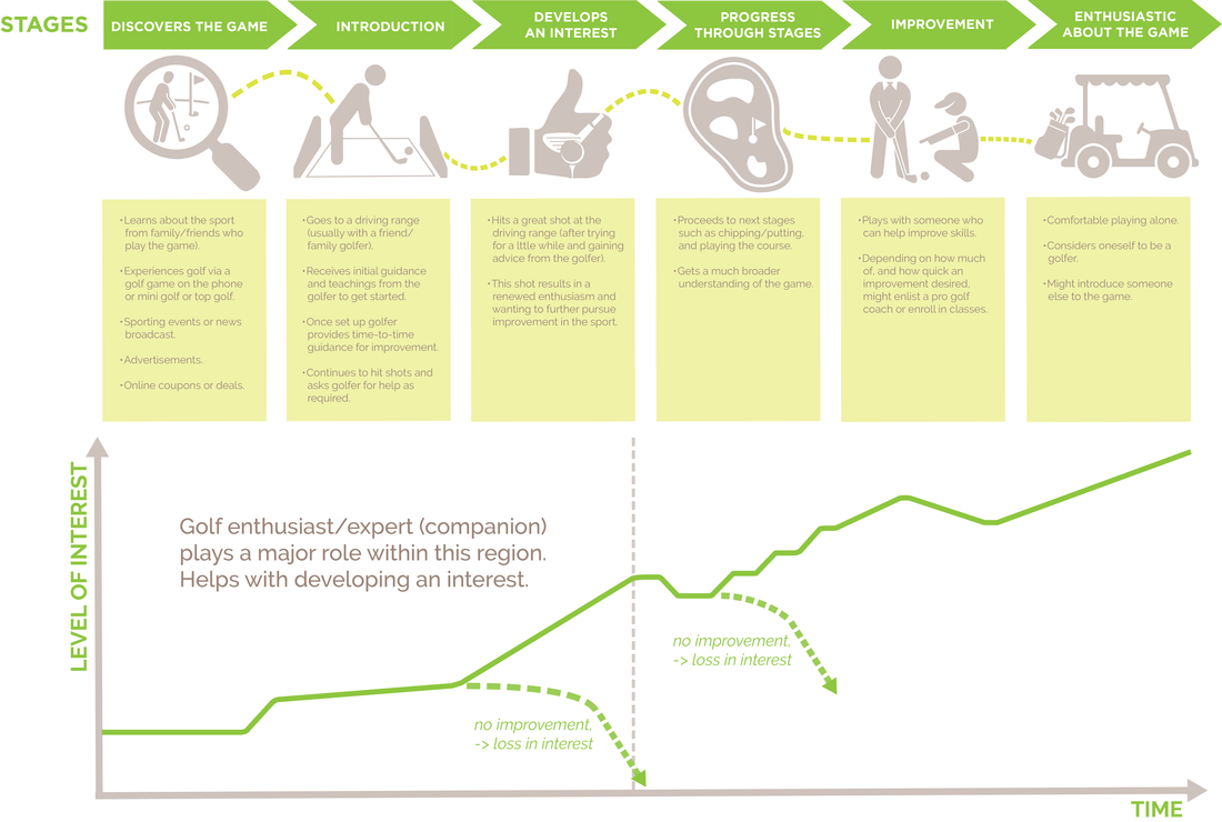
From the research I conducted, I was able to identify some common trends:
INSIGHT 1: Investing time and money is a significant commitment for those who aren't aware of an interest in the sport. People want to be able to try without committing. INSIGHT 2: In order to identify interest, people want to feel in control of their learning, and try to do so for as long as possible. This allows for learning flexibility. INSIGHT 3: While learning golf, reducing the disjoint between "visualization" and "putting into action" can be frustrating. Support, in the form of guidance, is key to alleviating the frustration. HOW MIGHT WE Enable novice golfers to experience and learn the game within a positive environment of lowered barriers, commitment, and formality, while benefiting golfing facilities. 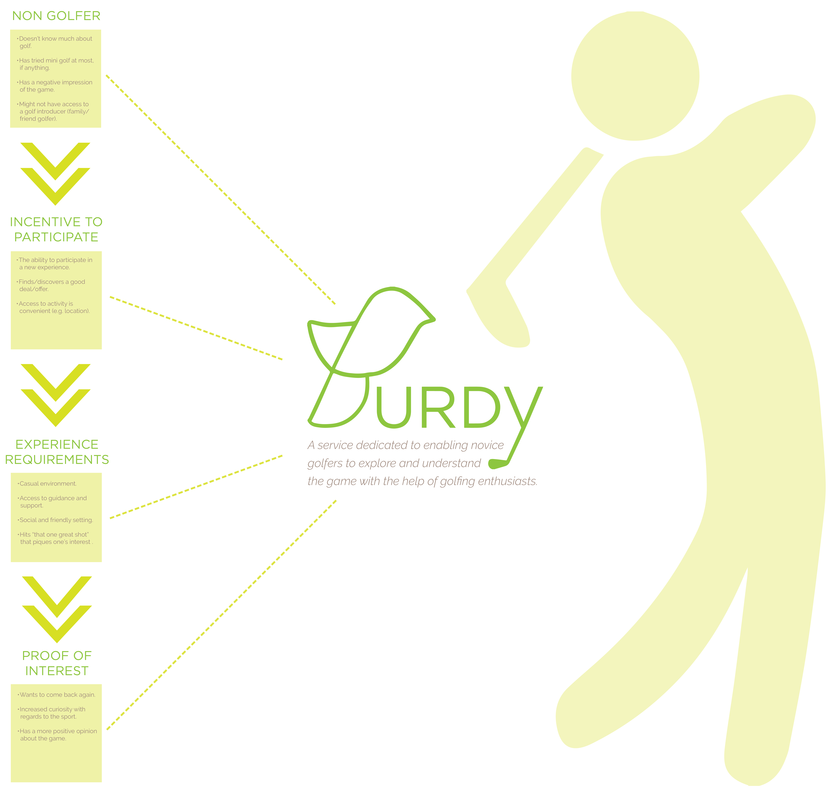
Framing the solution's stages and requirements
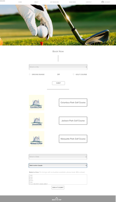
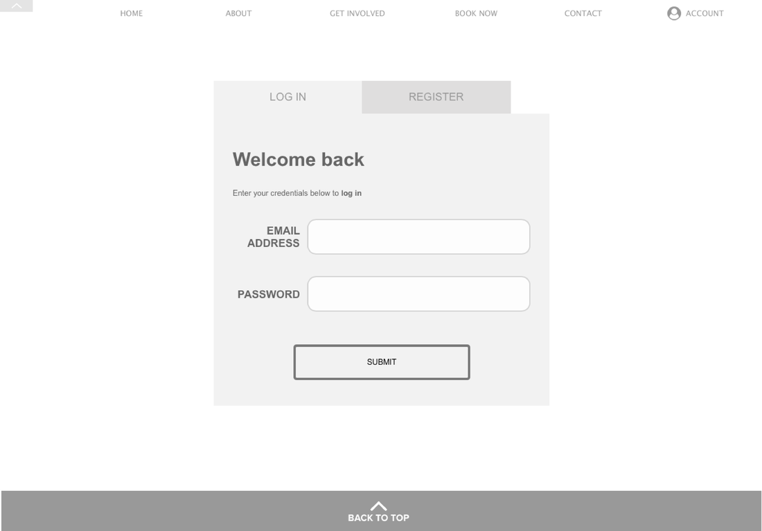
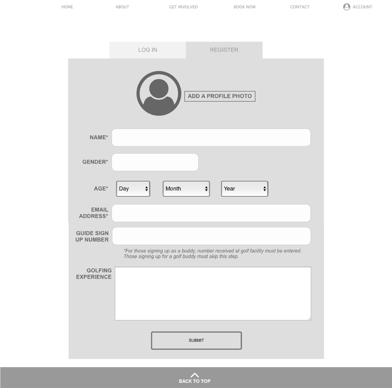
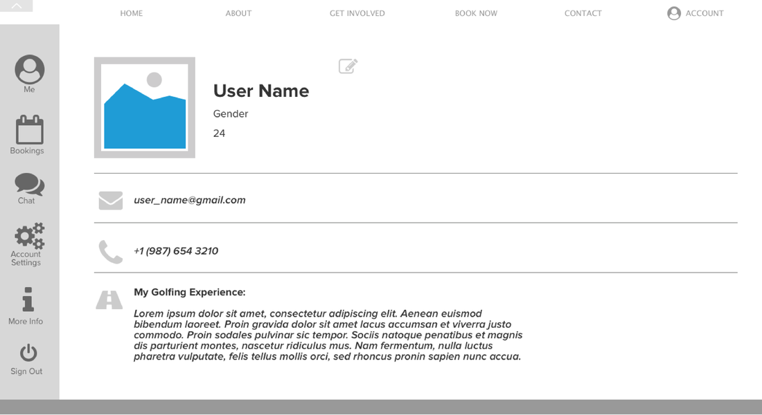
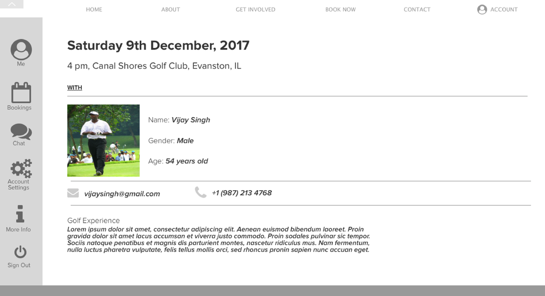
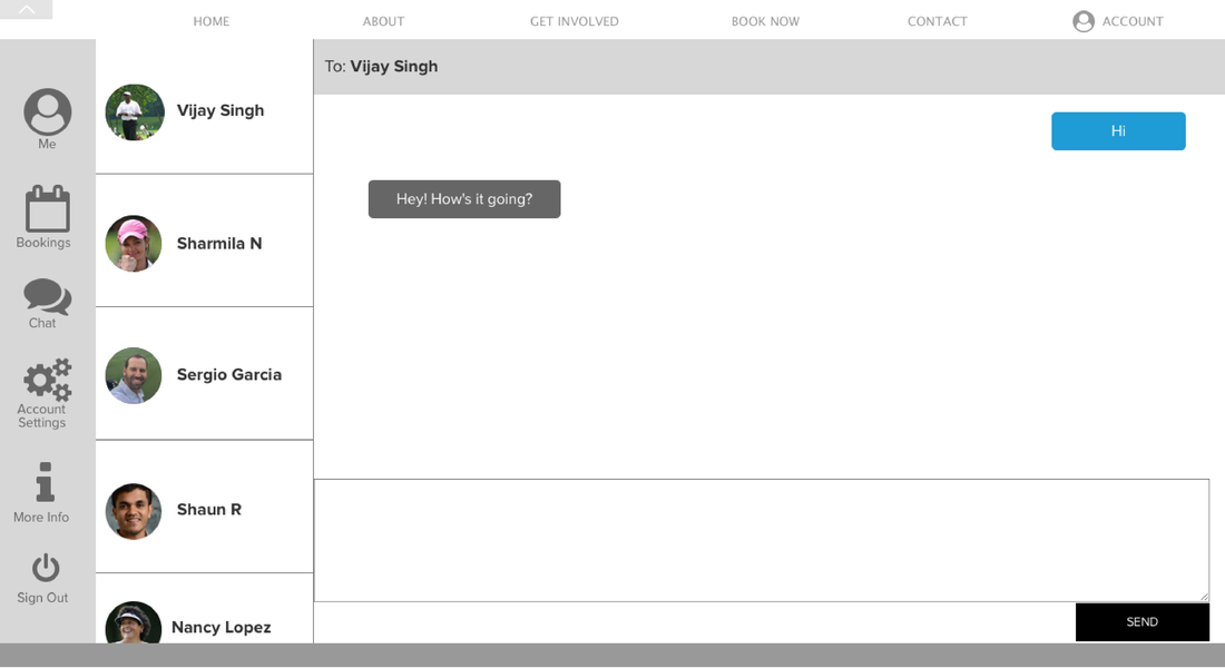
As a solution, I developed Burdy - a service that connects aspiring golfers with golfing enthusiasts, who serve as golf guides, or buddies, and support the aspiring golfers' introduction to the game. These golfing buddies would be regulars at particular golfing facilities, where they can be registered onto the platform, by the facility, as long as they're skilled enough to be able to provide golf guidance. Aspiring golfers can log onto the Burdy platform and look for available golf buddies at their desired date, time, and location, and sign up. Once signed up for a session, the aspiring golfers can communicate with their "golf buddy" through the platform, before meeting in person.
Solution Benefits:
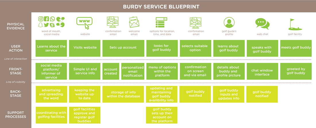
Service Blueprint
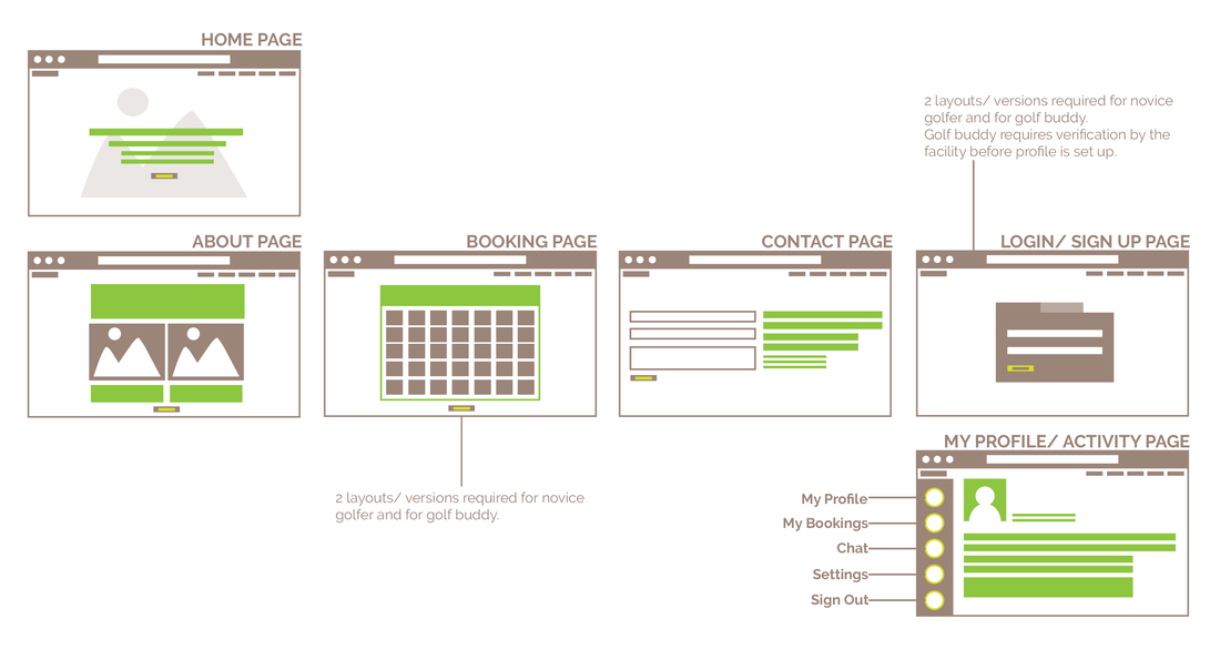
Site Map
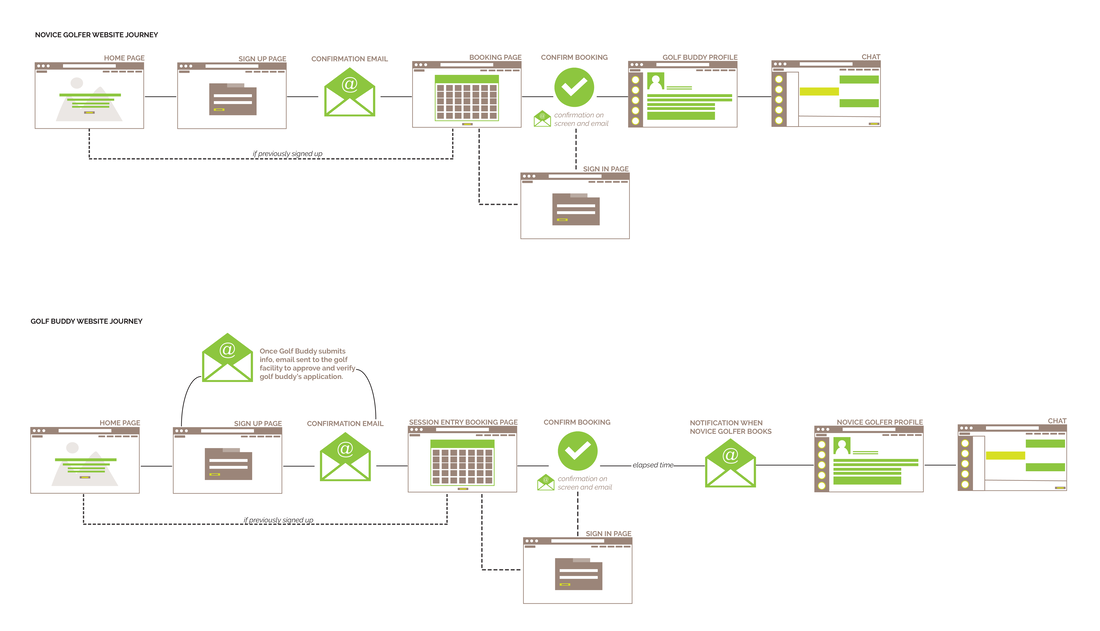
User Flow
|
|
|
UX Research and Design Internship |
Aspire |
|
Enabling students to make more educated career decisions.
|
|
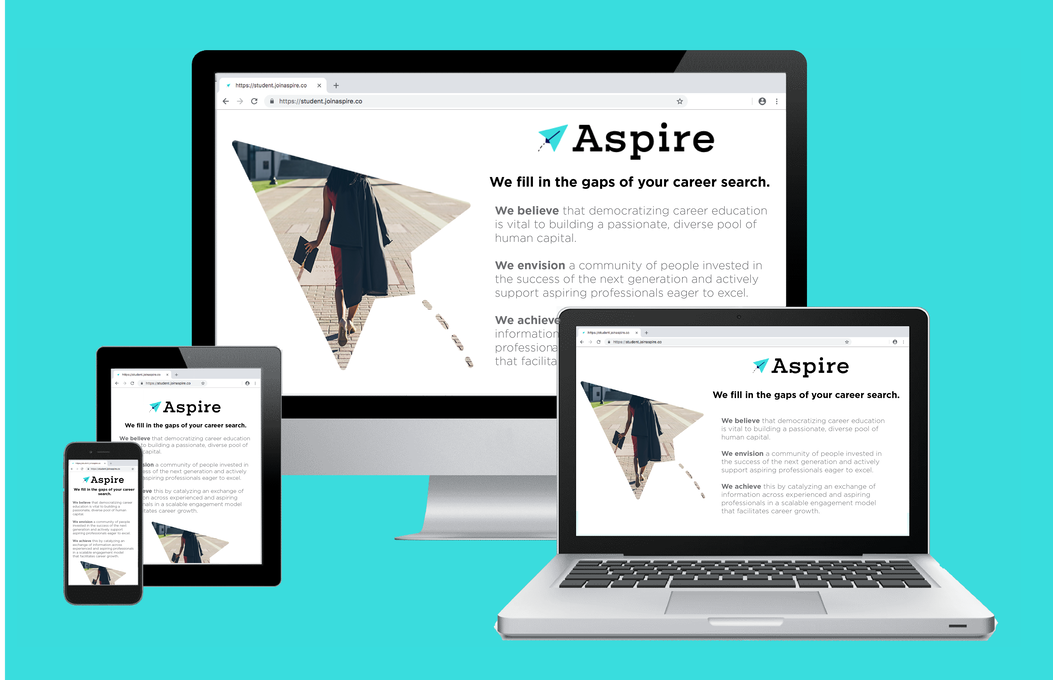
Aspire is an early stage startup that focuses on facilitating career growth for students by democratizing career education and by creating a community of people invested in the success of aspiring professionals. I was responsible for leveraging the design process to drive user retention and worked with front-end developers in improving the product experience.
Internship Length 9 months: May'18 - Feb'19
Contribution Research | Synthesis | Prototyping | User Testing | Visual Design |
|
Problem Three of the biggest problems that students face during their career search include not understanding the company, not understanding the role, and an inability to find the right people to talk to. Aspire aims to fill in these gaps with their online platform that catalyzes an exchange of career information and insights across experienced and aspiring professionals.
|

Process and Outcome |
|
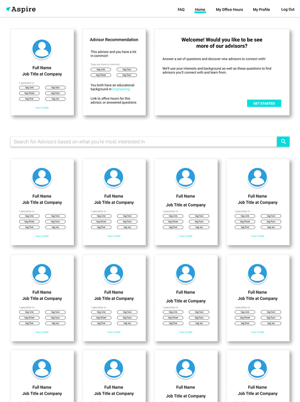
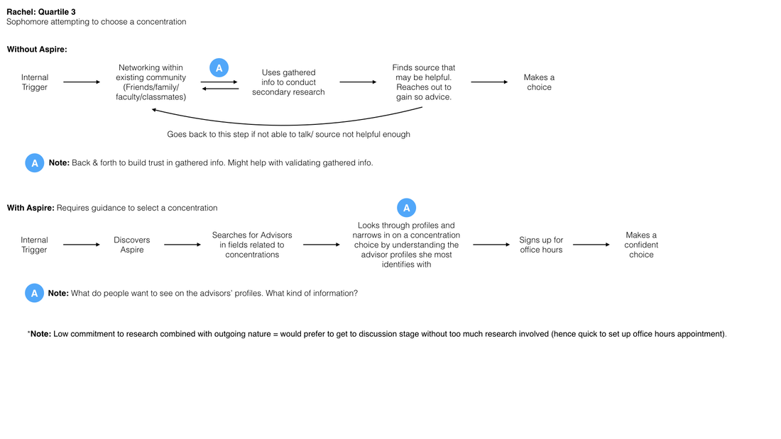
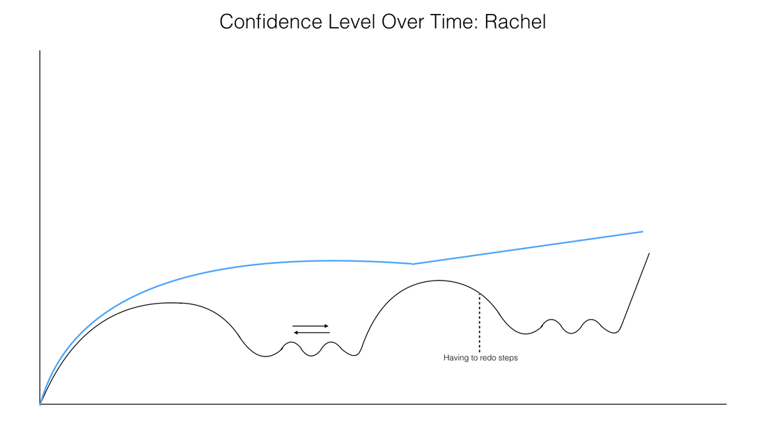
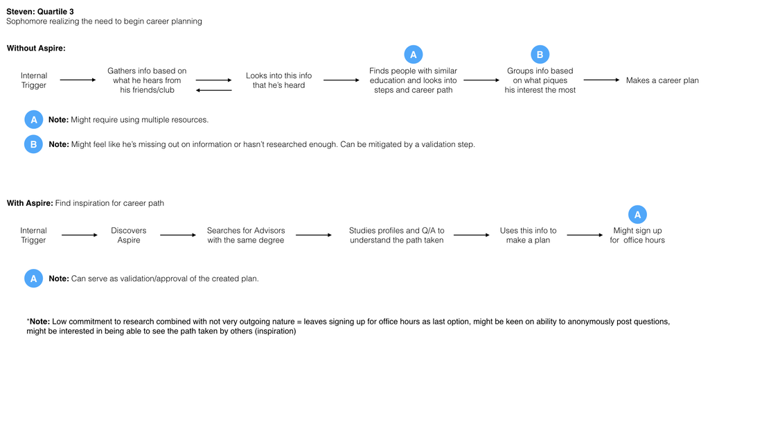
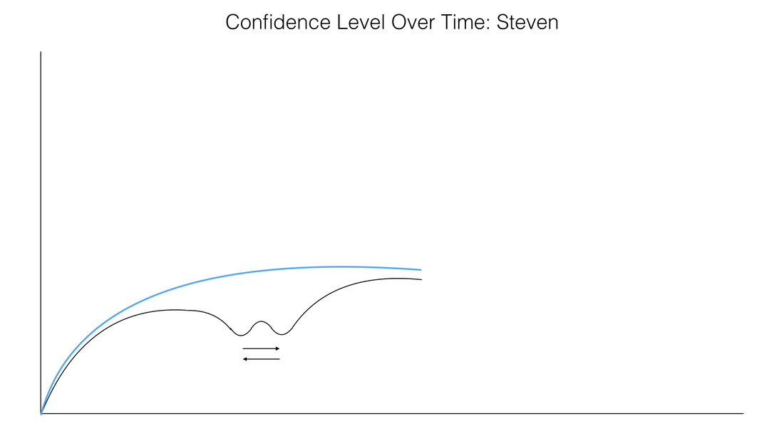
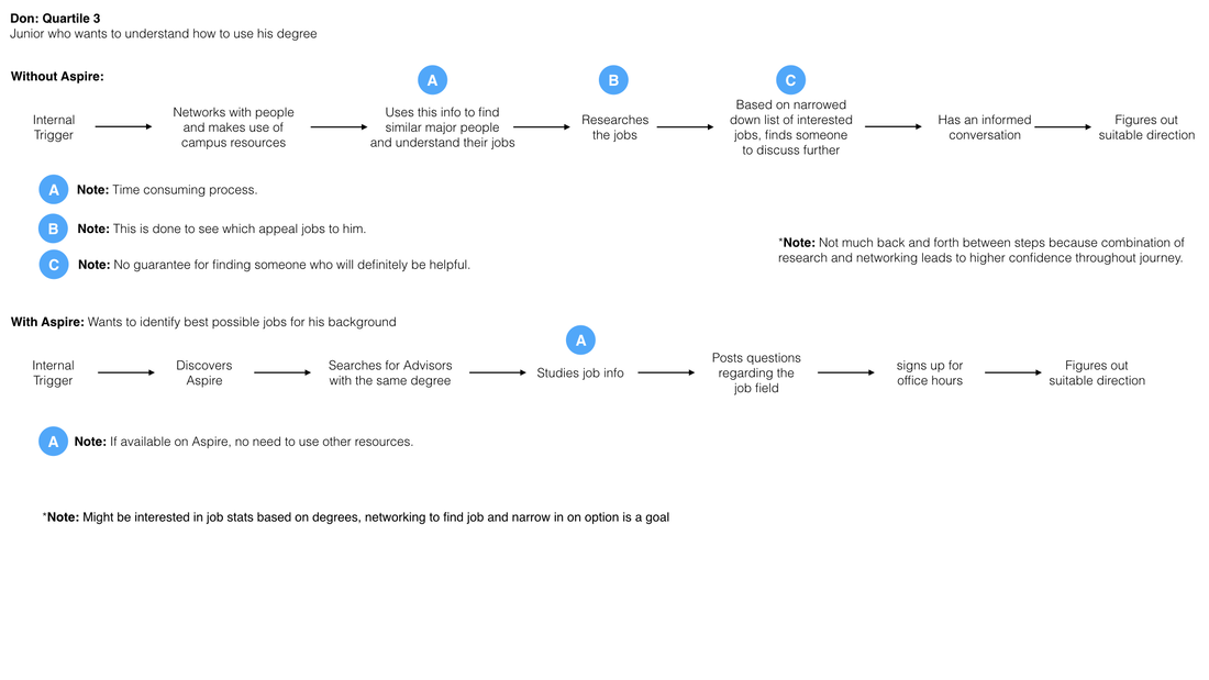
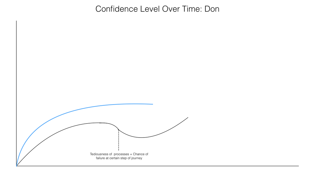
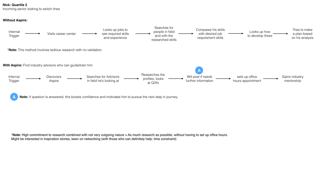
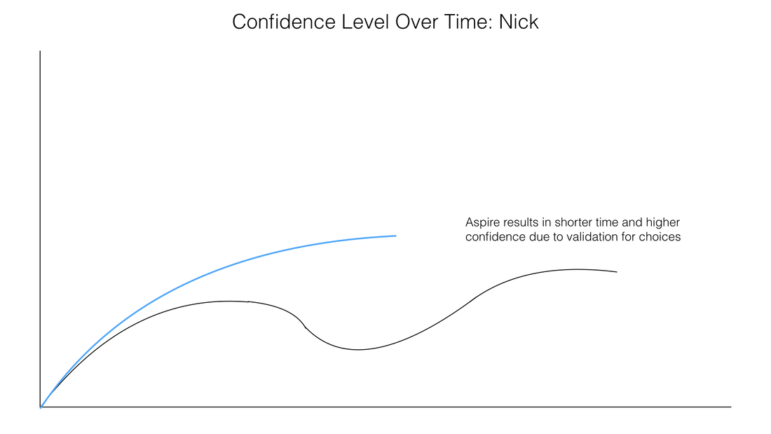
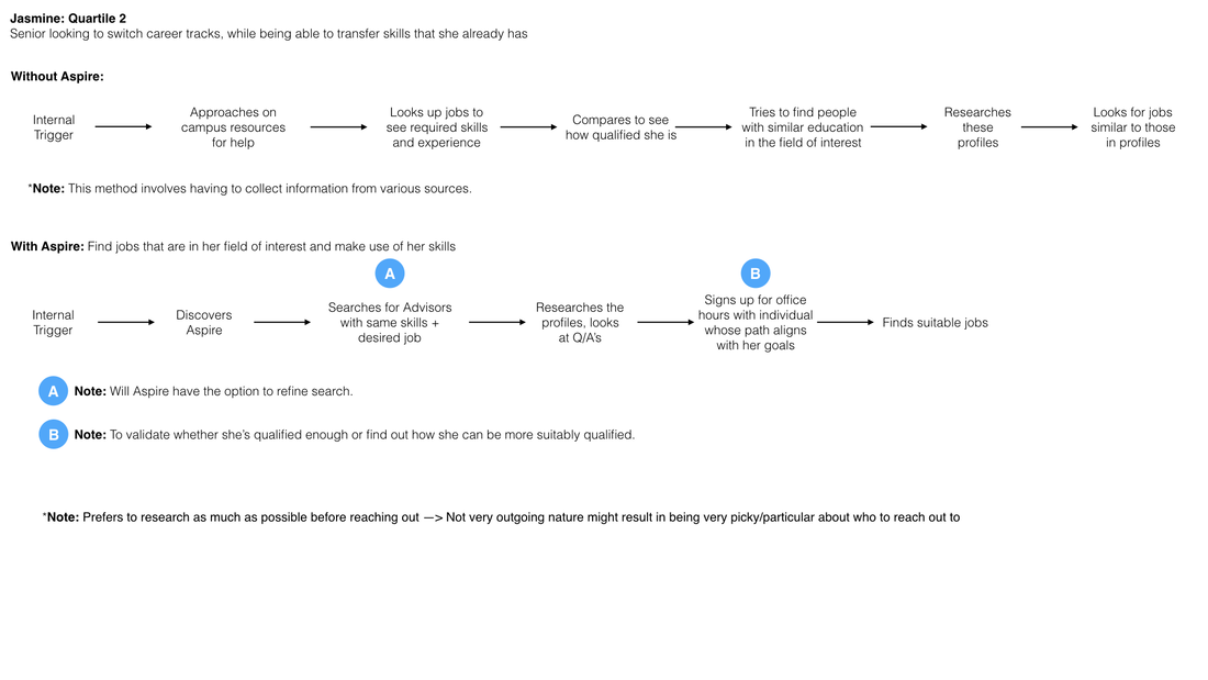
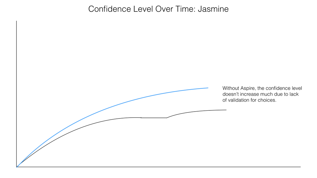
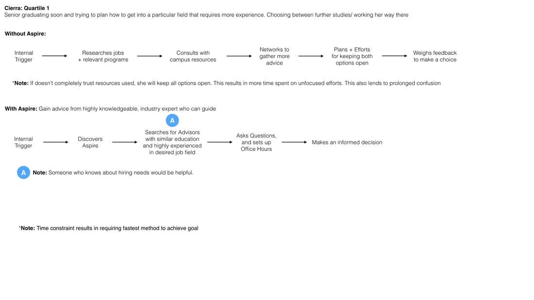
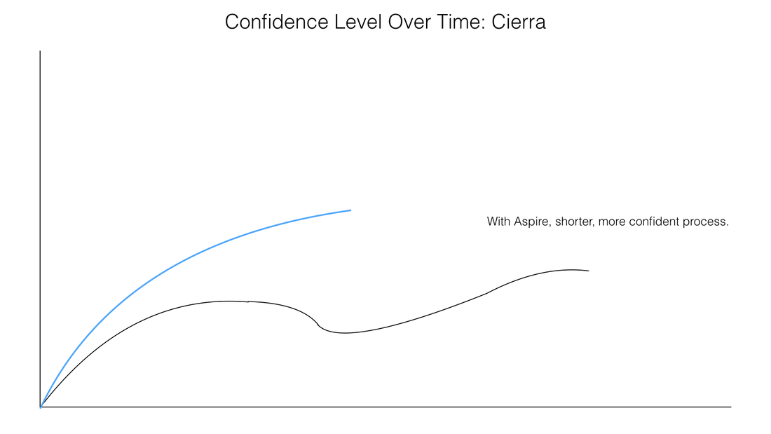
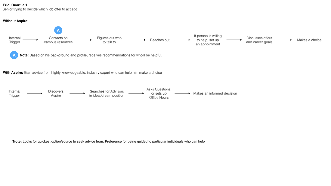
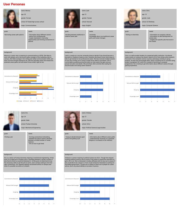
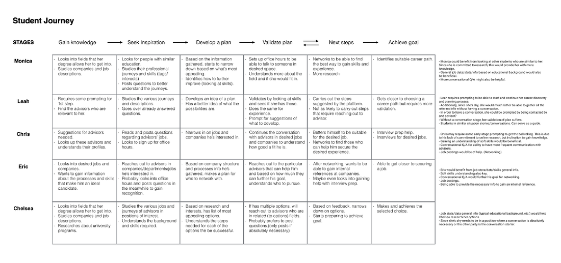
In order to gain a better understanding of the target users and their needs, I participated in conducting user interviews and developing surveys. Additionally, I carried out user testing, using Aspire's already launched website. As a result of the research and synthesis, I was able to develop user personas and journey maps, which led to the uncovering of the most valuable user traits: knowledge level, access level, personality, skill strength, commitment to research, and internal triggers. These traits help to determine how much, and the kind of, guidance a user might require. These traits were also helpful in understanding Aspire platform user journeys for the personas. The user testing sessions also allowed me to understand the existing product's key pain points.
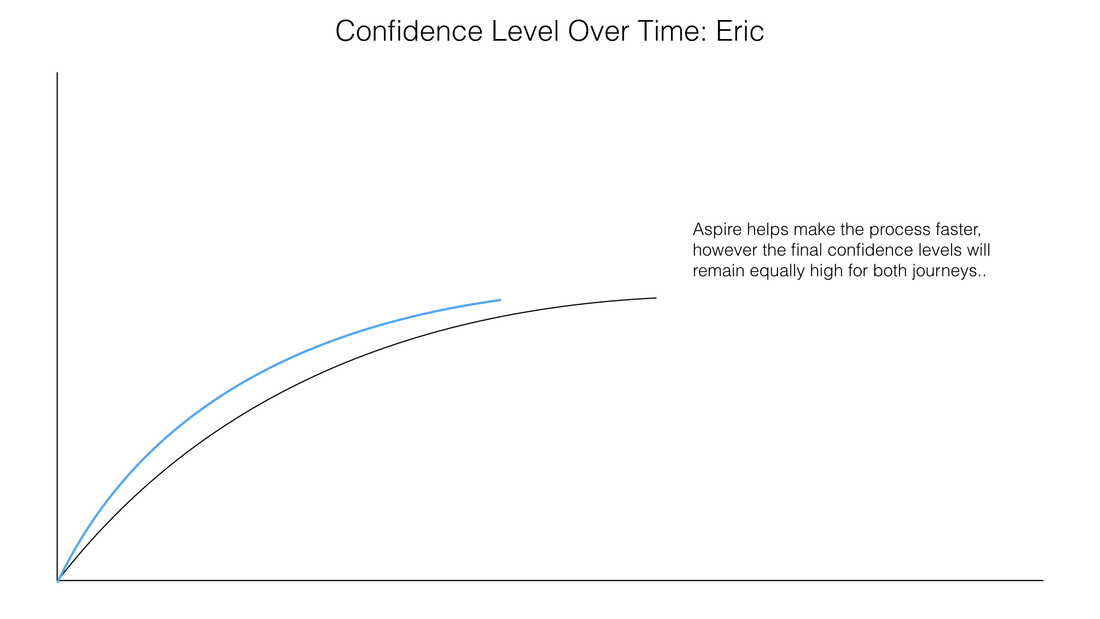
Research Findings: Based on research synthesis, personas, and journey maps - Students would like to seek inspiration from professionals in industry, or other students with similar backgrounds. - Understanding general and basic info with regards to companies and jobs would be helpful: relevant education/ experience/ skills required. - Having one-on-one conversations about career planning contributes to more confident decision making. - Some students require additional guidance and nudging to remain motivated. - Students look for verification of plans and goals - they want to know if they’ve chosen wisely. 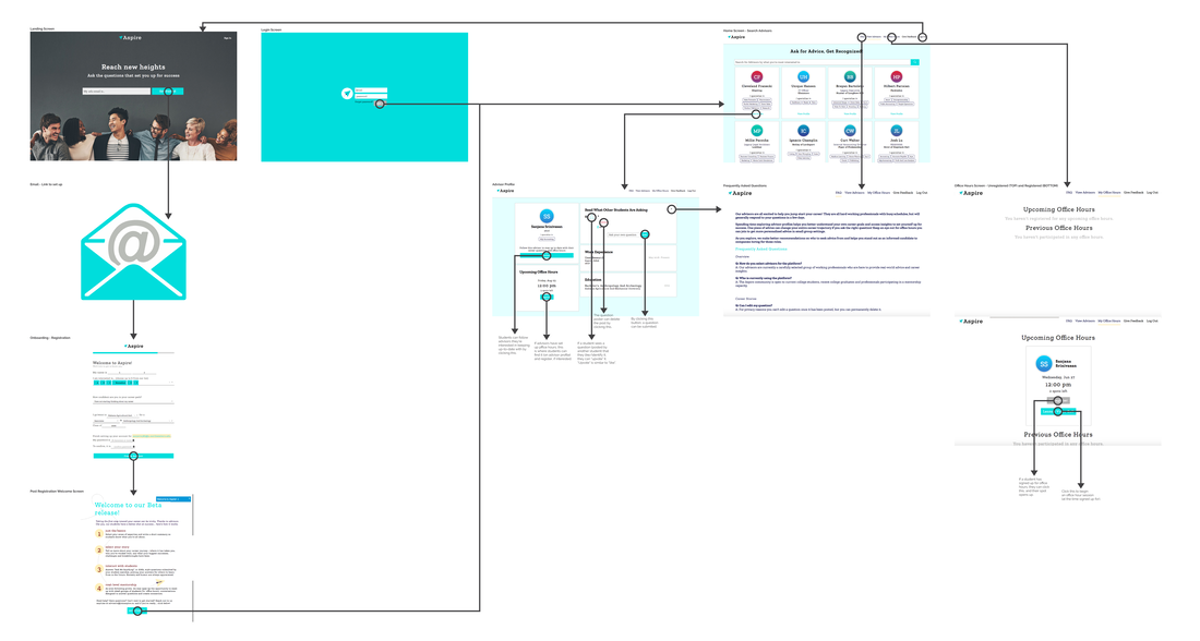
Original User Flow of Aspire Platform (Student user perspective)
Platform's Features:
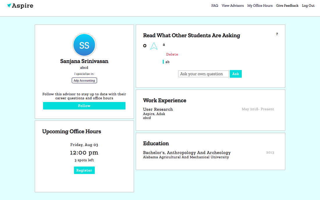
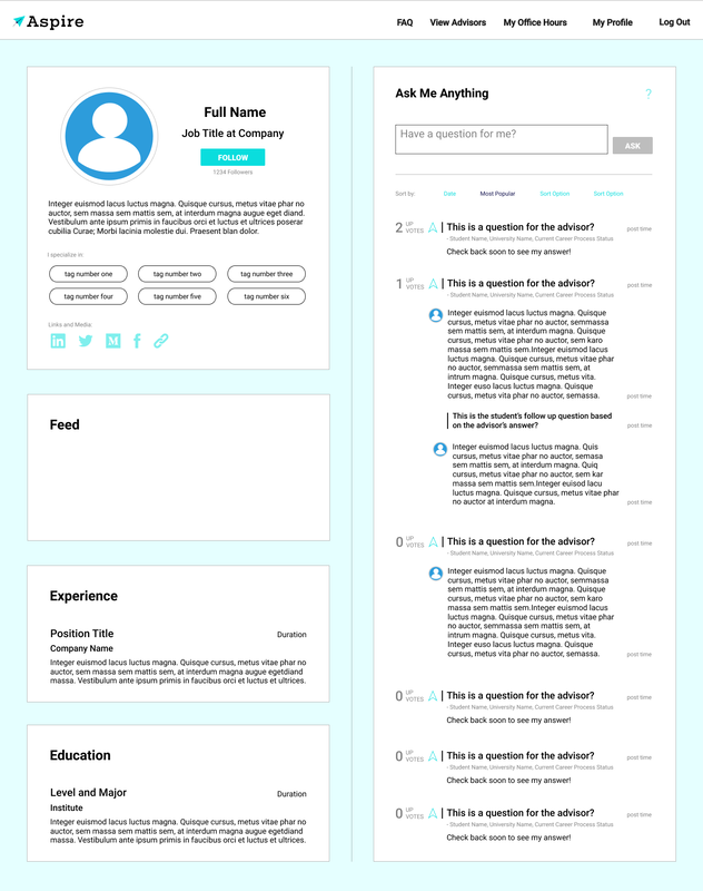
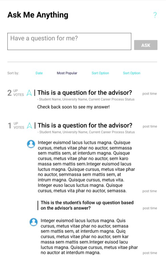
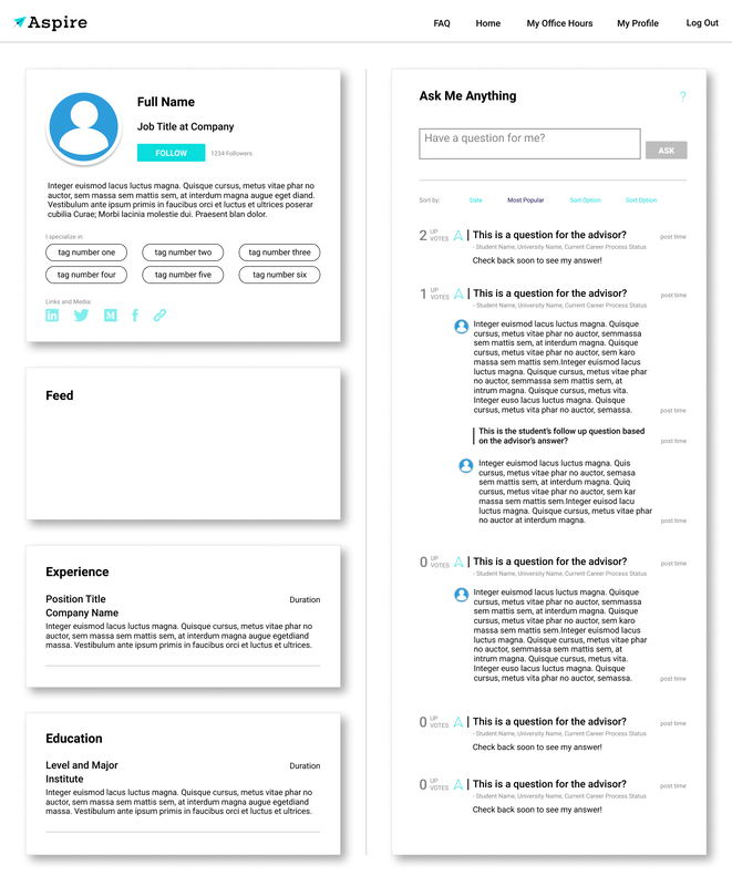
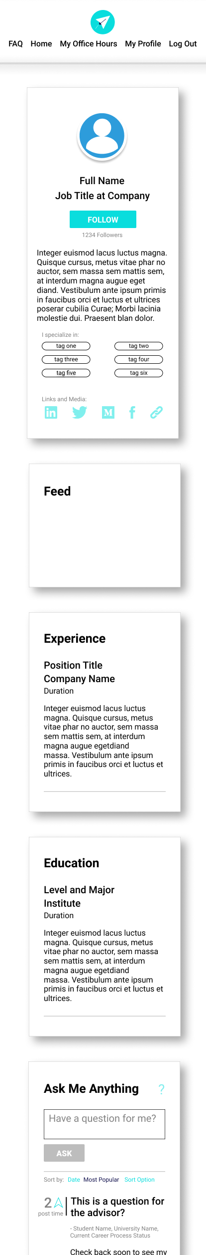
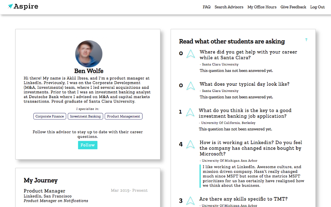
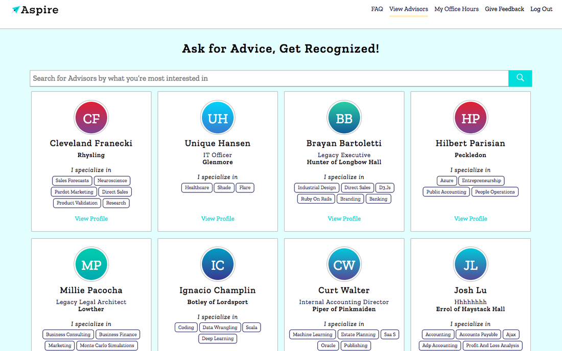
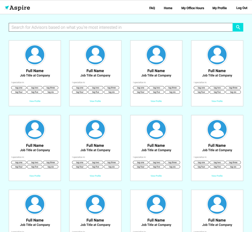
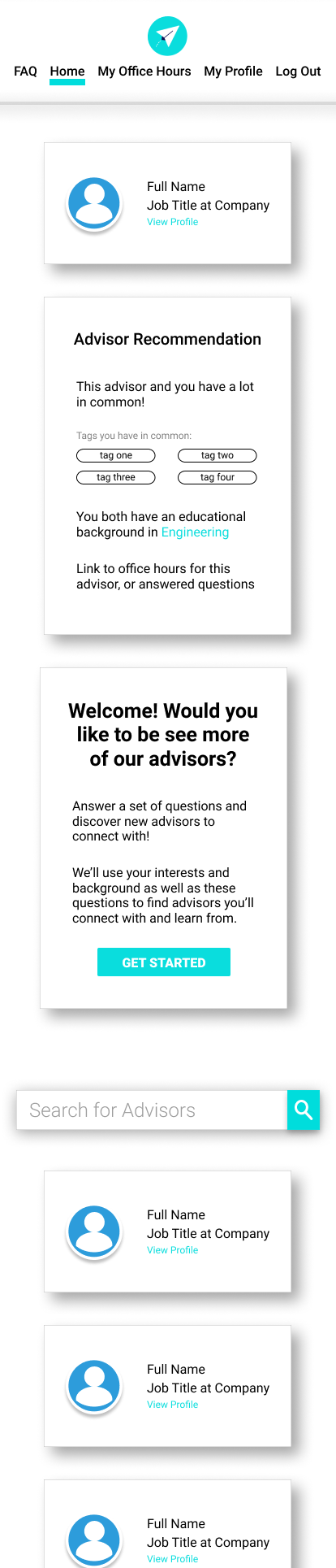
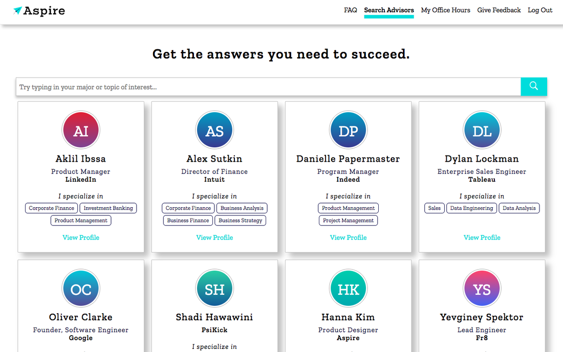
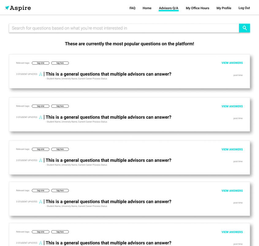
- Students provide their “edu” email address and are emailed a link to register. - After submitting their info and creating a password, they are taken to the platform’s home page where they can searcher advisors. - Upon visiting an advisor profile, they may view advisor’s bio, their interests, educational background, professional experience, students can post questions/up vote already posted questions, “follow” the advisor, and sign up for office hours (depends on whether the advisor has posted). - Office Hours are video call sessions between an advisor and 1-3 students. Overall Product Pain Points: User Testing Results - The platform requires more personalization according to students’ (personas) needs and goals. - Users feel a little lost while using the platform and don’t understand how platform activity lends to achieving goals. They can’t track their own activity. - Platform, in it’s current state, isn’t compelling enough to encourage continued usage. - Users were confused while interacting with the platform due to the inconsistencies among elements, like buttons and forms. First Phase of Updates:
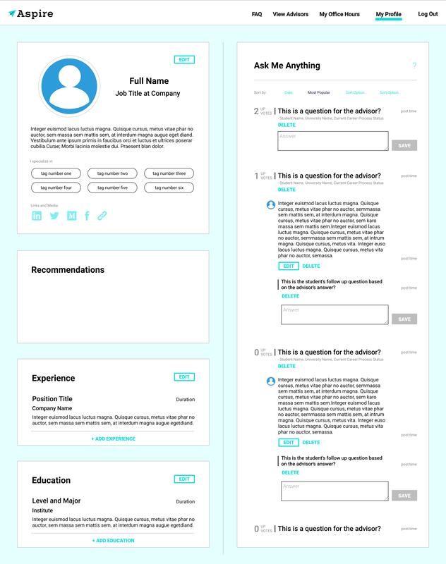
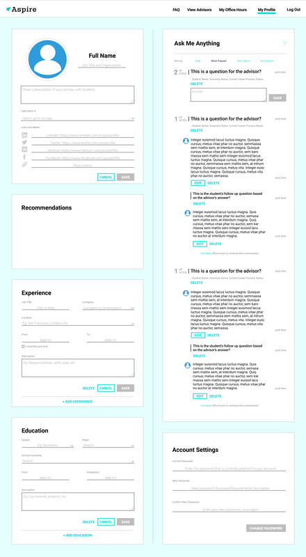
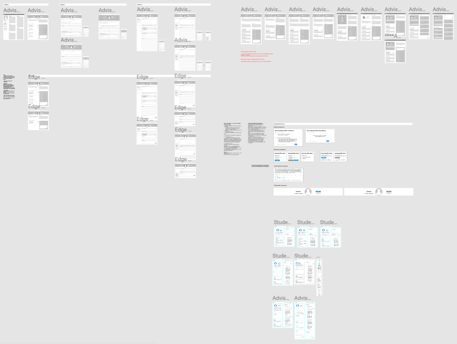
The goal was to focus on making each page more engaging, while creating features on each of the pages that would contribute to making the platform more cohesive. Additionally, I worked with front-end engineers to develop the design system and redline documentation that would enable visual consistency across the platform, and help with visual hierarchy on each page.
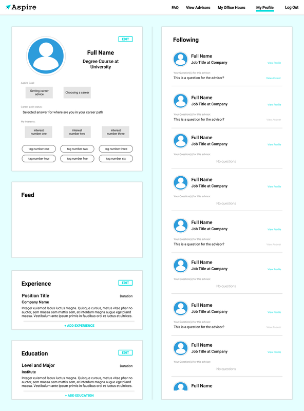
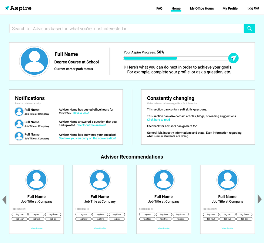
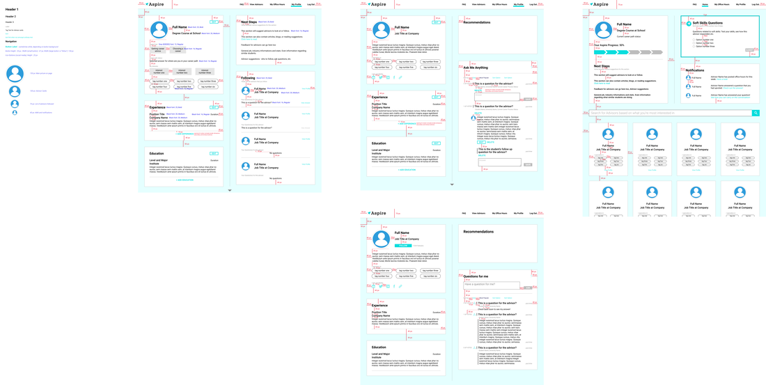
During the platform registration process, students have to enter details regarding interests, skills, education, and experience. In the original platform version there is no way to go back and make edits to these details. Therefore, I designed a student profile (very similar to the advisor profile) in order for students to be able to update information, and also, keep track of their platform activity - who they follow and questions posted.
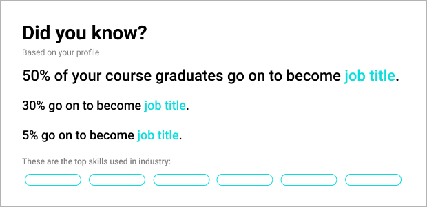
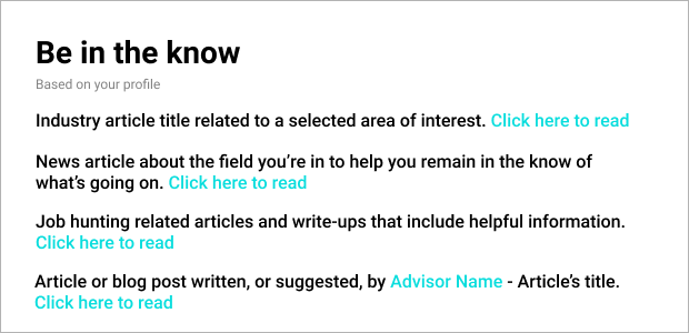
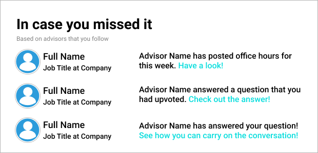
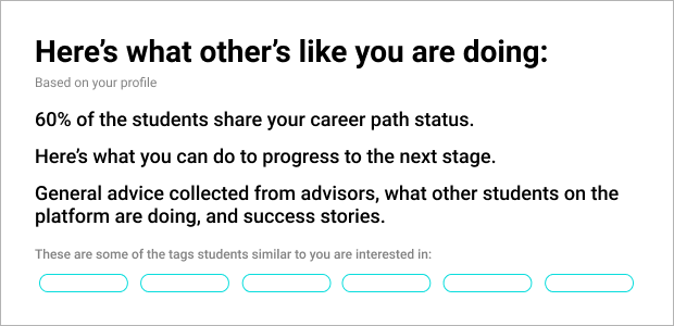
Similar to the Advisor Profile, the Student Profile also includes a "Feed" section. This section is to be used for notifications/ next steps/ advisor suggestions/ general info (job stats, etc.) that the user finds relevant. It can also be used to motivate the user along the way. Below are some prototypes for this particular section.
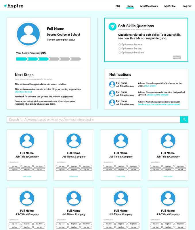
I brainstormed various ways to make the home screen more engaging and developed prototypes that included features such as: student career planning progress bar, a home page that provided notifications and updates, a feed feature for common trending questions that any advisor can answer, and a soft skills quiz feature that could enable improved advisor-student matching.
In working with the front-end developers, it was evident that some of the features outlined in the prototypes would take longer development times. Additionally, during user testing sessions, the soft skills quiz feature appeared to be quite popular. Therefore, I adjusted the prototypes to include only the soft skills quiz feature and also be more easily implementable within the near future.
Second Phase of Updates:
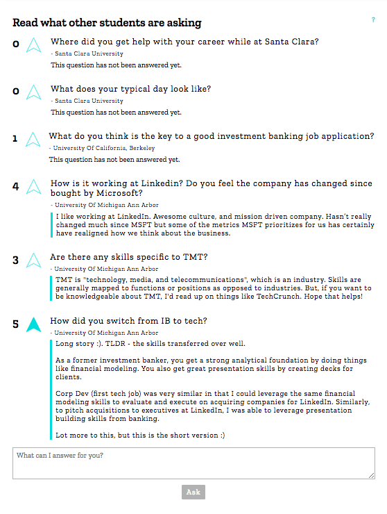
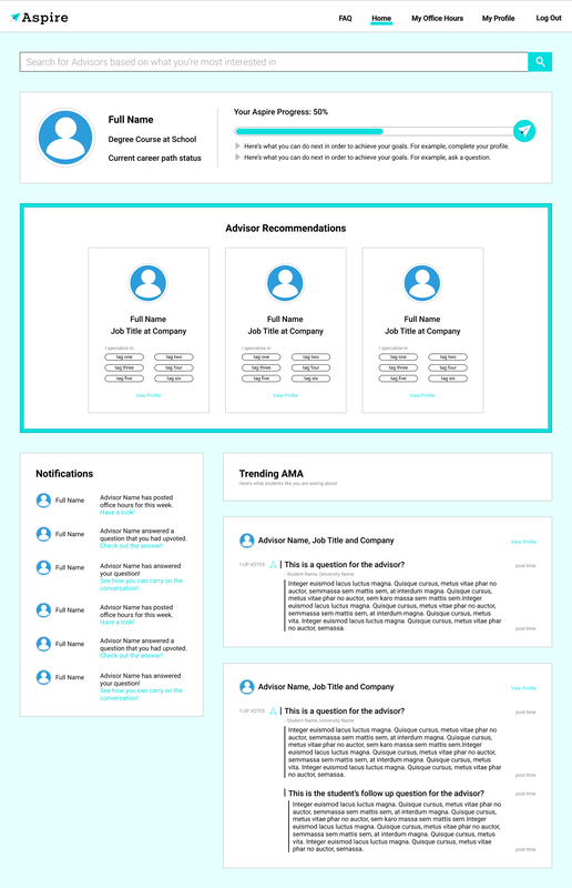
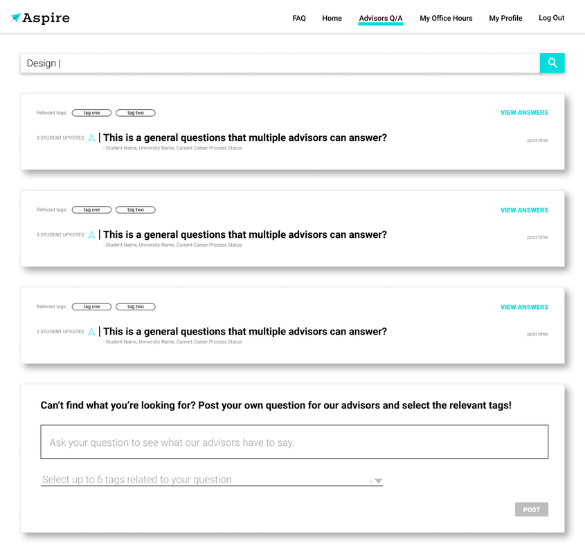
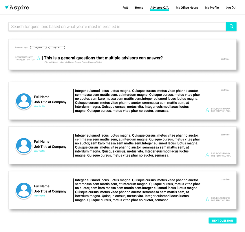
After understanding how to improve the individual pages, and the direction in which to take them, the focus was to improve the overall flow of platform, fill in the gaps, and address the "overall product pain points". Having taken each of the pages and existing features to the next level, the user testing sessions revealed the successful aspects of the overall platform, how well the various features worked together in helping the user fulfill their needs, and where it needed improvement. One of the problems that persisted through the various rounds of redesigning and testing, was the lack of user engagement with advisors, through the Q & A feature (on the advisor profiles). Upon conducting more user research, a number of gaps contributing to this issue were revealed. - Users who had just begun their career planning found the Q & A to be a jump. They had a lot of general questions that they needed/wanted answered before interacting with advisors. Due to the knowledge gap, some users didn't know what to ask the advisors/ didn't have any questions for them/ were intimidated. - Users assumed their questions might've already been asked by another individual on another advisor's profile. User hesitation to repeat a question that may already be present on the platform. - Some users didn't feel comfortable posing more general, non advisor-centered, questions. They felt the questions need to be regarding the advisor's experience and background. In order to tackle these issues, I designed a Q & A page that would allow users to search for, and also, post questions that could be answered by multiple advisors. This page would allow users to gain access to more general career advise relevant to themselves. The additional benefits: - Provide users with another way to discover advisors. Users viewing answers to questions on this page may find a helpful reply from an advisor they hadn't previously seen on the platform. - The ability to gain multiple perspectives. - Discovery questions that hadn't previously occurred to them. - Provides a sense of comfort when one sees others having similar questions. - Considering the Q & A feature is one of the platform's most important ones, this page helps draw more attention to it. Another issue with the platform was it's flow. Student's felt a little lost upon initially using the platform, and required more time to explore it, before being able to begin their career planning. Through research, it was understood that students were also interested in career planning advise and tips that weren't necessarily provided by advisors. The research also revealed that students want more direction (actionable advise), which would help build their confidence throughout the career planning process. Essentially, students were seeking an intermediary step between signing up, and reaching out to advisors, that provided similar benefits to conversing with a career counsellor. A potential solution for this is an AI Chat Bot, that would also support a more seamless platform user experience. Therefore, to begin with, I redesigned the platform on-boarding process (using mobile-first approach) to be a conversation through a chat feature. This feature can later be implemented and further developed, if proven to be helpful.
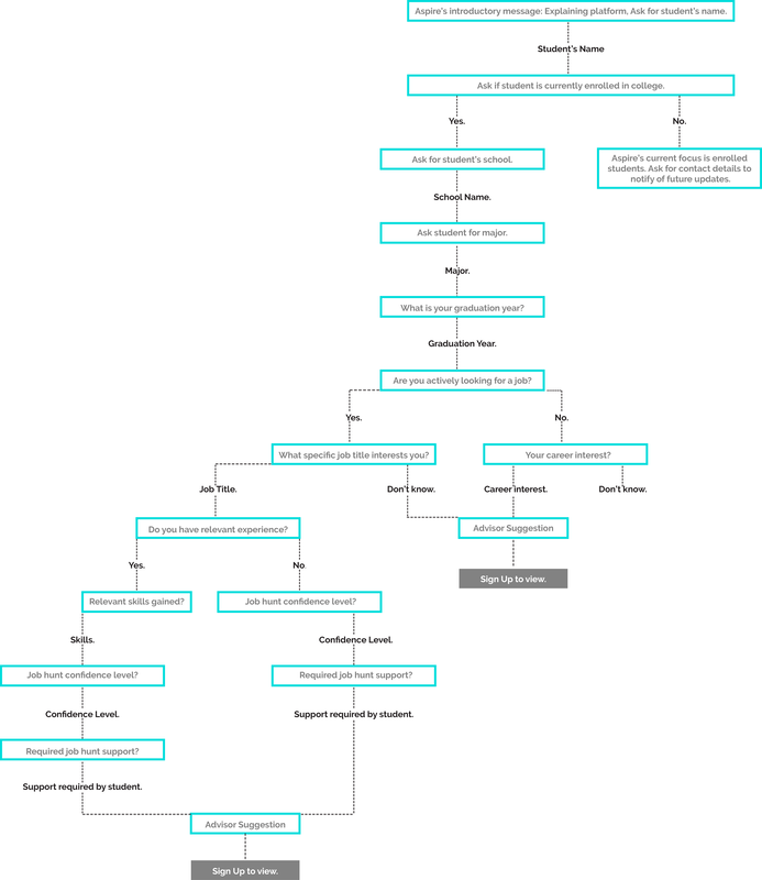
Onboarding Conversation Flow
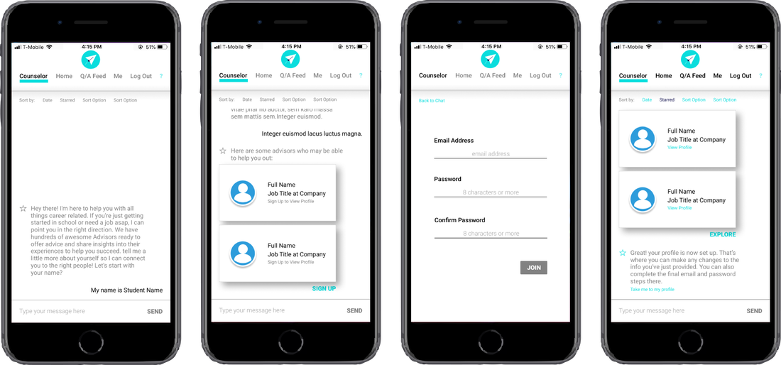
Chat feature for Onboarding: Screens
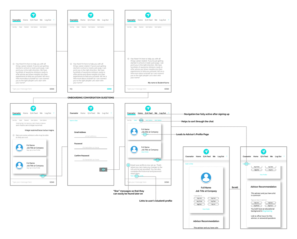
Flow for Onboarding using Chat feature
|

|
|
Internship |
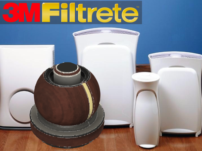
3M's Filtrete |
|
Reimagining the room air purifier.
|
|
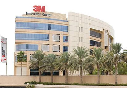
During my internship at 3M Gulf (Dubai, UAE), I worked in the R&D department for the Consumer Products Division. I was assigned projects related to new product introduction, product development, product testing and product compliance.
Internship Length 3 Months: Sep'15 - Dec'15
My Role Market Research | Local Regulation Research | Ideation | Concept Development | Product Testing |
|
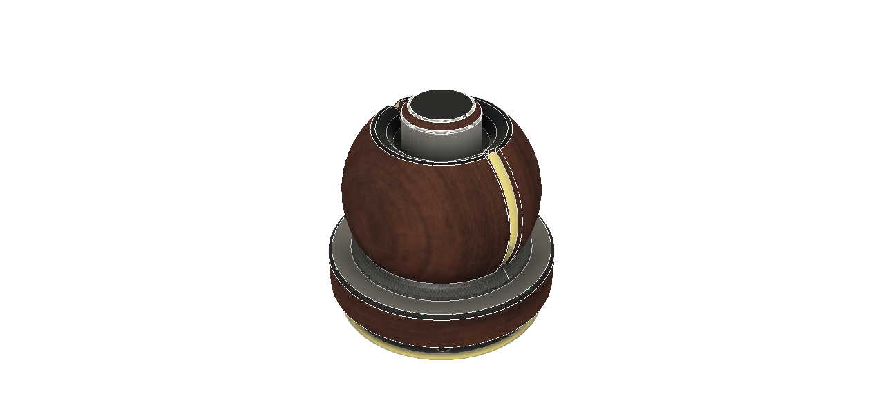
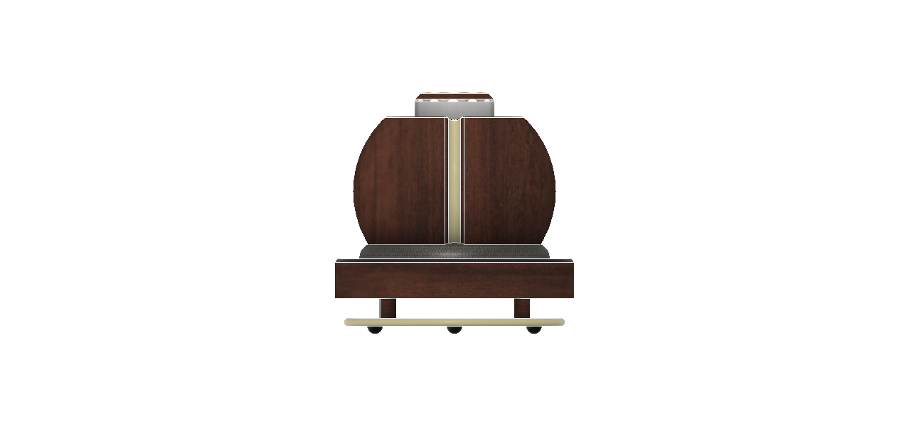
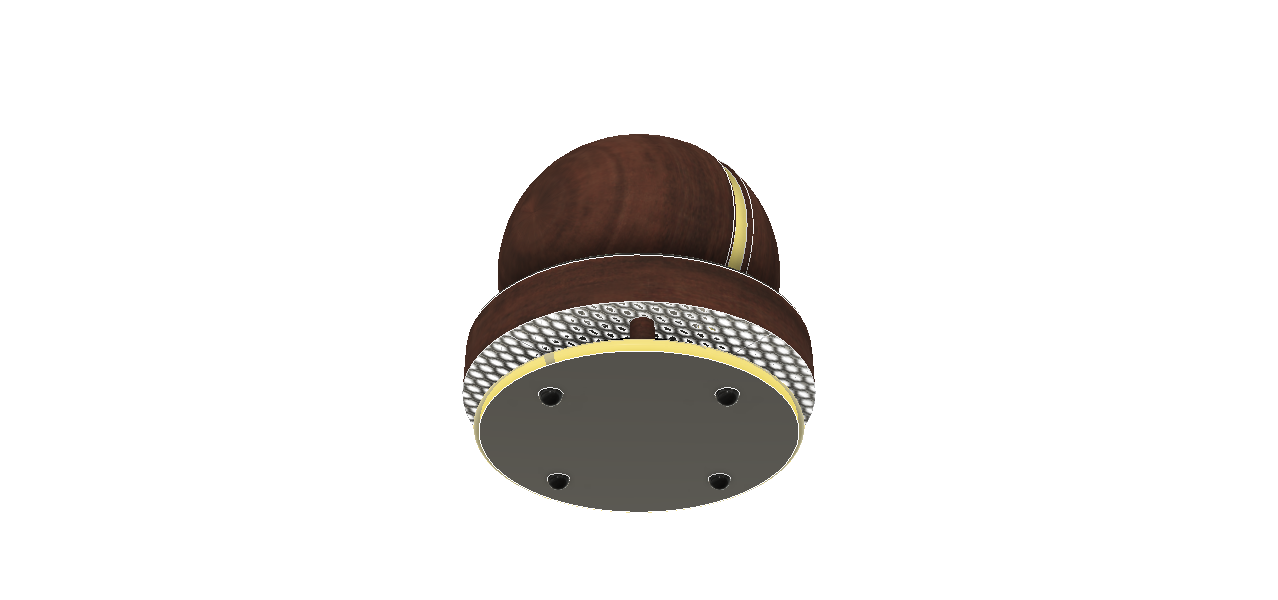
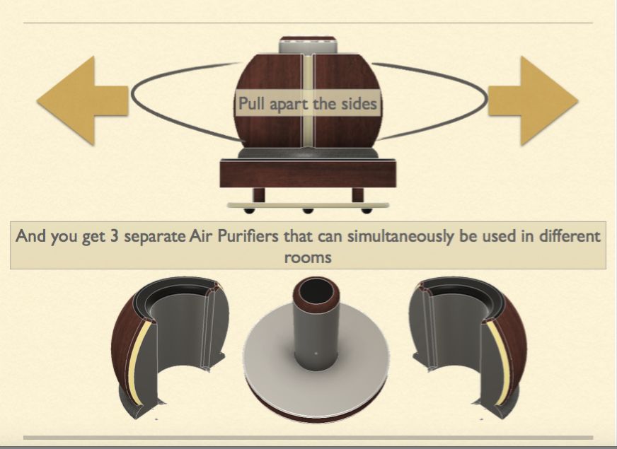
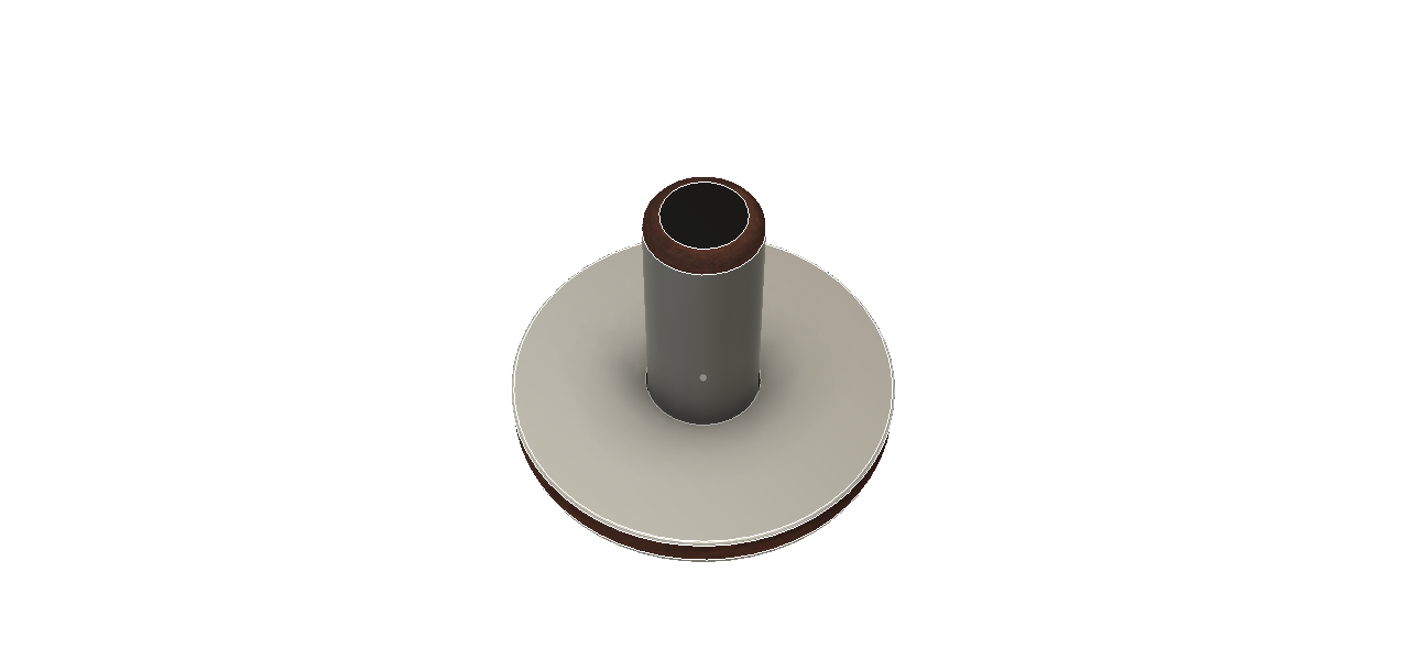
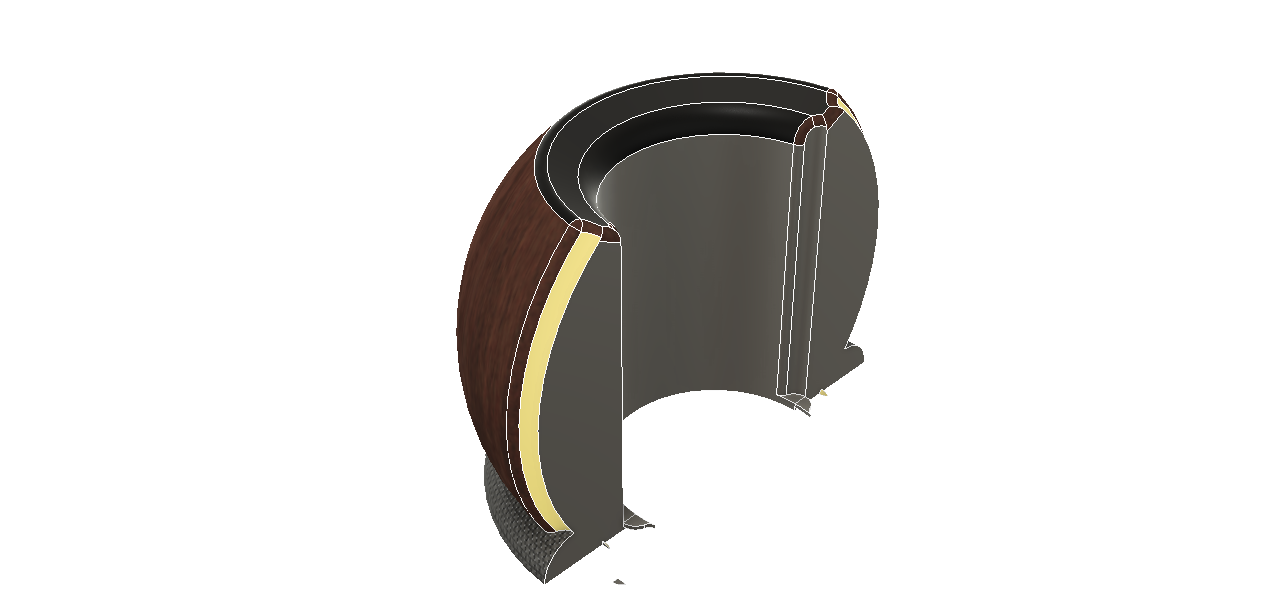
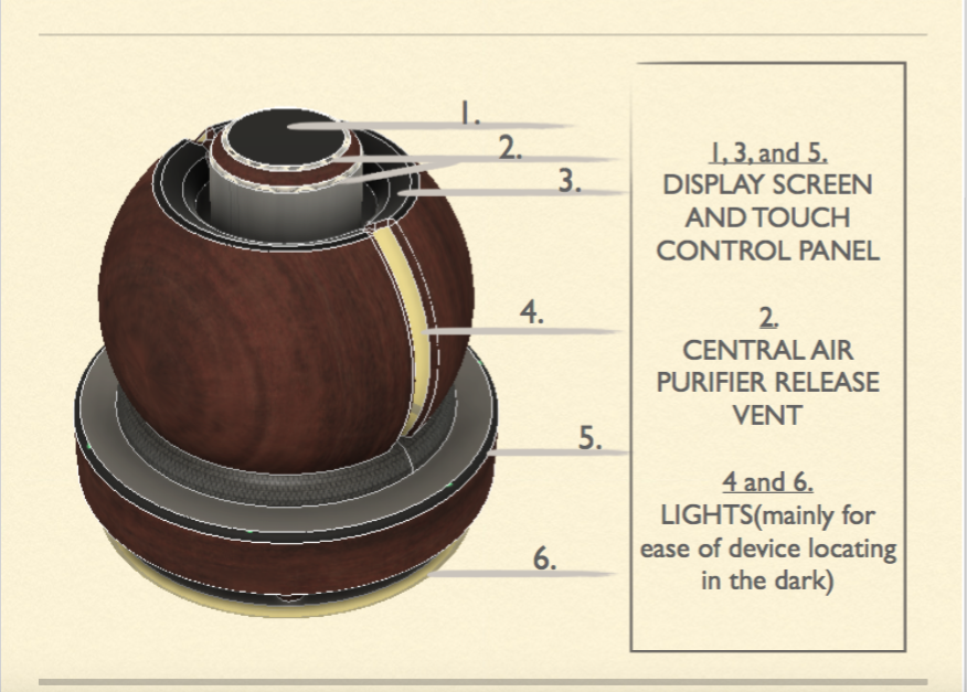
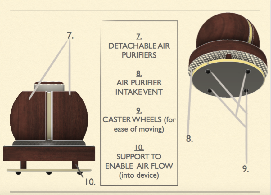
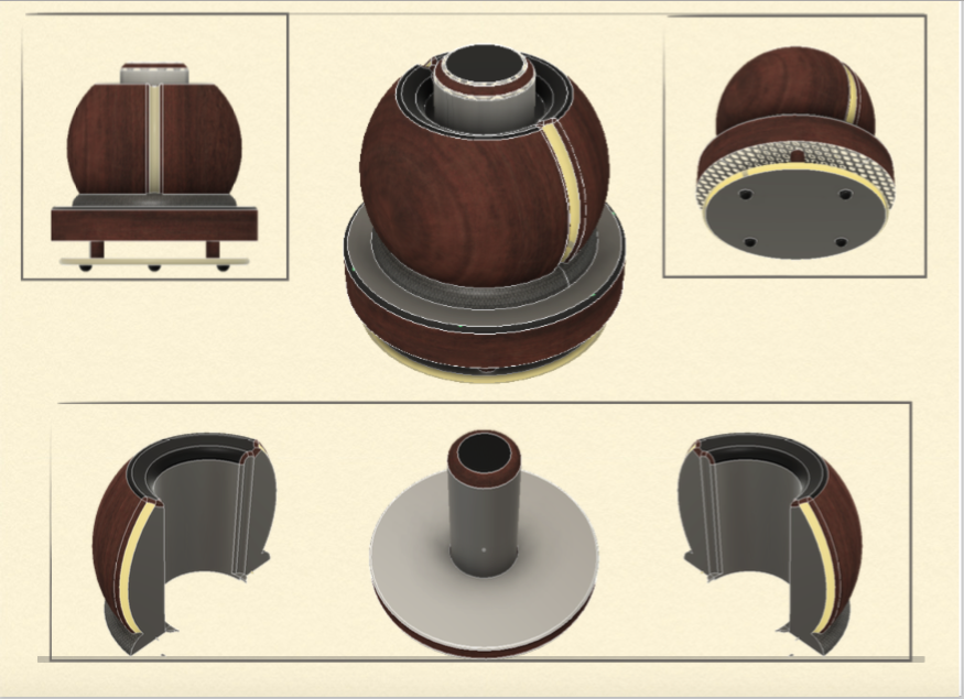
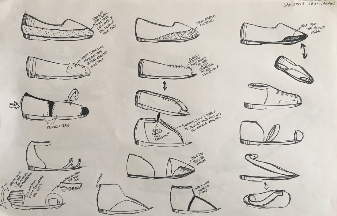
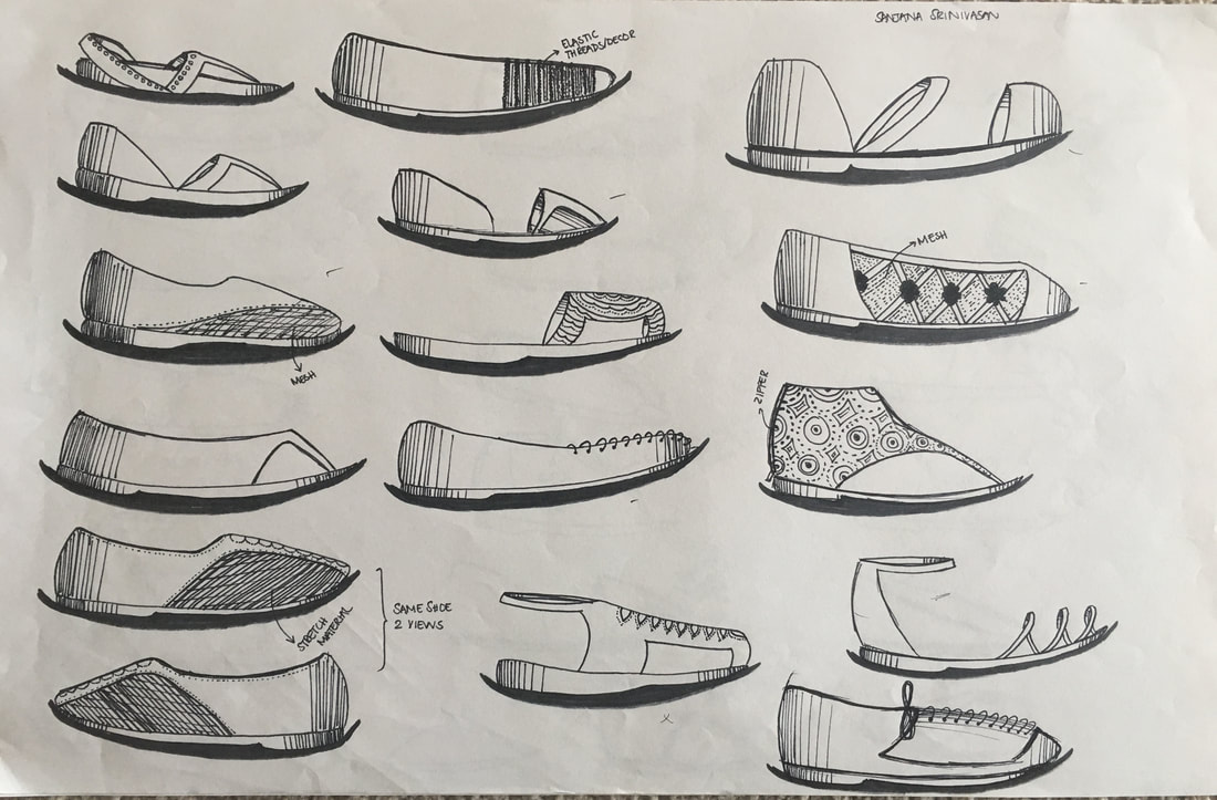
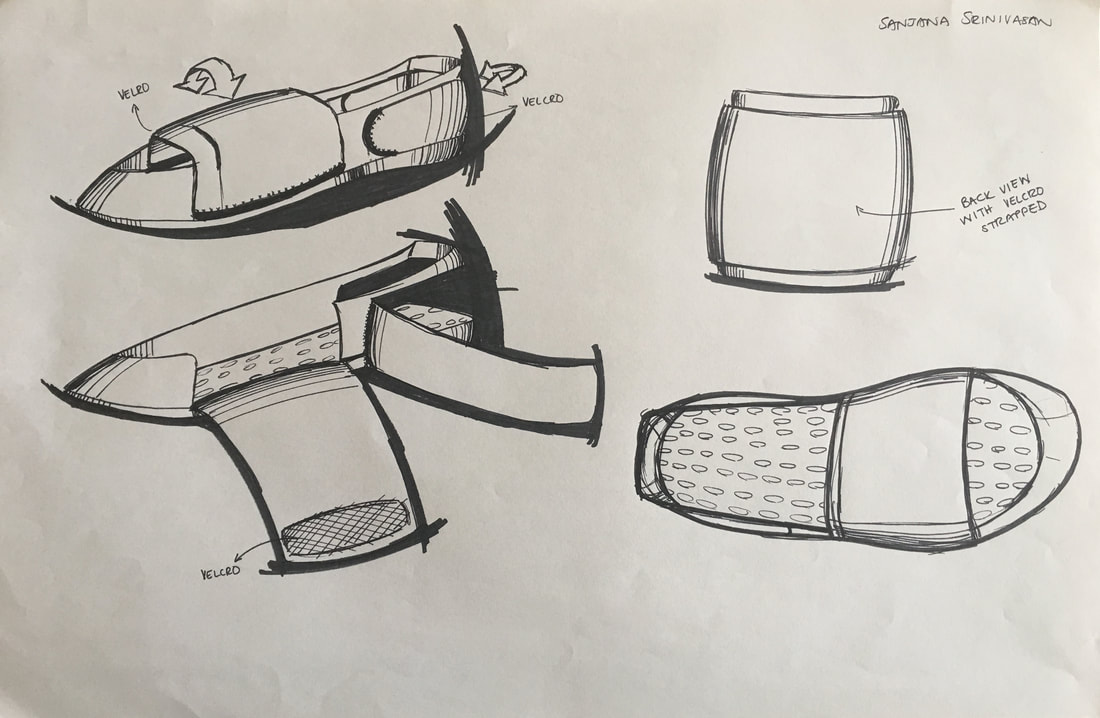
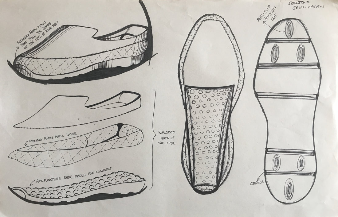
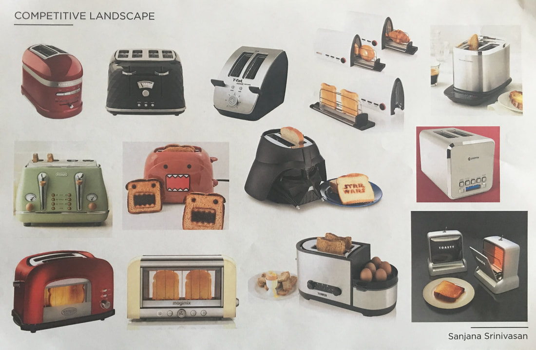
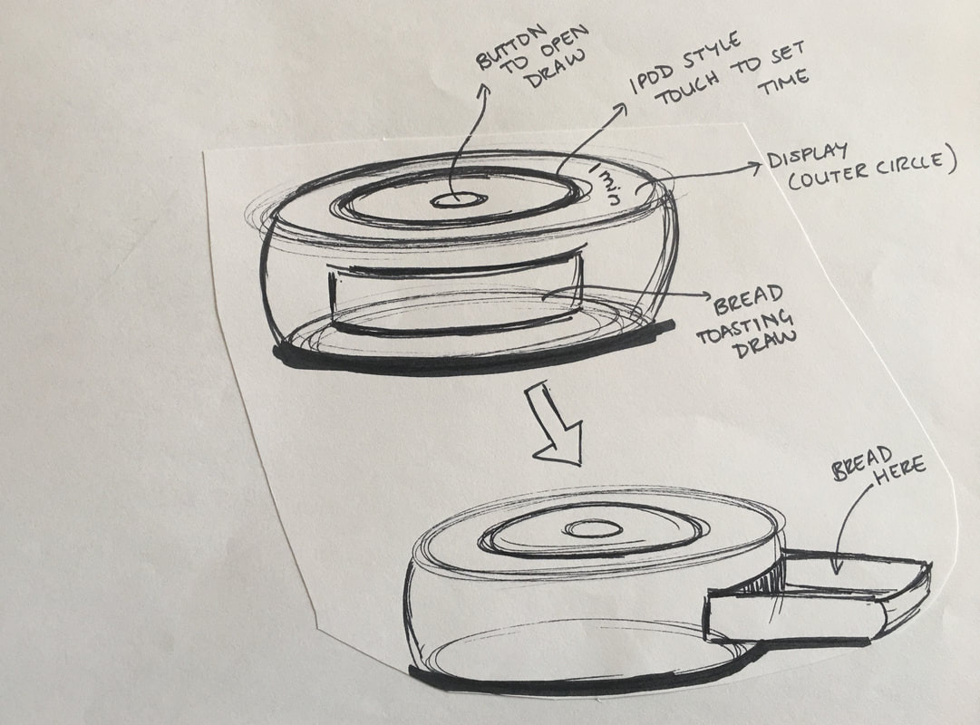
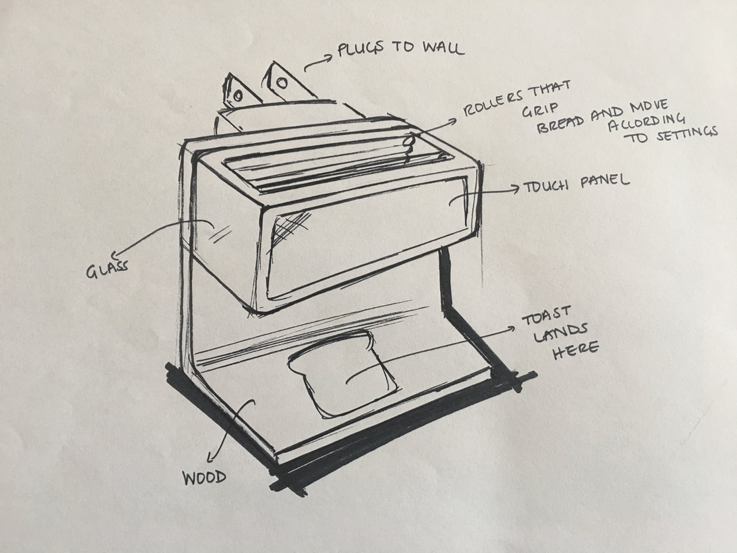
Product Development This project involved designing a new air purifier concept that would enable 3M's Filtrete Air Purifier range to compete with the higher end products in the market that serve the same purpose.
|
Process and Outcome |
|
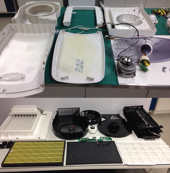
For the air purifier design concept, I was tasked with improving the aesthetics, features, and quality of the product. Therefore, I conducted competitive landscape research and secondary research to understand what was available and what users liked, disliked and wanted from these products. In order to assess quality of the product, I took apart a few air purifiers - a mid range product and a higher range one. Once I gained a better understanding of the existing products, and identified a few issues and gaps, I designed an air purifier to include desirable features. Additionally, I wanted to design a product that would fit seamlessly into a space.
|
|
|
|
|
Technology Innovations Class |
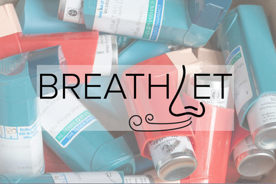
Breathlet |
|
Redesigning dry powder asthma inhalers to keep up with athletes' active lifestyles.
|
|
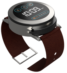
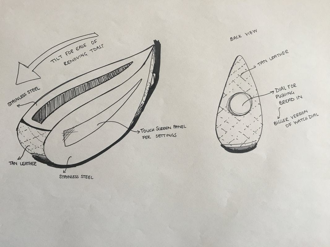
Breathlet is a product concept that was developed as a final project for a technology innovations class. The product is a wearable, easy-to-use, inhaler system designed to counter asthma symptoms experienced by individuals, and at the same time compliant with all medical and safety standards.
Project Length 2 Weeks: Dec'14
My Role Research | Ideation | Designing | Prototyping |
|
Problem The typical inhaler tends to be bulky, and is not necessarily designed to be used in all situations.
For athletes that suffer from asthma, gaining treatment from symptoms may require them to leave the training or competition area. As a result, they may risk being prevented from participating for the remainder of the session. Additionally, gaining immediate relief isn't possible as they might not always have easy access to their inhaler. This product is also designed for those who suffer from exercise-induce asthma, which can affect individuals that do not necessarily suffer from asthma. |
Process and Outcome |
|
In order to understand and narrow in on a target market, I conducted some research and discovered:
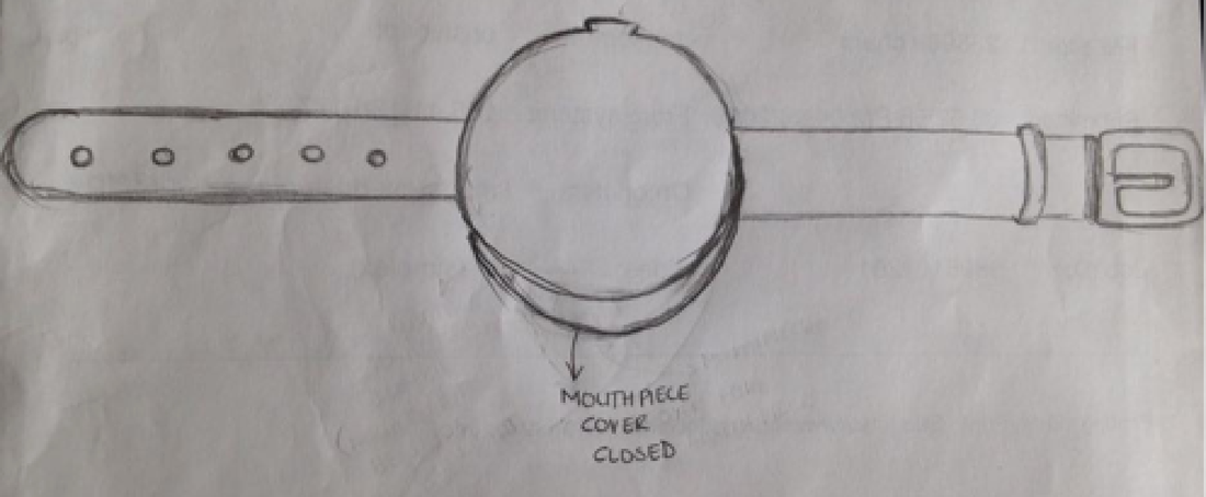
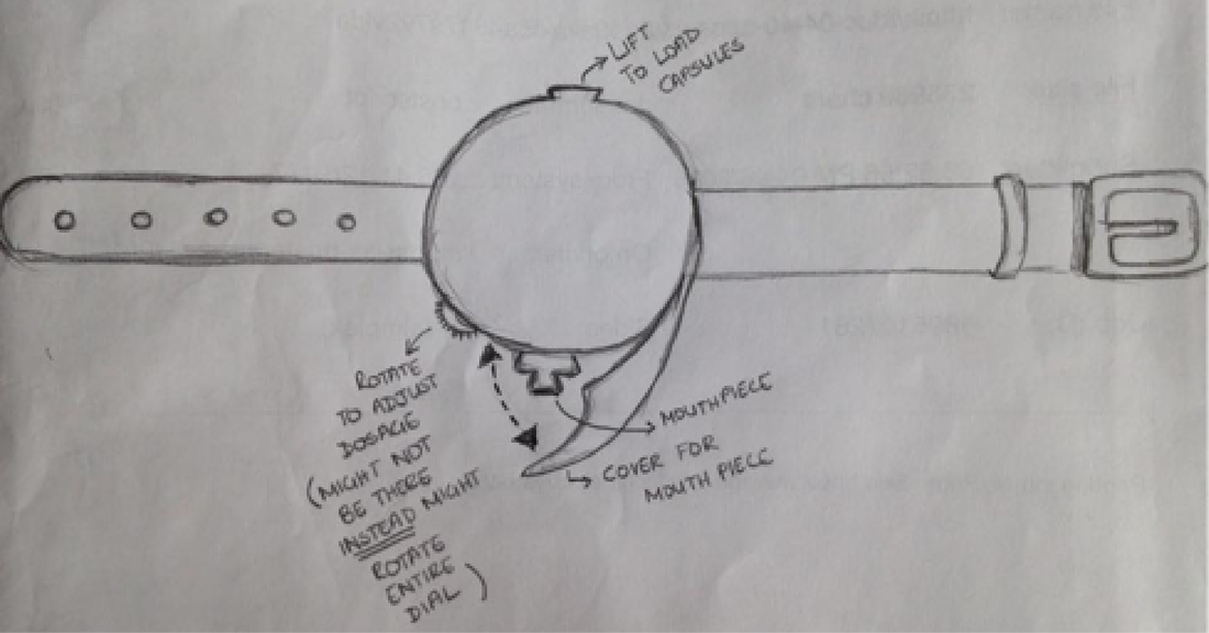
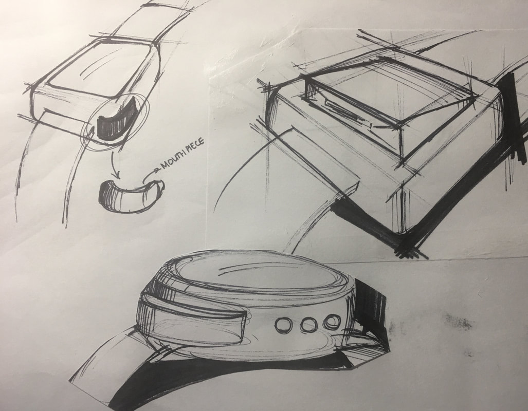
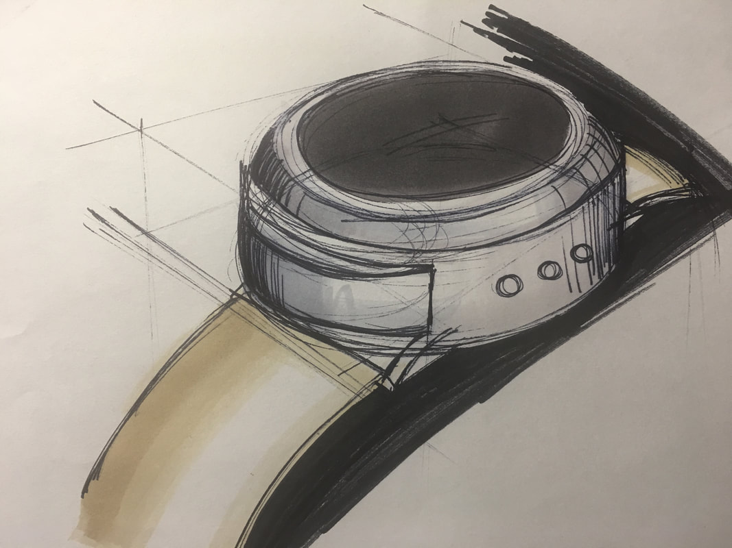
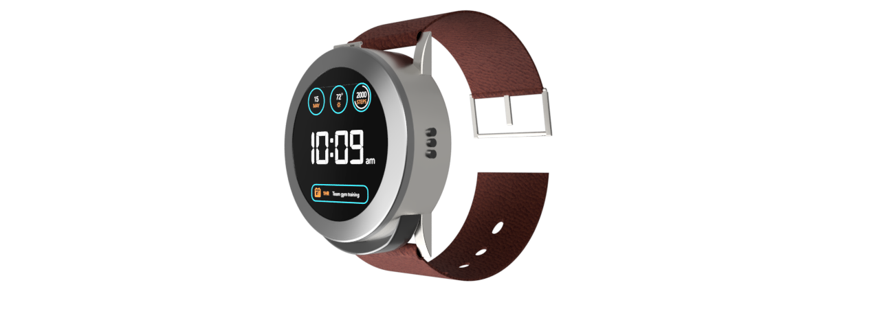
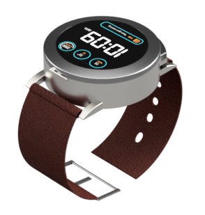
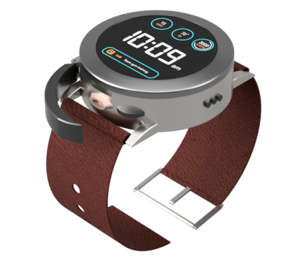
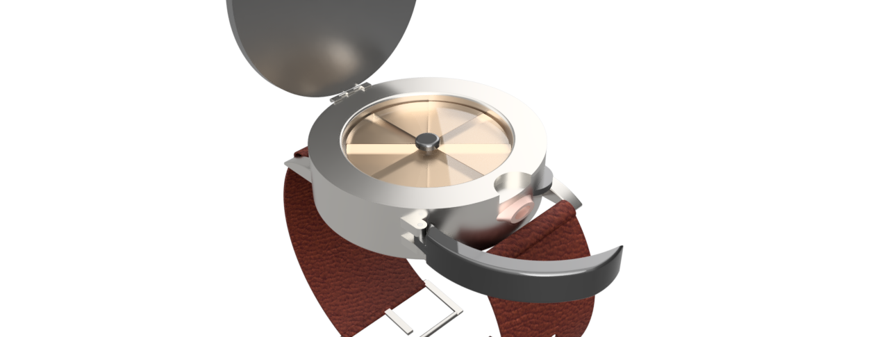
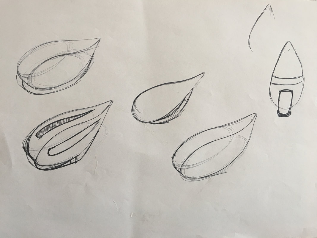
Following this research, I studied the competitive landscape and conducted research into what physical form the solution could take and the form of medication that could be used. I was also able to understand the required features for the product. I developed multiple design concepts before narrowing in on one. I was also able to develop a low fidelity prototype and gain feedback, which helped with refining the concept. The final solution is a wearable, watch-like, device that includes dry-powder medication. This device can be used as a smart watch and an inhaler. It includes a compartment for the medication, a covered mouth-piece for medication intake, a rotating wheel to load and release dosage, display screen, and buttons to adjust watch settings.
|

|
|
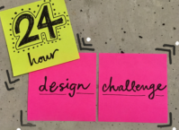
24 Hour Design Challenge |
Annual IDI Challenge |
|
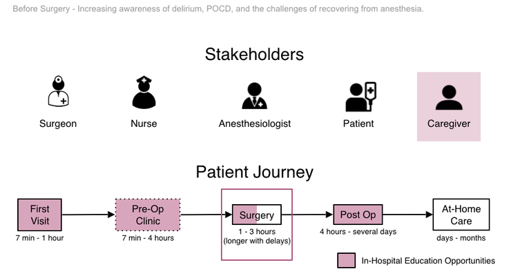
How might we prepare patients and loved ones for potential post operative delirium.
|
|
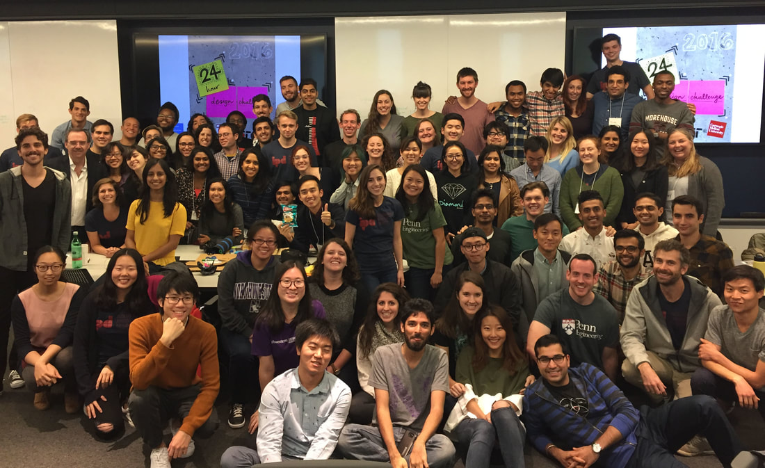
For the 24 hour design challenge, our prompt was to help increase awareness of delirium, POCD, and the challenges of recovering from anesthesia. This challenge was hosted at UPenn and was held in association with Carnegie Mellon University, MIT, and Northwestern University.
Team Justin Chang | Hardik Patel | Anna Phan | Sarah Schechter
Project Length 24 Hours: Oct'16 Contribution Research | Synthesis | Ideation | Prototyping |
|
Problem Delirium and POCD (postoperative cognitive dysfunction) can often occur post surgery and cannot necessarily be predicted. Additionally, not everyone understands delirium and POCD, which can result in being unprepared during instances of occurrence. This lack of awareness and being unprepared can sometimes leave caregivers and loved ones in a difficult situation.
|

Process and Outcome |
|
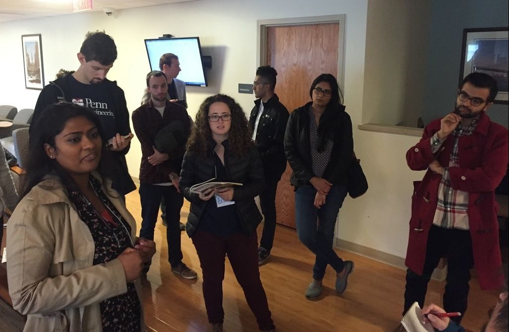
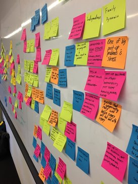
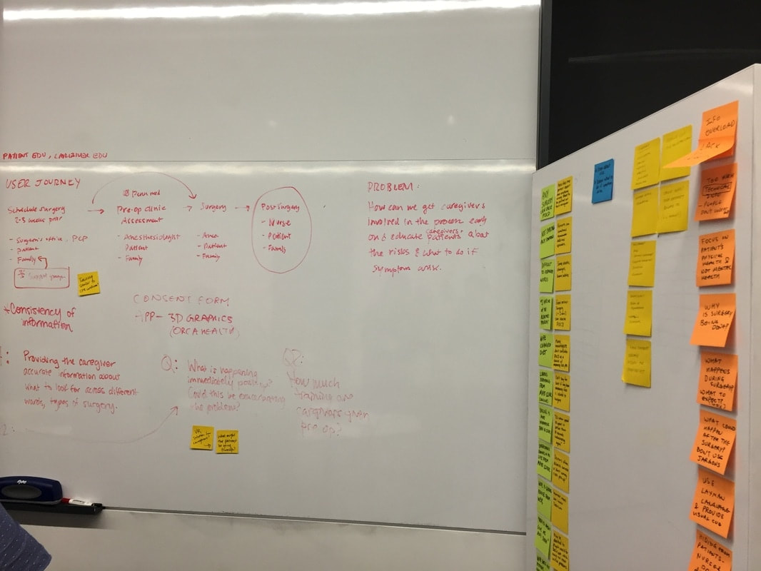
Within the allotted 24 hours, we had the opportunity to interview caregivers who had dealt with post operative delirium experienced by loved ones. Additionally we toured the facilities where patients are cared for and the waiting areas that have been created for loved ones and caregivers. We were also provided with the information that is distributed to both parties. The provided us with an overview of the journey.

Mapping out the stakeholders and patient journey
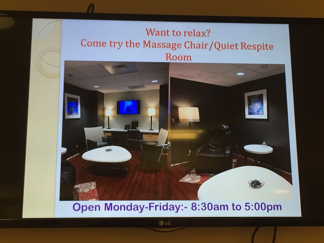
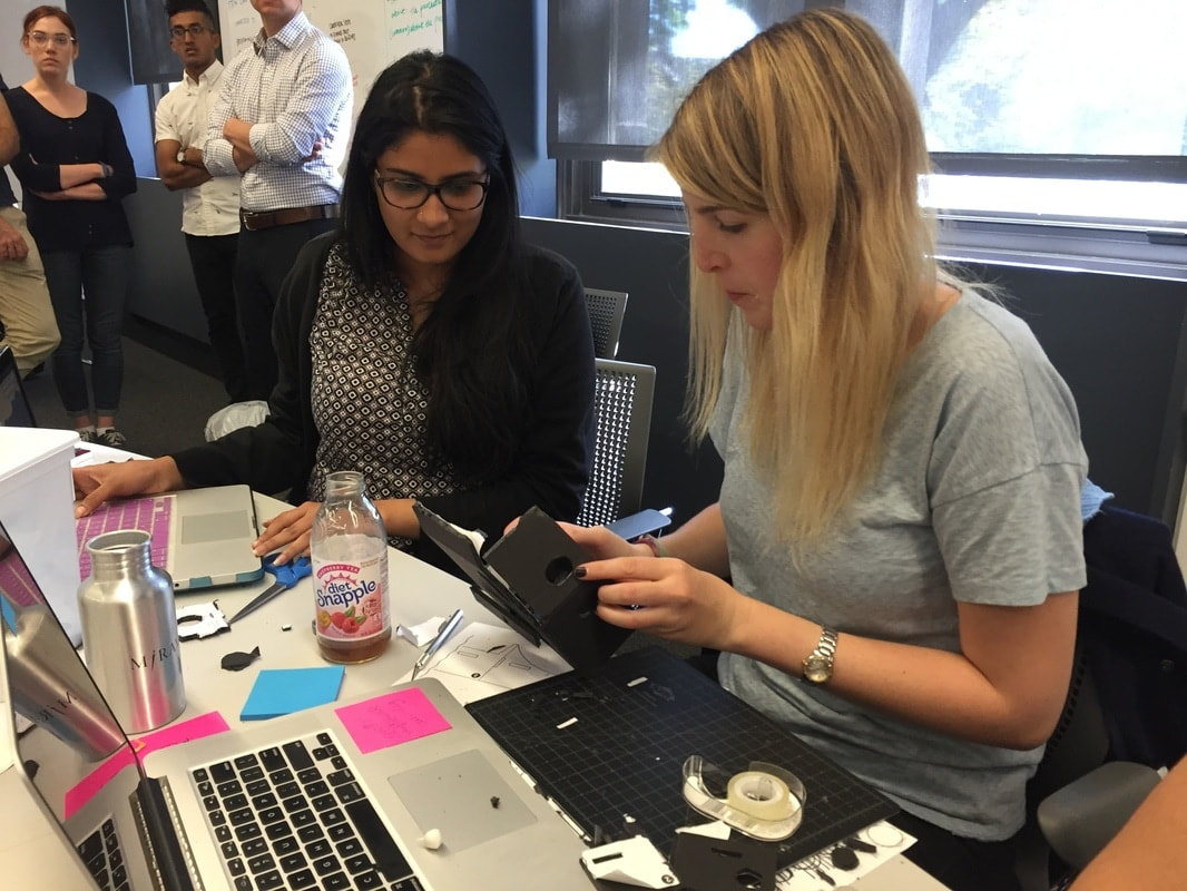
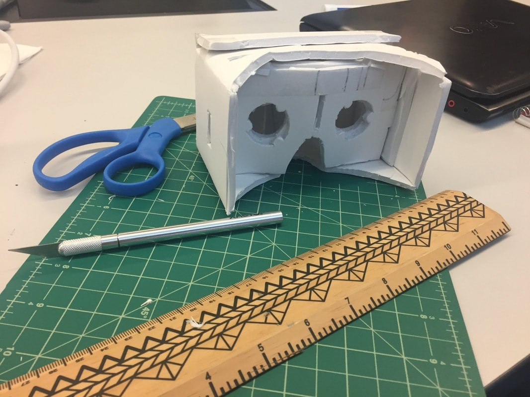
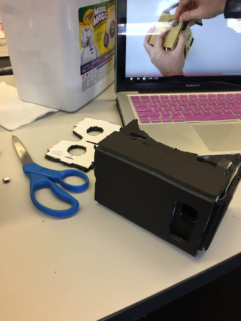
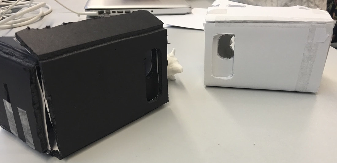
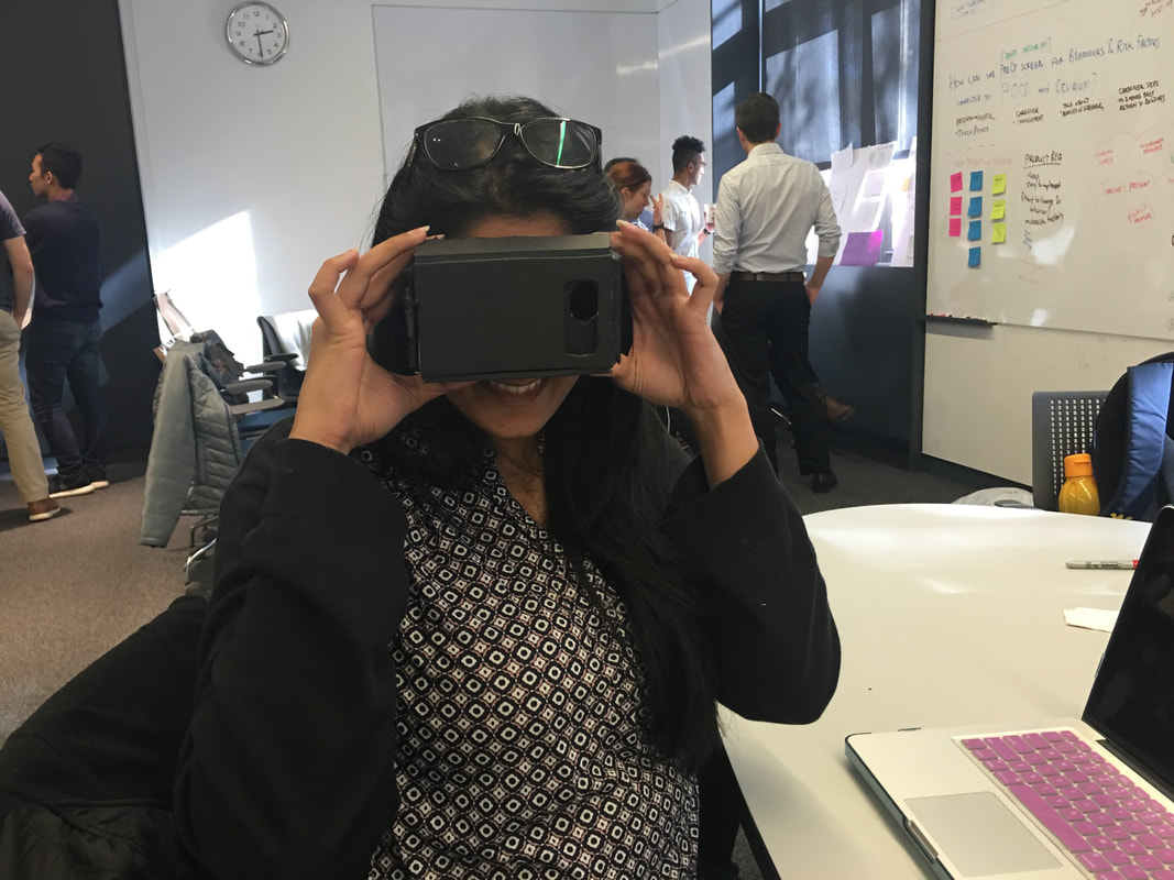
Our solution was to leverage VR technology in order to be able to put caregivers and loved ones in the patients' shoes in order to experience what they (patients) go through, post surgery. The hospital facilities included waiting room lounges for caregivers and loved ones, where where a number of hours are spent. These lounges have massage chairs, magazines, gaming consoles, televisions, magazines, books, and music in order to provide for a relaxing environment while waiting. Therefore, we suggested that these VR headsets to be placed in these lounges, through which the patients' positions could be experienced in order to better prepare the patients' loved ones and caregivers. This service would be provided in addition to the already existing information.
Journey Map with proposed solution
|
|
|
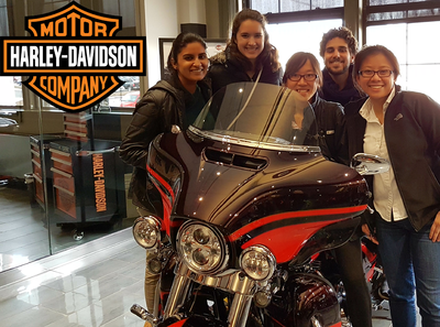
Design Strategy |
Harley Davidson |
|
Designing a strategy that would enable consistent growth for Harley Davidson.
|
|
The declining Harley Davidson ridership, has resulted in the motorcycle manufacturer having to seek fresh business models that generate growth. A key goal for these new opportunities involves growing millennial ridership. For this project, my team and I were tasked with identifying breakthrough growth opportunities, which arise from and surround the sale of used motorcycle products, and generate scalable, sustainable demand outside the core business.
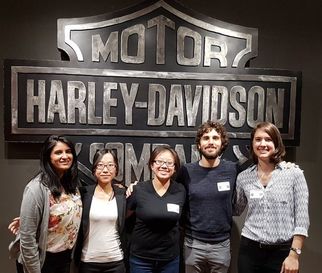
Team Hua Chin | Sheila Lo | Sasha Mitts | Julia Savich
Project Length 10 weeks: April'17 - June'17 Contribution Research | Synthesis | Ideation | Graphic design | Storytelling | User Testing |
|
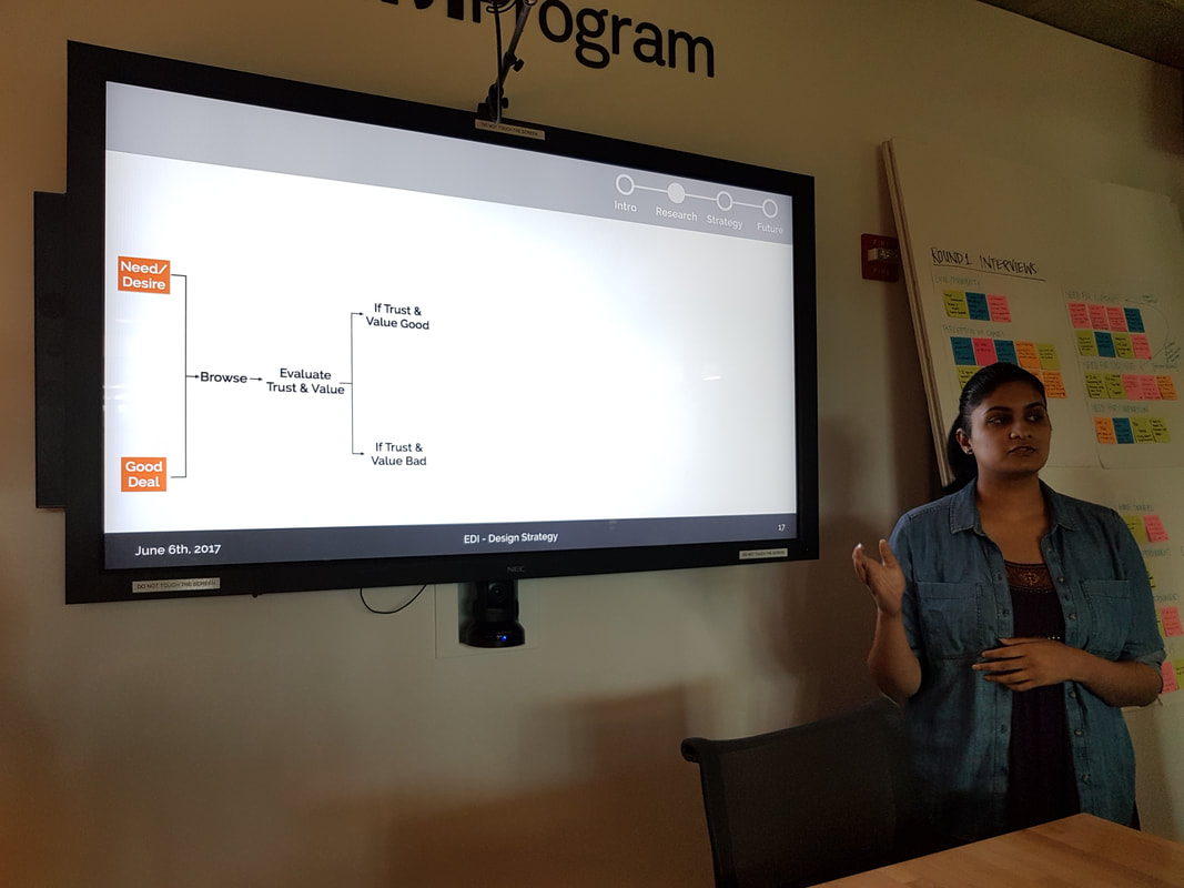
Problem Millennials look to trust and value experts when they are considering buying used goods due to their inexperience in the evaluation process.The current used good buying process is time consuming and requires meticulous searching before finding a potentially satisfactory product.
|
Process and Outcome |
|
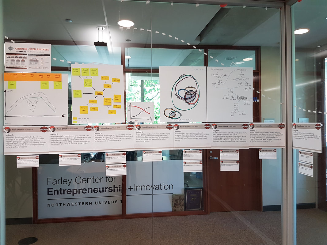
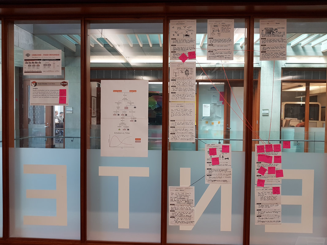
We conducted interviews with 14 individuals who ranged from avid bikers to those uninterested in ever riding a bike. From this process, we understood their buying habits, values, and concerns. For the most part, these interviewees fell into the millennial age profile. In addition to this, we were able to gather survey data from 750+ individuals who regularly trade used items on an online platform. We also gathered data on brands, activities, and interests that millennials associate with. We then compared this with the user profile of a typical Harley Davidson rider. All of this enabled us to create a strong basis for the next steps.
We discovered that for millennials, in order to reduce their carbon footprint, be part of a community, and spend smartly (while still engaging with desirable brands), used purchasing has become an increasingly important part of the millennial’s lifestyle. 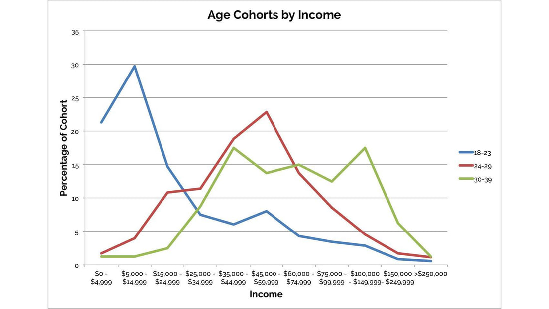
Understanding age ranges for various income brackets
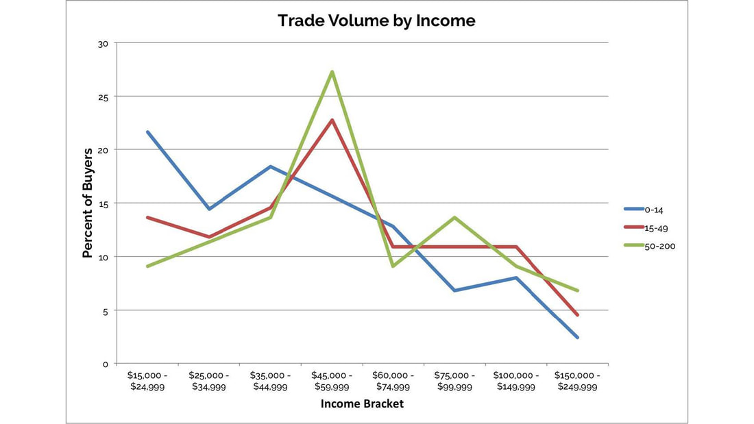
Understanding purchasing volumes for various income brackets
Understanding the current used buying process was also key to developing an ecosystem of solutions.
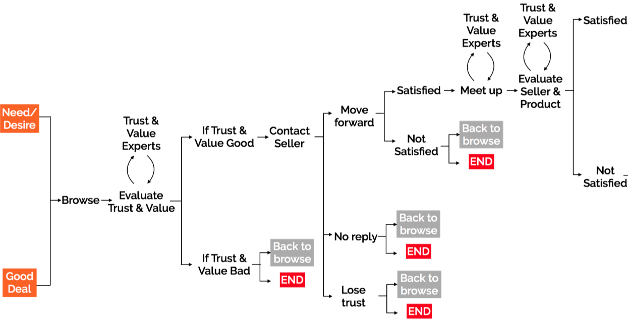
Used Purchasing Journey Map
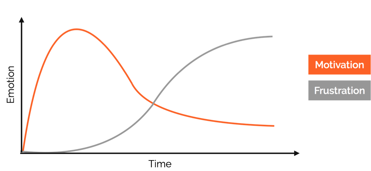
Emotional Journey Map throughout the used buying process
Uncertainty around trust of either the seller or the product can lead to suffering exceeding buyers' motivation to buy used products. This can be mitigated by experts, who are currently unavailable to many. Therefore, for our ecosystem, we wanted to focus on building trust and community among an untapped millennial audience. By reducing the need for sourcing external experts, and simplifying decisions around trust and safety, we could make profitable a latent used market, ensuring consistent growth through long-term assurance.
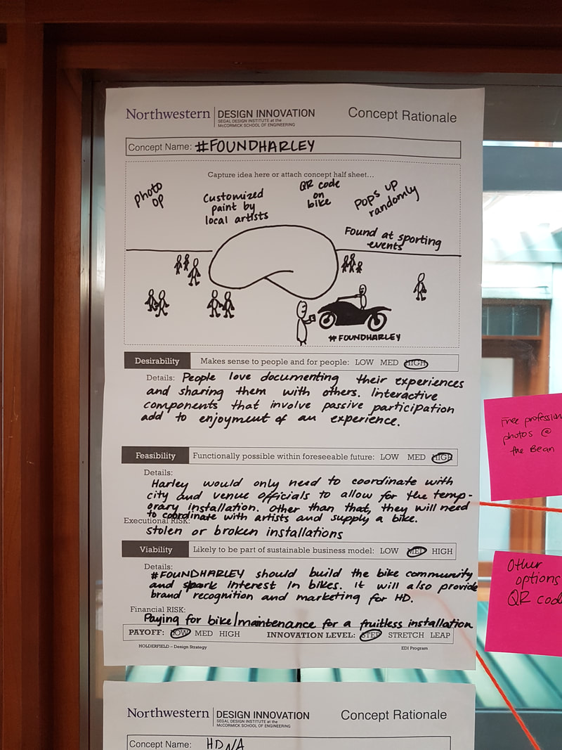
#FoundHarley
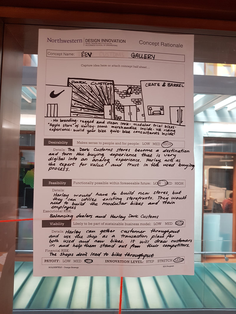
HDNA A low risk, shareable experience, that doesn't rely on identifying with Harley Davidson, but begins building a relationship. HDNA is an aspirational quiz to guide non-riders towards bikes that fit their personalities. An incentive to completing this quiz would be free access to local artists' work. REV Gallery
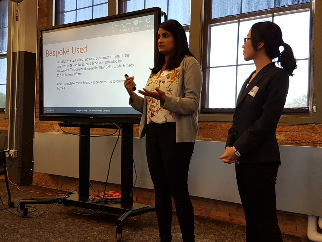
Bespoke Used Used bikes that Harley finds and customizes to match the requirements - features, cost, timeline - provided by customers. This can be done at the REV Gallery, which leads to a website platform. Once complete, these bikes will be delivered to customers' homes. Iron Cross Warranty Covers used products from select American-made brands. Customers can have peace of mind knowing that their valued items are backed by Harley’s guarantee. 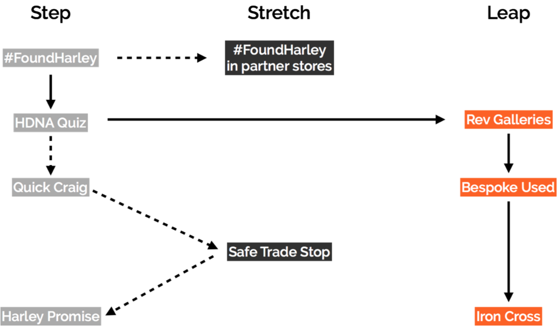
How the ecosystem can develop over the years
|

|
|
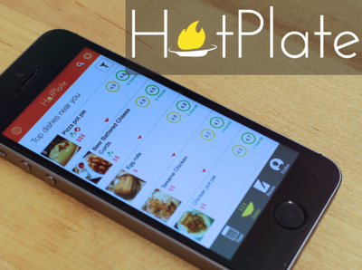
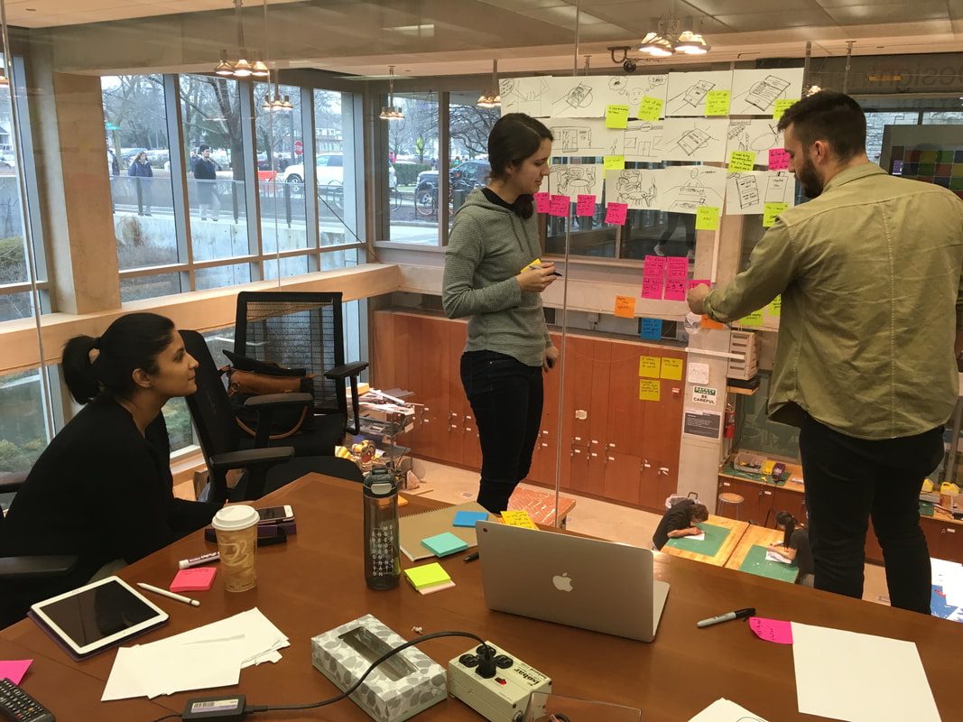
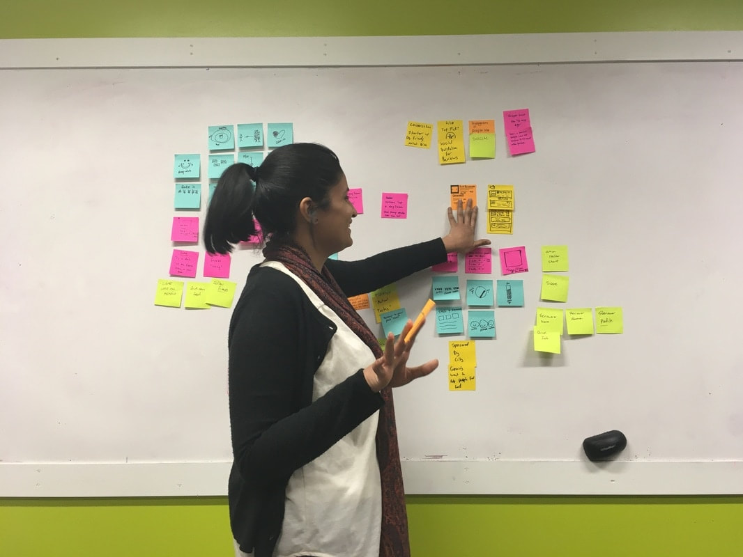
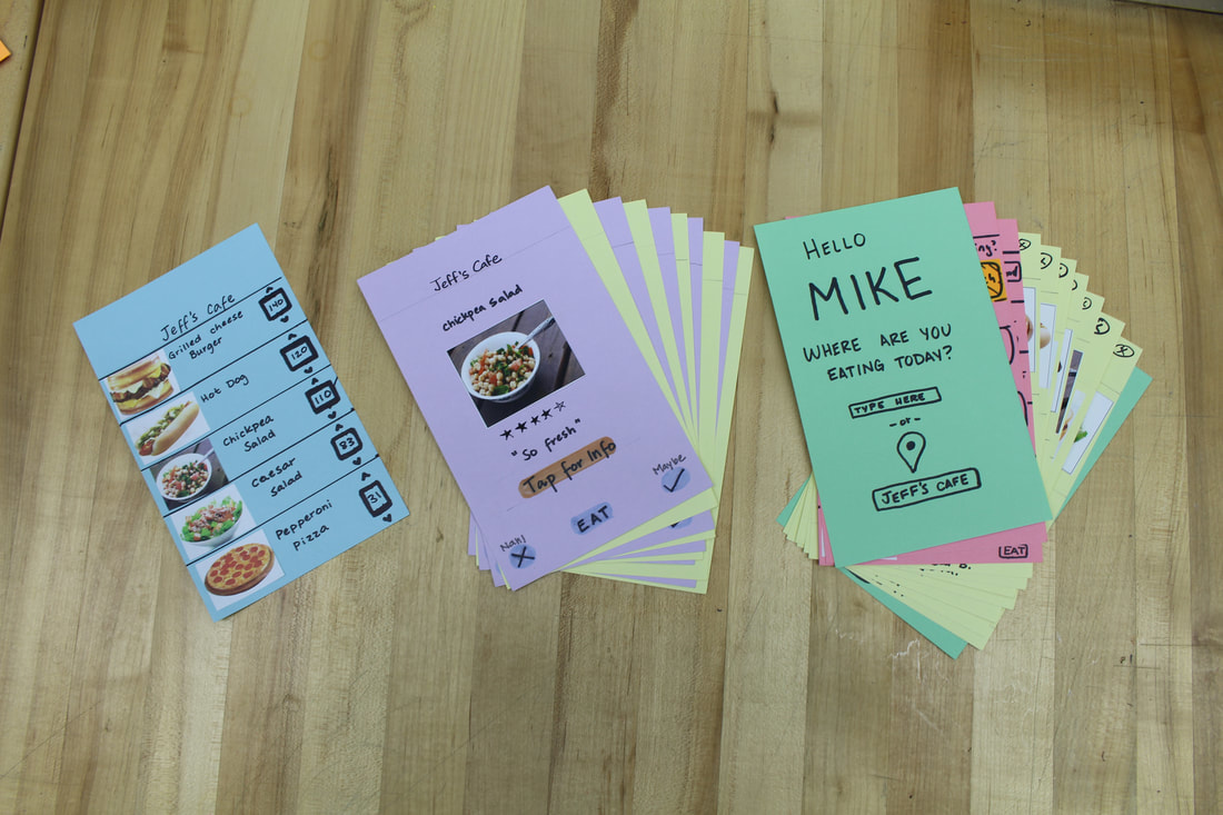
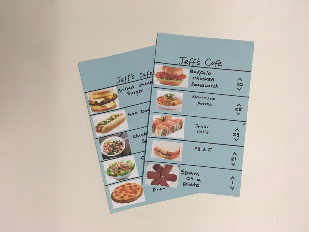
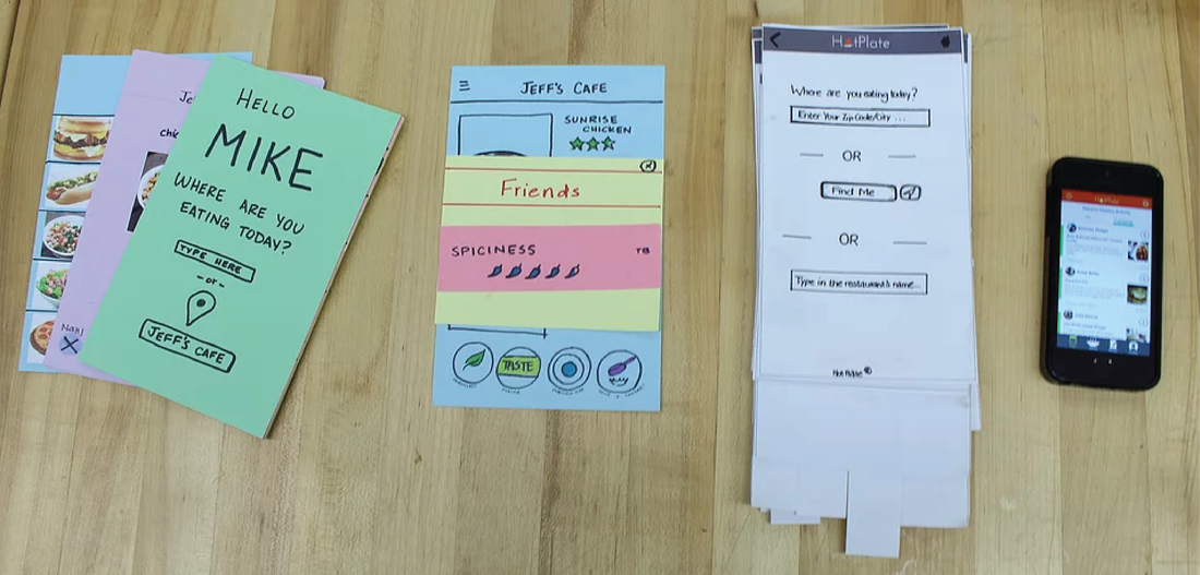
Interactions Design Studio |
Hot Plate App |
|
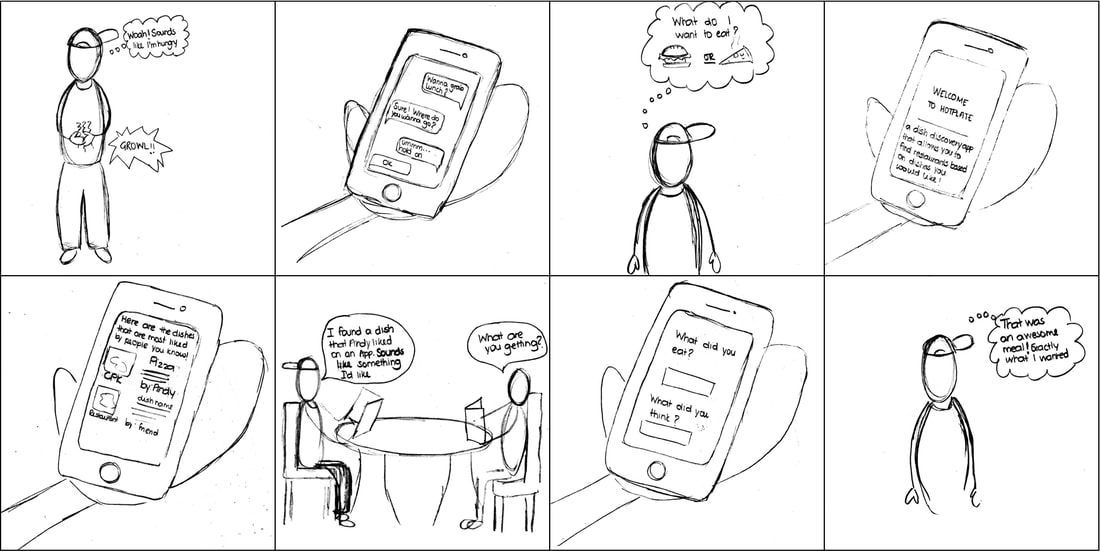
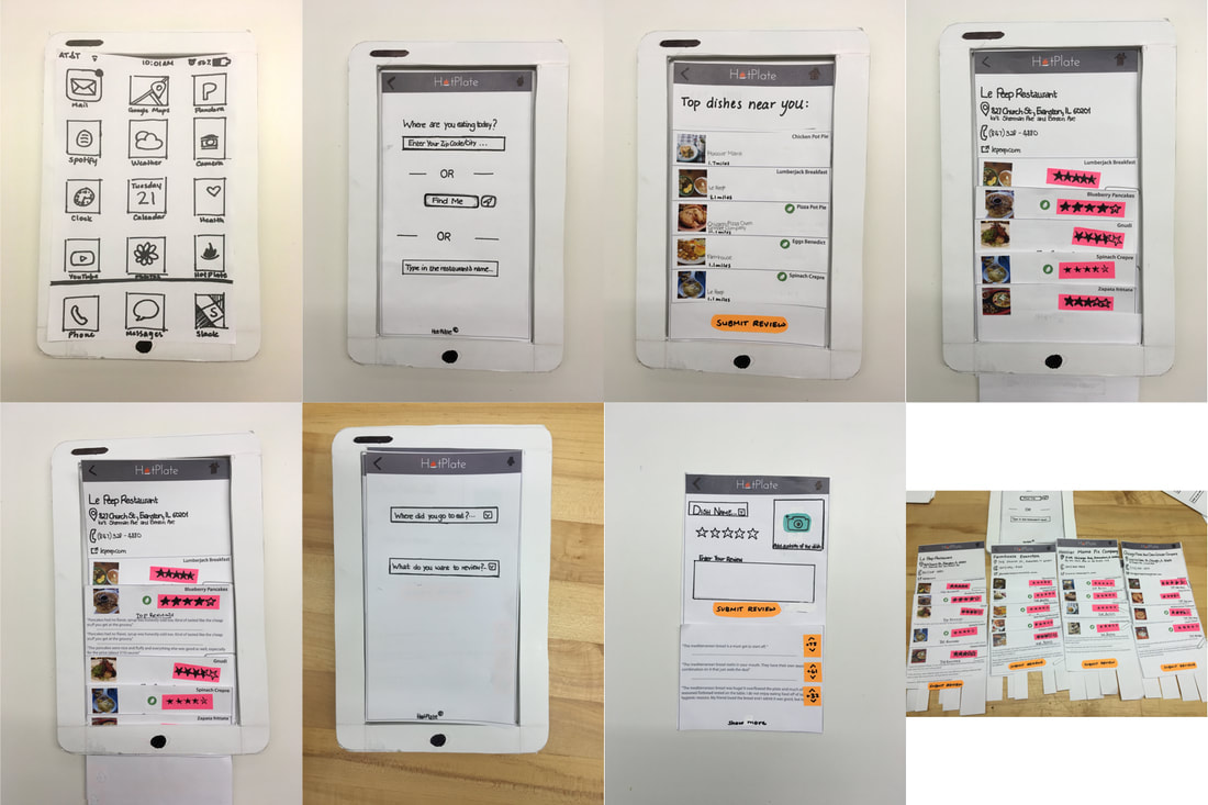
Allowing explorative eaters to confidently discover their new favorite dishes.
|
|
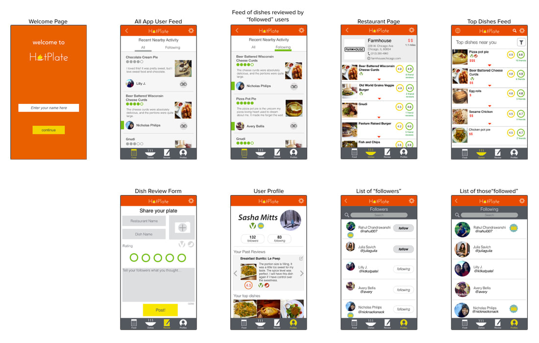
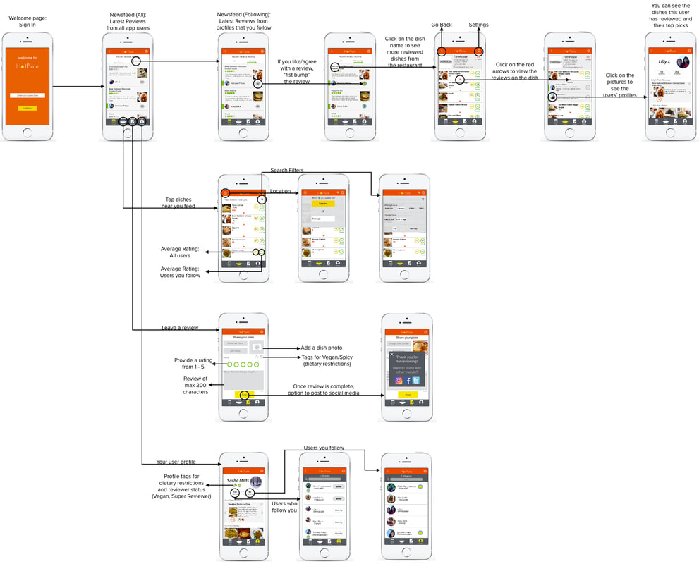
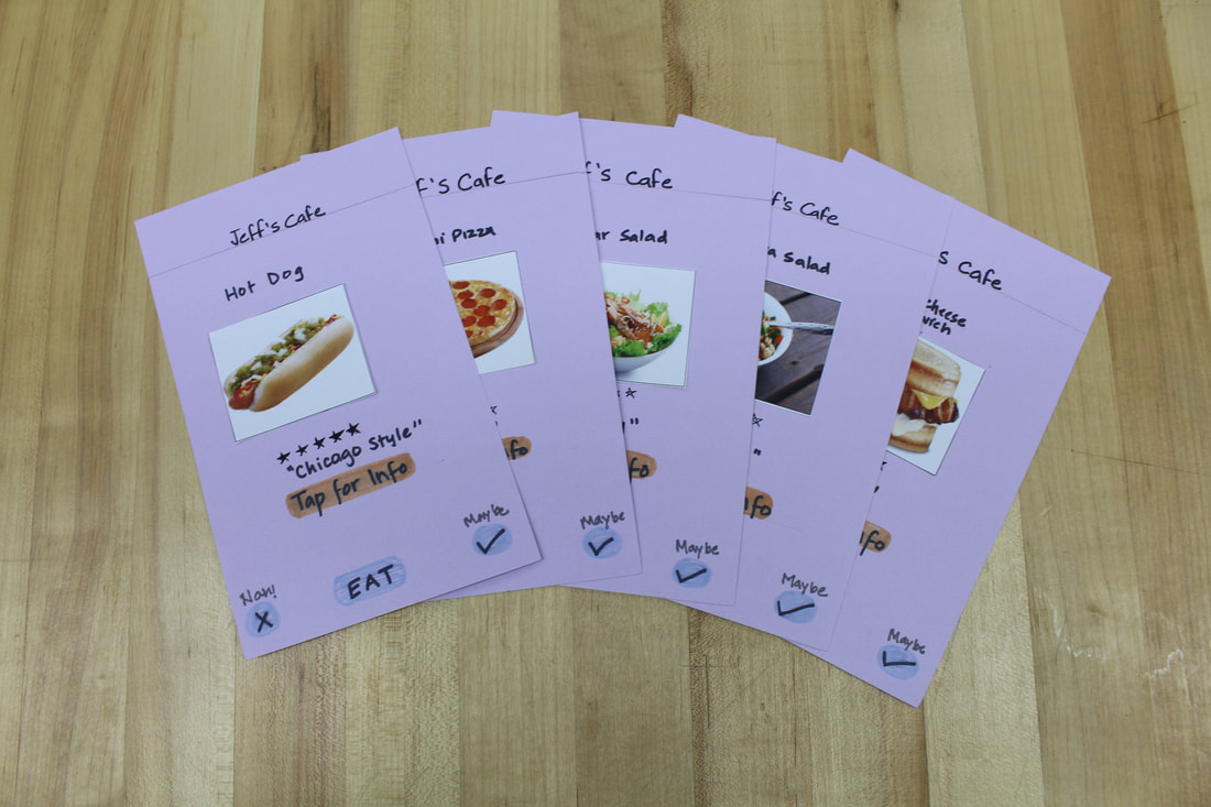
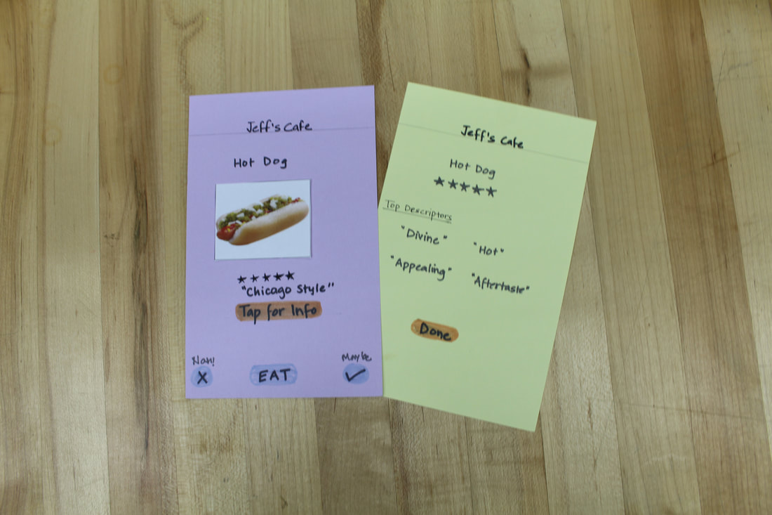
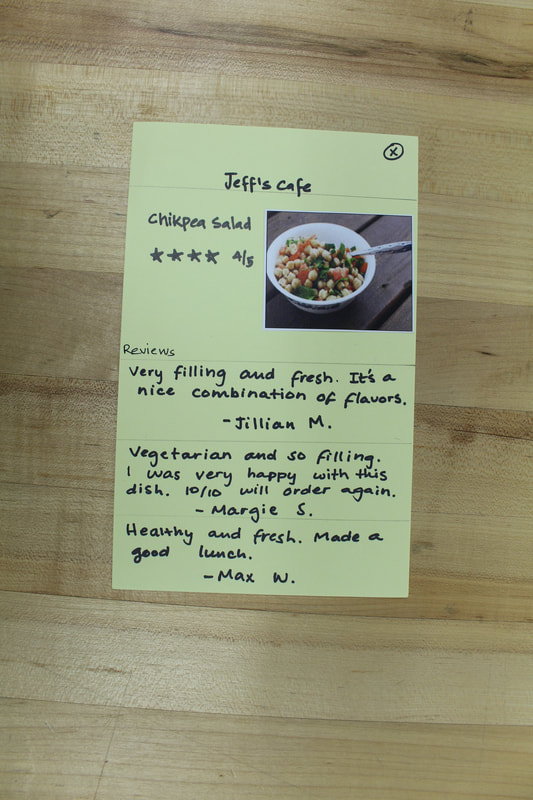
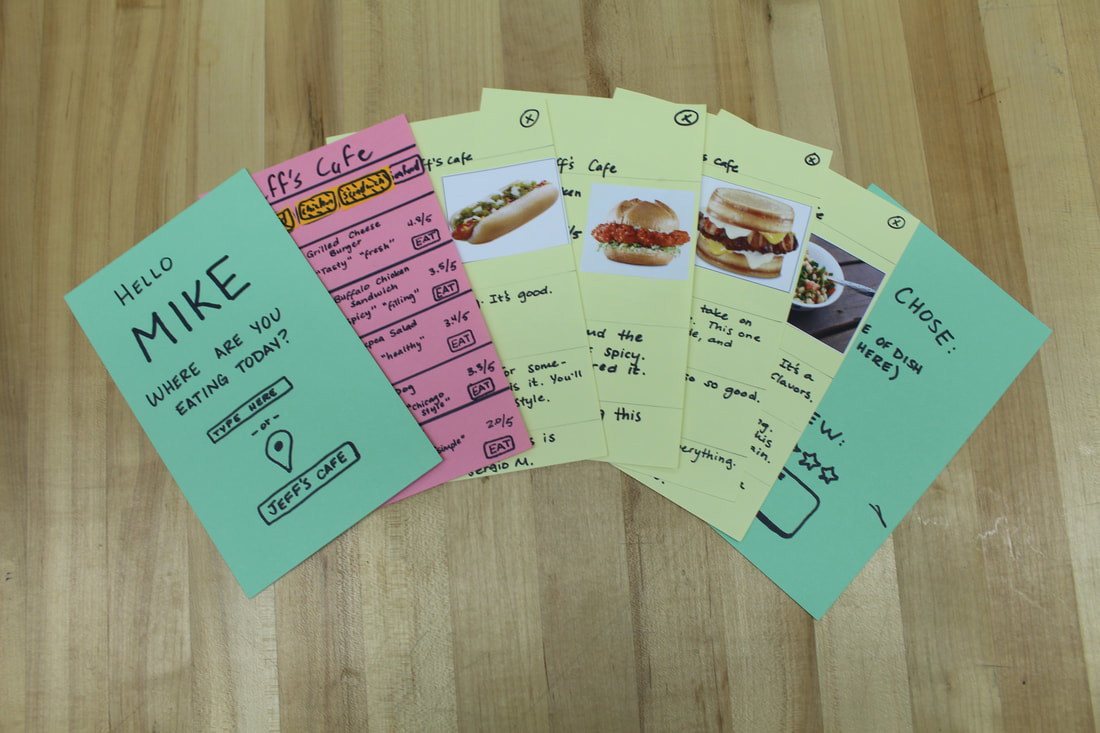
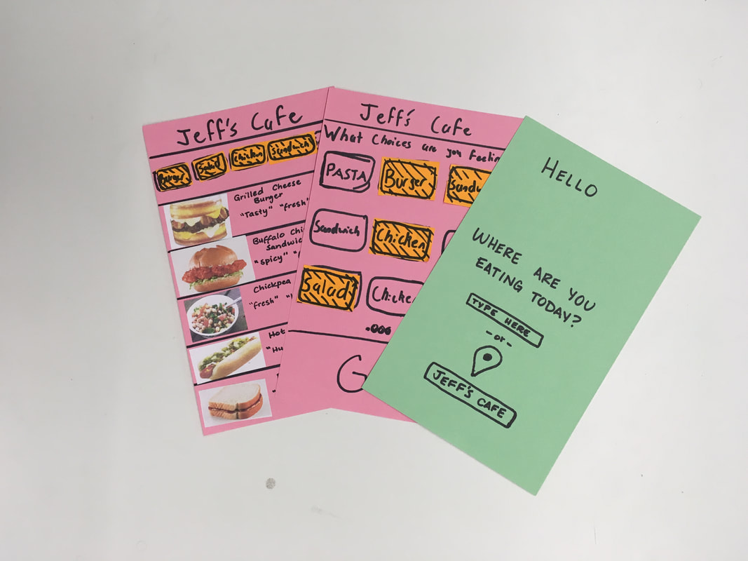
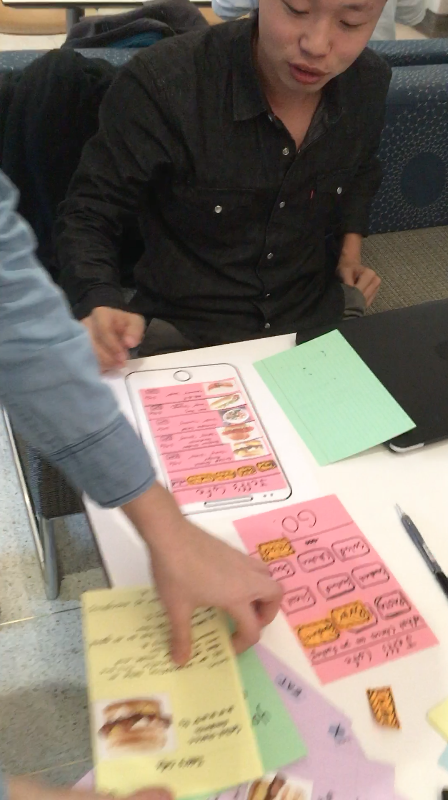
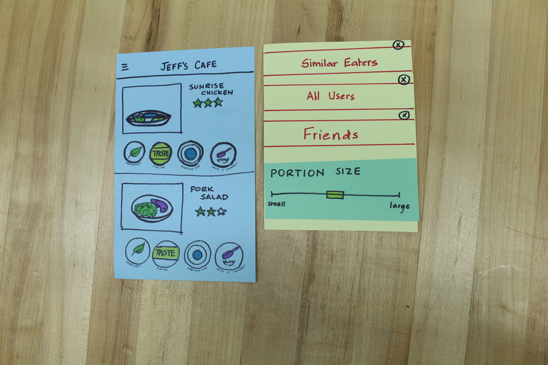
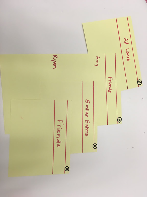
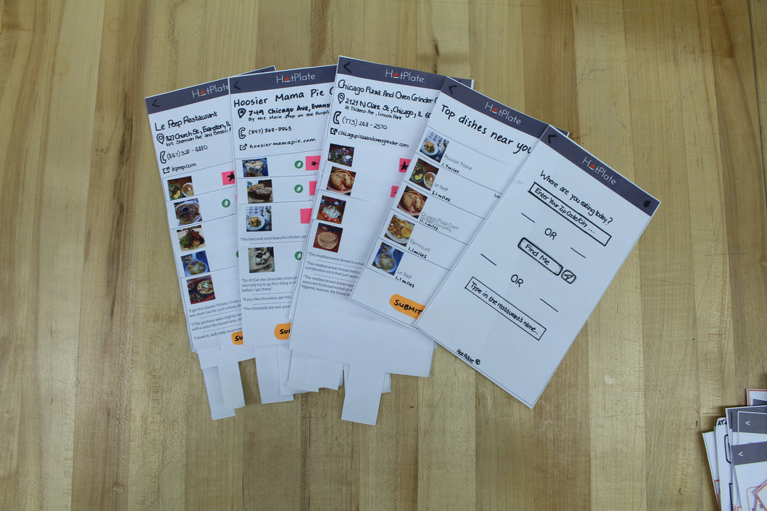
For this project, we assisted the HotPlate team from Northwestern's incubator space, The Garage, in designing and developing their app concept. Their concept involved allowing users to rate restaurants' dishes, and also support their decision making process for choosing a dish.
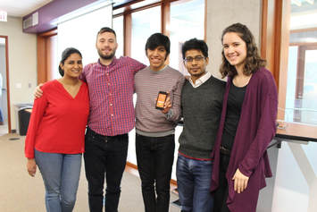
Team Avery Bellis | Rahul Chandrawanshi | Sergio Marquina | Julia Savich
Project Length 10 weeks: Jan'17 - March'17 Contribution Research | Synthesis | Storytelling | Ideation | Prototyping | User Testing |
|
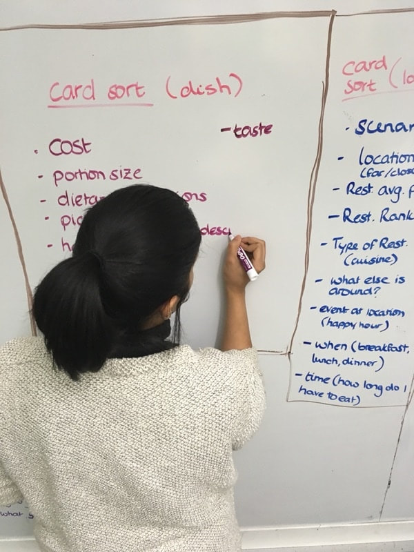
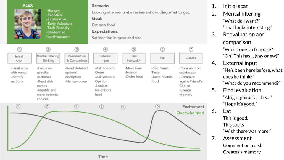
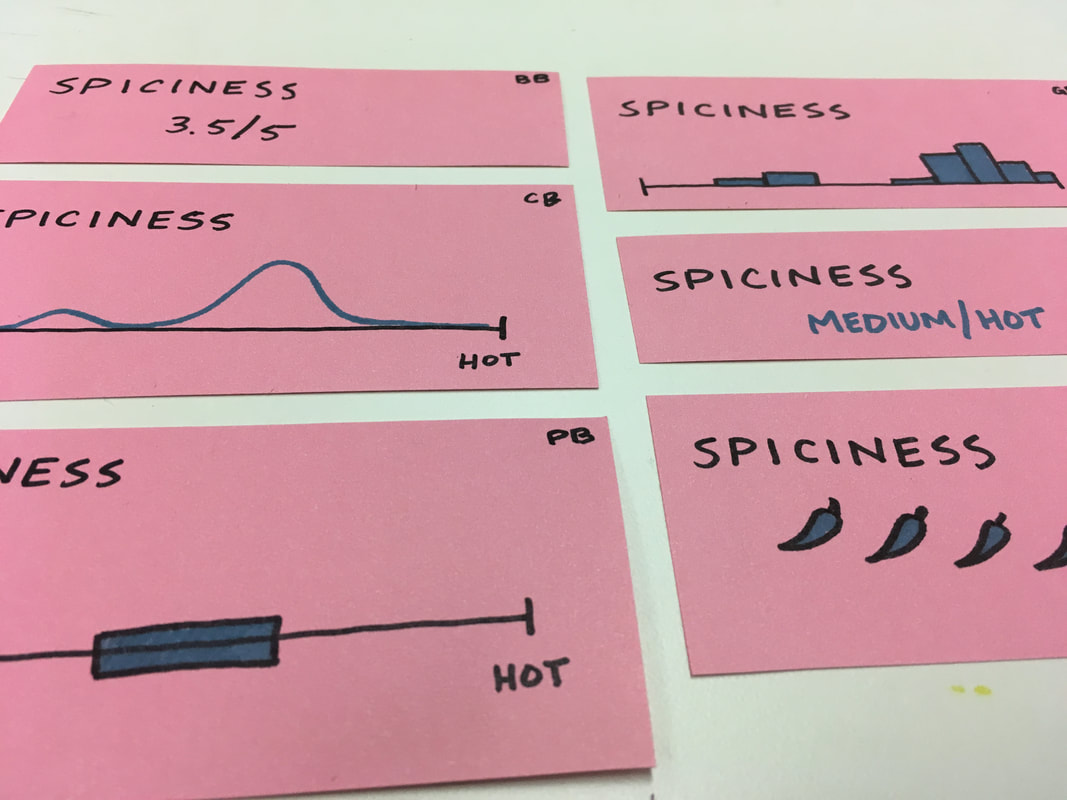
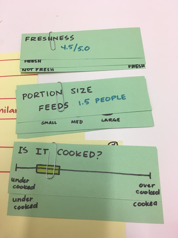
Problem People want to be able to go out and enjoy a satisfying meal, however, they don't always know where to get the best dishes for themselves. The current method involves using restaurant reviewing platforms, where information tends to be related to general restaurant information and not about specific menu items. Additionally, the reviews are not always trusted due to lack of reviewer familiarity and credibility.
|

Process and Outcome
|
|
|
|
|
UX Research and Design Internship |
Aspire |
|
Enabling students to make more educated career decisions.
|

|
Aspire is an early stage startup that focuses on facilitating career growth for students by democratizing career education and by creating a community of people invested in the success of aspiring professionals. I was responsible for leveraging the design process to drive user retention and worked with front-end developers in improving the product experience.
Internship Length 9 months: May'18 - Feb'19
Contribution Research | Synthesis | Prototyping | User Testing | Visual Design |
|
Problem Three of the biggest problems that students face during their career search include not understanding the company, not understanding the role, and an inability to find the right people to talk to. Aspire aims to fill in these gaps with their online platform that catalyzes an exchange of career information and insights across experienced and aspiring professionals.
|

Process and Outcome |
|
In order to gain a better understanding of the target users and their needs, I participated in conducting user interviews and developing surveys. Additionally, I carried out user testing, using Aspire's already launched website. As a result of the research and synthesis, I was able to develop user personas and journey maps, which led to the uncovering of the most valuable user traits: knowledge level, access level, personality, skill strength, commitment to research, and internal triggers. These traits help to determine how much, and the kind of, guidance a user might require. These traits were also helpful in understanding Aspire platform user journeys for the personas. The user testing sessions also allowed me to understand the existing product's key pain points.
Research Findings: Based on research synthesis, personas, and journey maps - Students would like to seek inspiration from professionals in industry, or other students with similar backgrounds. - Understanding general and basic info with regards to companies and jobs would be helpful: relevant education/ experience/ skills required. - Having one-on-one conversations about career planning contributes to more confident decision making. - Some students require additional guidance and nudging to remain motivated. - Students look for verification of plans and goals - they want to know if they’ve chosen wisely. First Phase of Updates:
The goal was to focus on making each page of the platform more engaging, while creating features on each of the pages that would contribute to making the platform more cohesive. Additionally, I worked with front-end engineers to develop the design system and redline documentation that would enable visual consistency across the platform, and help with visual hierarchy on each page. Second Phase of Updates:
After understanding how to improve the individual pages, and the direction in which to take them, the focus was to improve the overall flow of platform, fill in the gaps, and address the "overall product pain points". Having taken each of the pages and existing features to the next level, the user testing sessions revealed the successful aspects of the overall platform, how well the various features worked together in helping the user fulfill their needs, and where it needed improvement. For a more detailed overview of this project, feel free to email me.
|
|
|
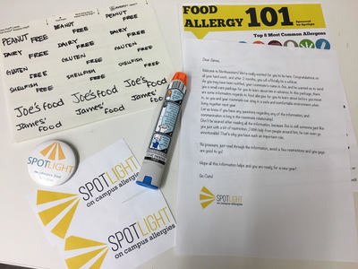
Service Design Studio |
Spotlight |
|
Raising on campus food allergy awareness.
|
|
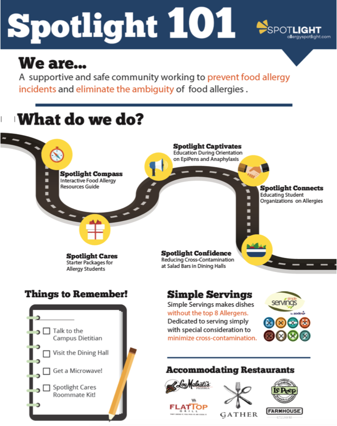
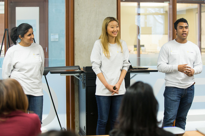
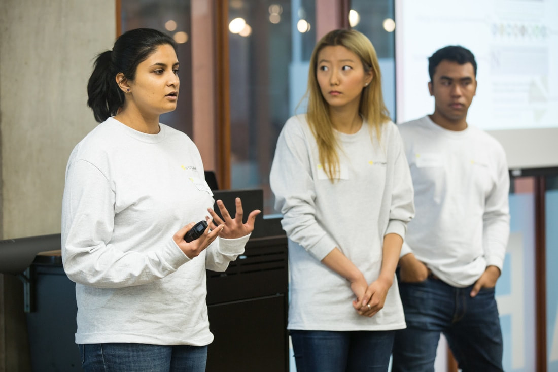
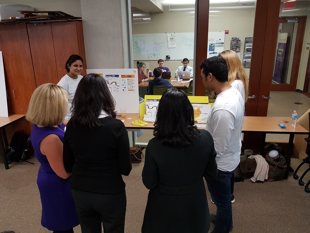
In partnership with Dr. Ruchi Gupta, a pediatrician and leading food allergy researcher at Northwestern Medicine, my team and I developed a service to support incoming college students with food allergies (SWA) and raise awareness about it. We were tasked with developing a service for the pre-orientation phase within the Spotlight organization that includes 4 other teams who also offer services related to on campus food allergies.
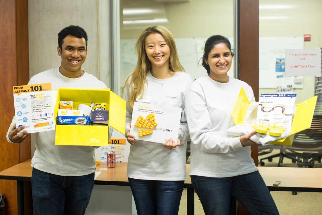
Team Sally Park | Nicholas Phillips
Project Length 10 weeks: Jan'17 - March'17 Contribution Research | Synthesis | Developing Blueprints | Prototyping | Graphic Design |
|
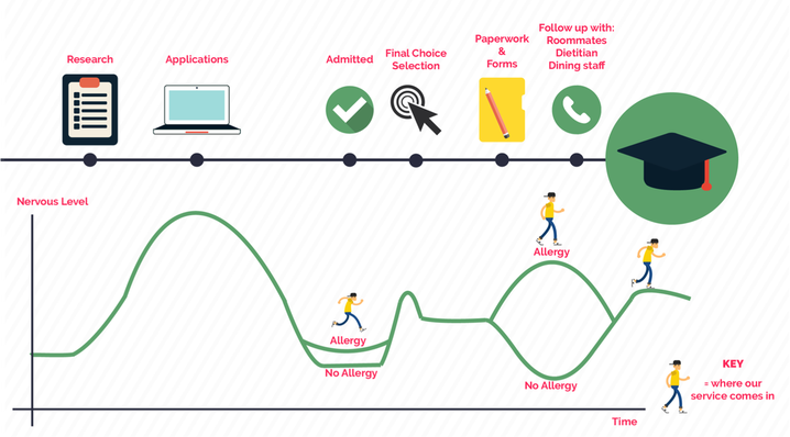
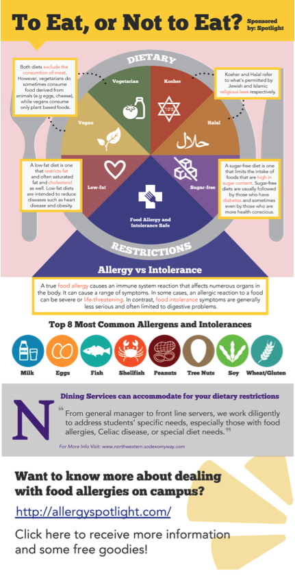
Problem Students with food allergies (SWA) are generally more anxious about the transition into college life as they feel the need to educate those, due to lack of awareness, in their new environment about their disability at the risk of being differentiated. Additionally, parents are also concerned about their child's safety as he/she moves from a protective infrastructure that has been carefully built to accommodate food allergies and keep them safe to a completely new one that isn't necessarily as safe.
|
Process and Outcome |
|
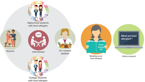
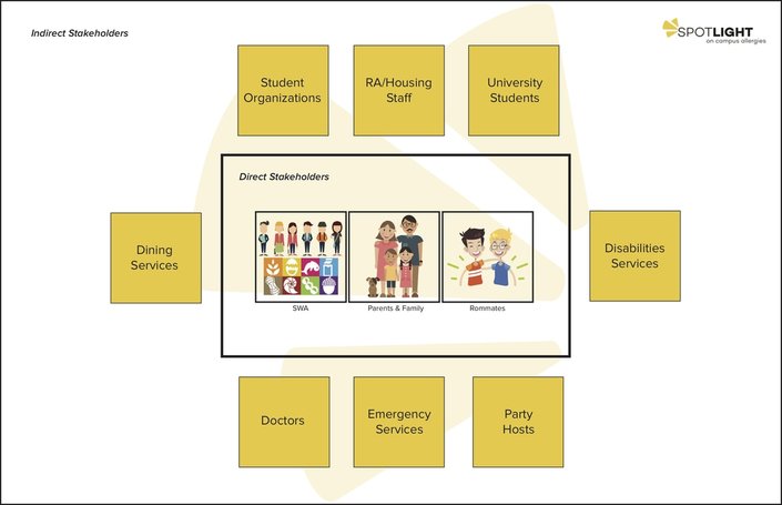
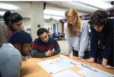
In designing a service, we conducted several interviews, with high school and college students, parents, on campus dietitians, and residence hall staff. Additionally, we carried out service safaris and observations. This enabled us to develop stakeholder maps, user journeys, a point of view (POV), and finally a service blueprint.
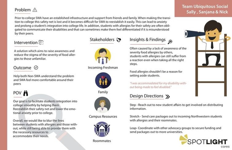
Point of View (POV)
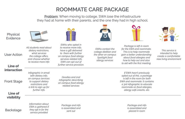
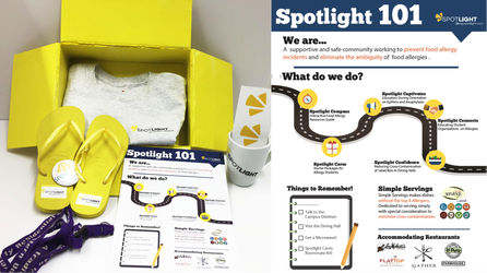
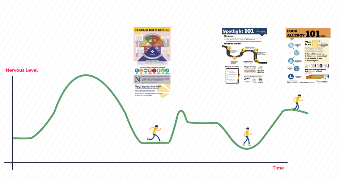
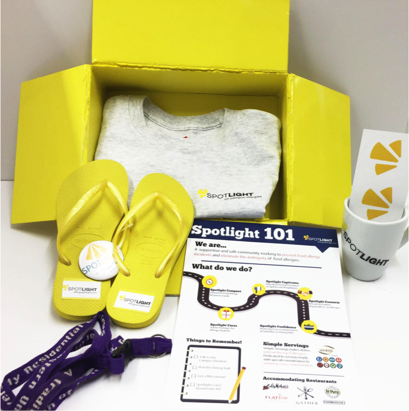
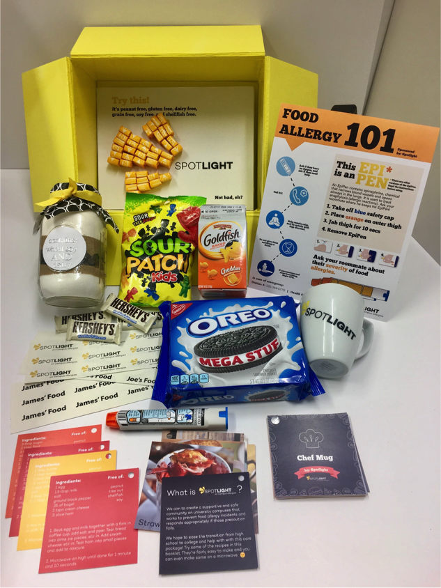
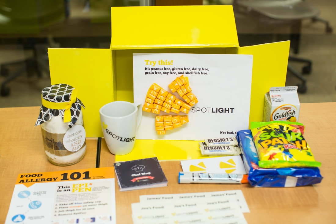
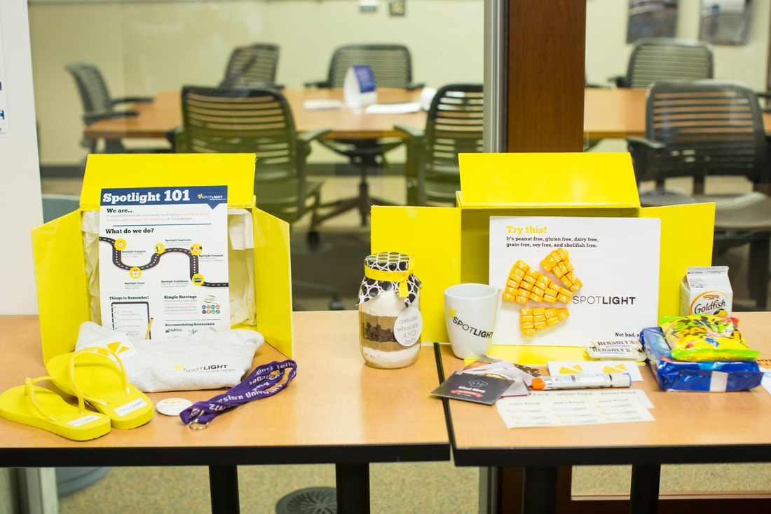
For our service, we came up with a 3-stage care package service, Spotlight Cares, which is intended to inform and educate individuals within the SWA’s new environment about food allergies. This service is also intended to ease the SWA's “home to college” transition process.

Service Blueprint
Email to all incoming students
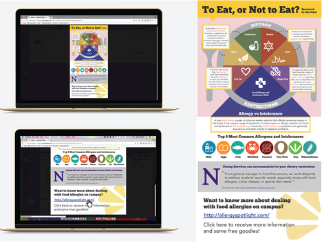
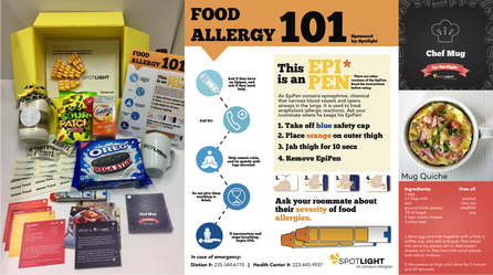
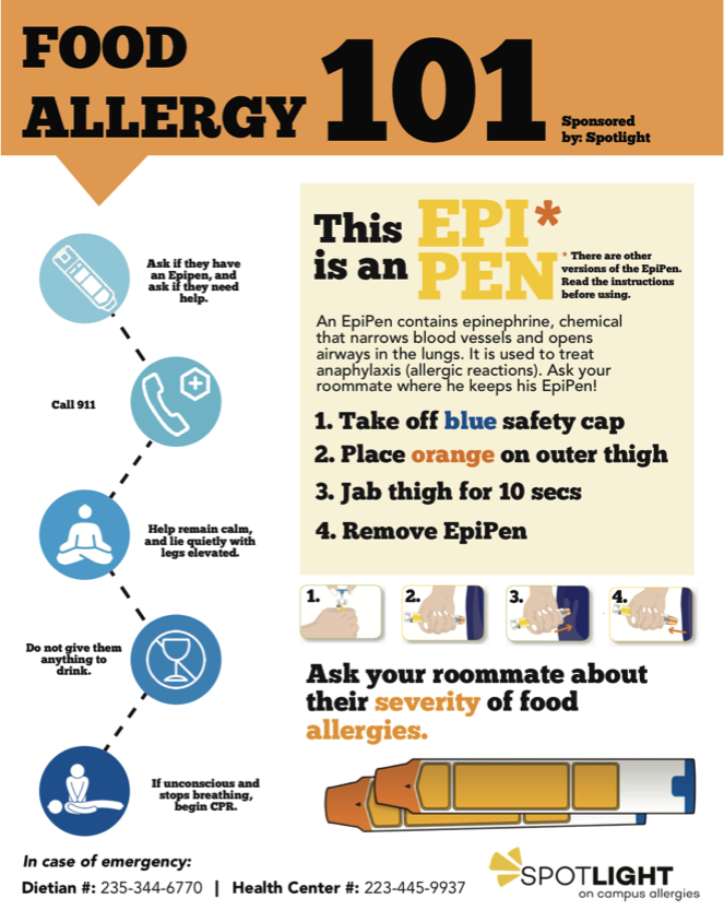
The 1st step is to educate the other students that can have an influence over the SWA's safety, as a need for this came up during our research - SWA's know how to manage their food allergies, however, the rare times that they suffer a reaction is usually a result of someone else's mistake. Care package sent to SWA (before arriving on campus) The second step is intended to inform SWA about Spotlight and all the services we provide and to also make them aware of the fact that they can be taken care of and accommodated for at Northwestern. This step is also intended to inform parents that their child will be taken care of and help them feel more comfortable during their child's transition process. Care package for SWA and roommate left in room Finally, the third step is to help SWA with informing and educating their roommate and to also inform the roommate that apart from having to be careful about the foods he/she (SWA) consumes, there is absolutely nothing else different about them and they are just like anyone else. |
|
|
Product Design Studio |
Procter and Gamble |
|
Providing users with a new, delightful experience. Due to an NDA, the details of this project cannot be disclosed.
|
|
For this P&G sponsored project, our prompt was to redesign the user experience in order to promote growth in consumption of a leading brand owned by the company.
Through the research and synthesis process, we were able to identify a new opportunity space for the brand and developed a unique product concept. We received a Intellectual Property Award for our work. Team Avery Bellis | Nicholas Phillips | Katrina Shah
Project Length 10 weeks: Sep'16 - Dec'16 Contribution Research | Synthesis | Storytelling | Ideation | Sketching | Prototyping | User Testing |
|
Problem Through research we understood what the users aspired to experience with the particular product, the limitations, and how competitors succeeded in fulfilling users' needs. The recurring themes throughout our interviews and surveys, were: using this kind of product is time intensive, the results are short-lived, and, in the case of packaging, it is difficult to have control over amount dispensed and to get all the product out .
|
Process and Outcome |
|
We conducted in-home interviews, surveys , and in-store observations in order to understand the competitive landscape and purchasing habits of the users. We were able to identify key tensions at various touch points of the existing experience, and generated insights. These insights provided us with a strong foundation for the brainstorming and prototyping process. We developed over 15 prototypes throughout the course of the project and were able to test them with our users during site visits. These user tests helped us refine our insights and concepts, and in turn, develop a concept that offered P&G with a fresher opportunity space.
For our final delivery , we developed higher fidelity, working, prototypes, a pitch video (highlighted marketing concepts), along with branding concepts. Our final concept received extremely positive feedback from P&G, and resulted in an intellectual property award. |
|
|
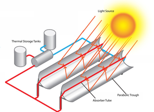
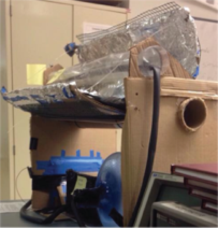
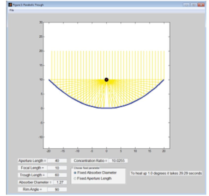
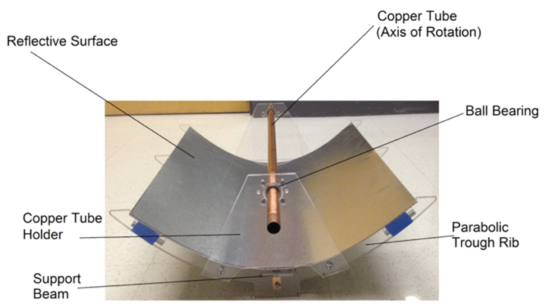
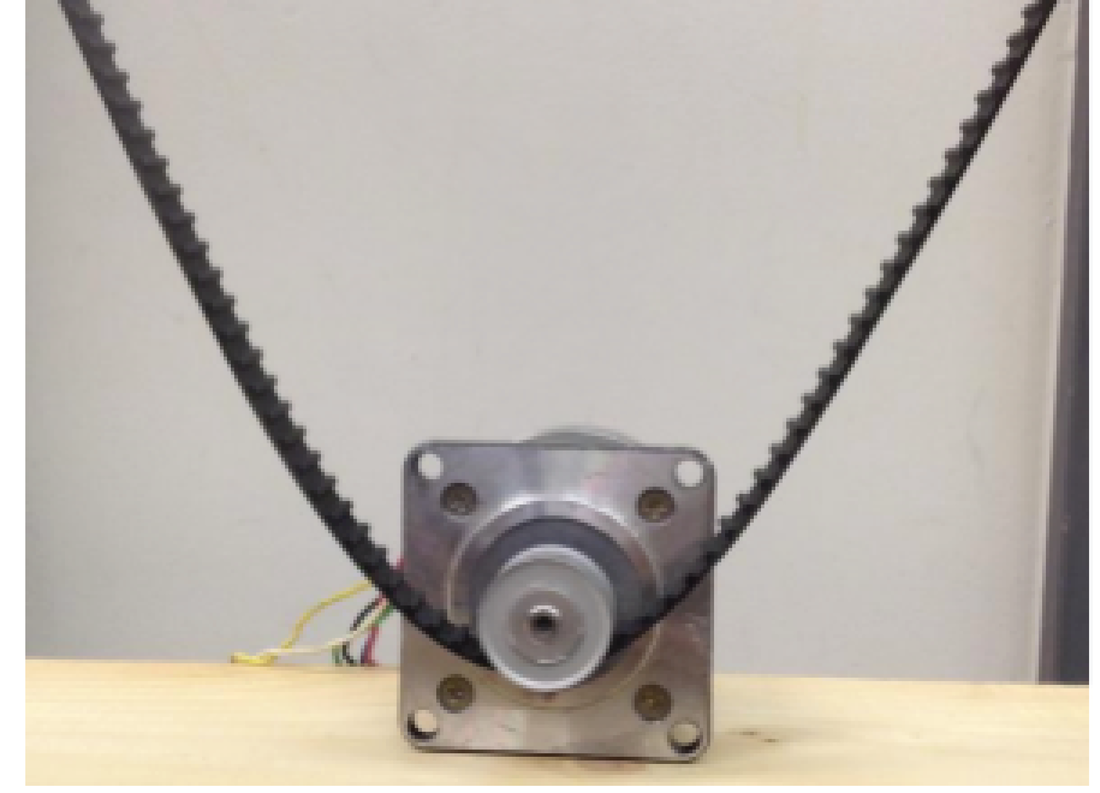
consolar: a small-scale working model of the parabolic trough solar technology
Senior Capstone Project
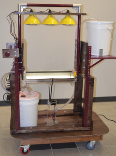
Final Prototype
Contribution:
|
My team and I were tasked with creating a small-scale working model of a parabolic trough solar technology for the purposes of in-class education. Our client for this project was a professor of a solar energy systems class at Boston University.
A Parabolic Trough Concentrated Solar Panel is a device that uses a curved, highly reflective surface, to focus light onto a tube that contains a fluid. This concentrated light heats up the fluid, which generates steam that can spin turbines and provide energy.
How our project worked:
|
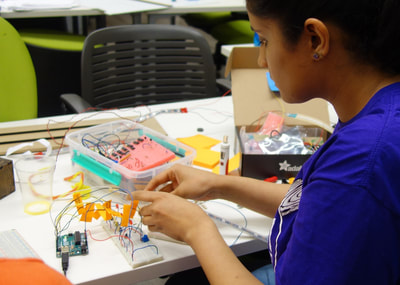
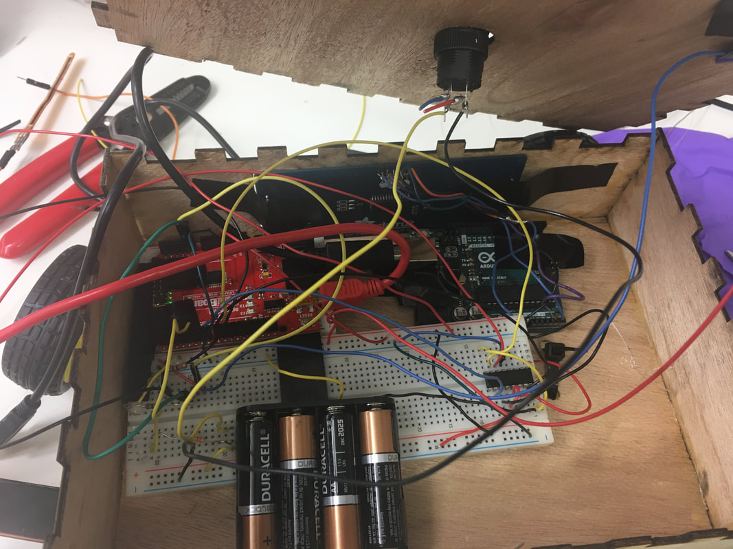
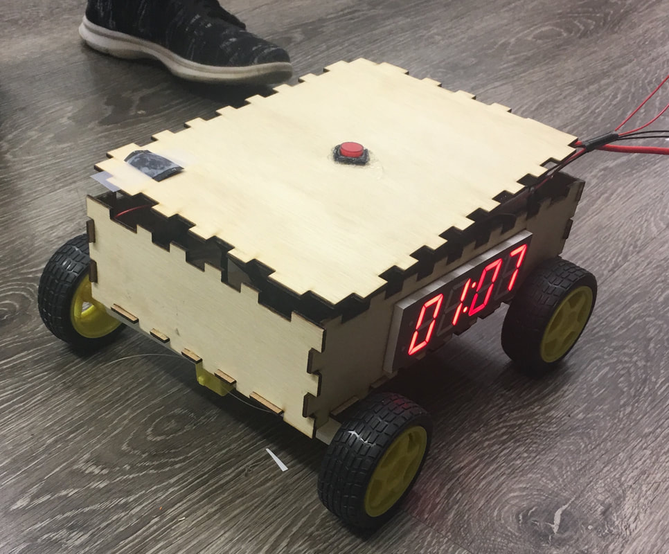
Runaway Alarm Clock: A CLOCK that requires one to put in a little more effort in order to switch it off
Tangible Interactions Class
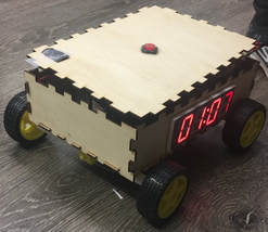
The runaway clock
Contribution:
|
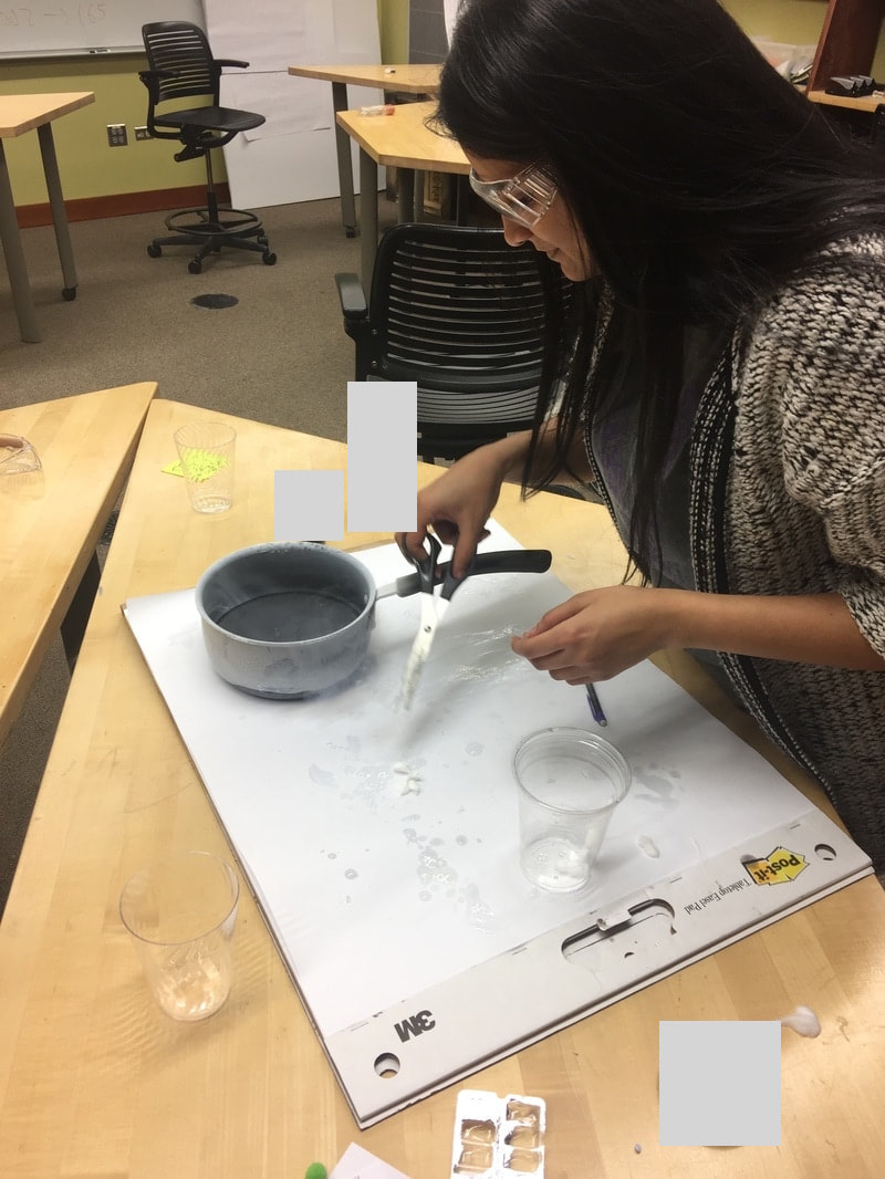
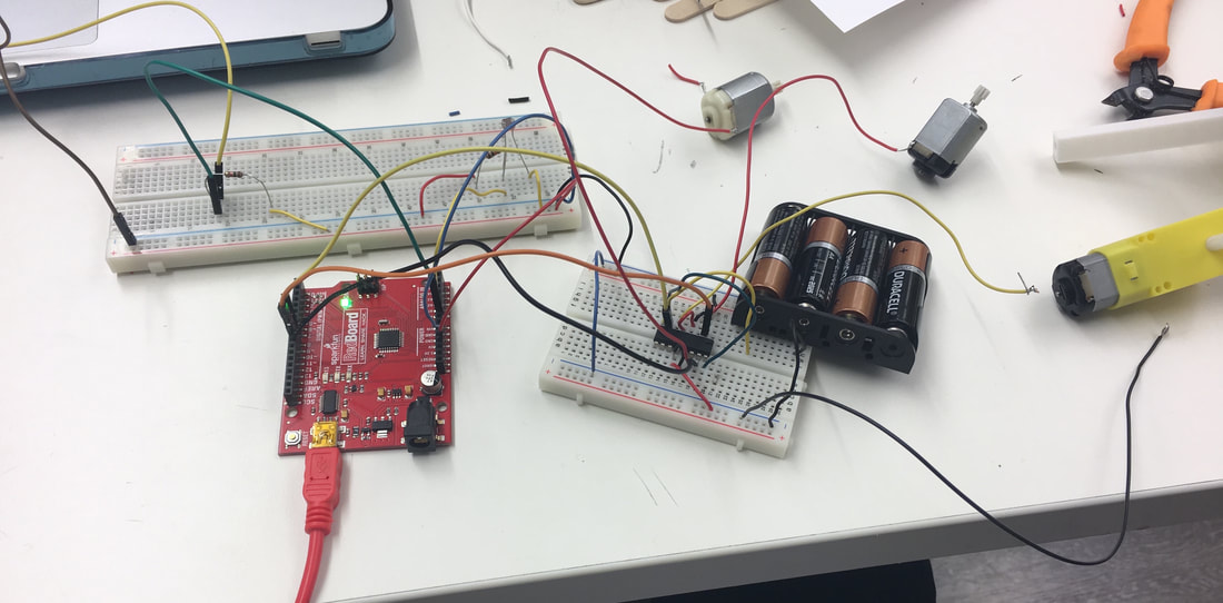
In order to experiment with, and gain some experience working with an Arduino, my teammate and I developed a clock that runs away, when the alarm is activated. In addition to running away, the alarm results in a fan being switched on (this is intended yo blow air onto the "sleeping person". We chose to have the alarm activate upon the detection of light - sunrise. In order to switch off the system (deactivate the alarm), a flexible sensor was used to "call" the device back by bending the sensor in the desired direction for the clock. Once the clock had been called back, a red button (on the top of the device) can be clicked in order to turn off the alarm.
Our goal for this project was to be able to play around with multiple sensors and components for the Arduino, in addition to creating a highly interactive product. |
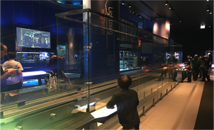
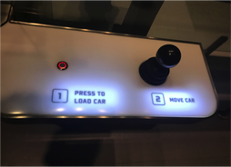
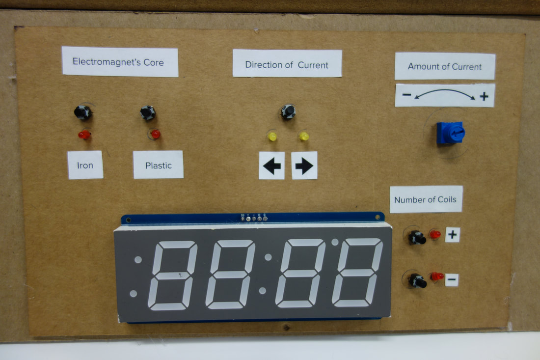
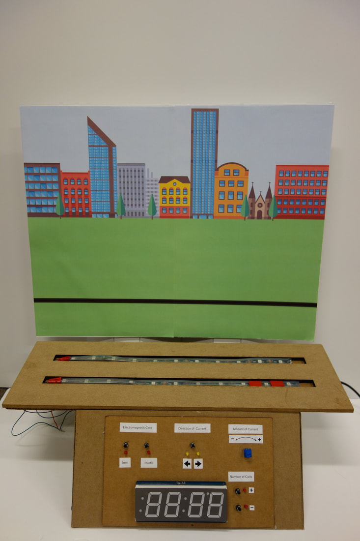
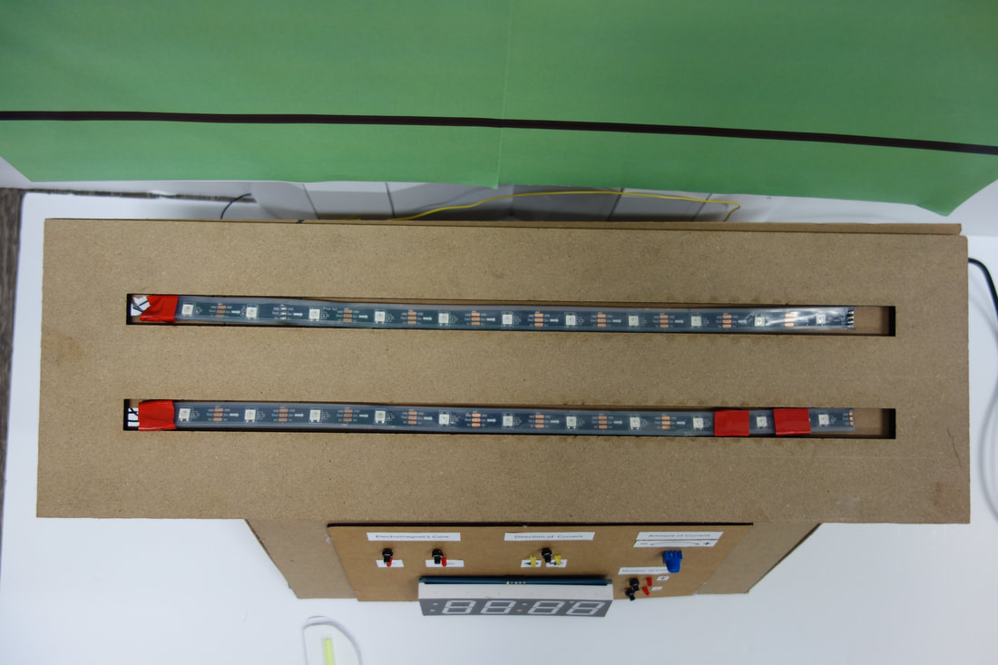
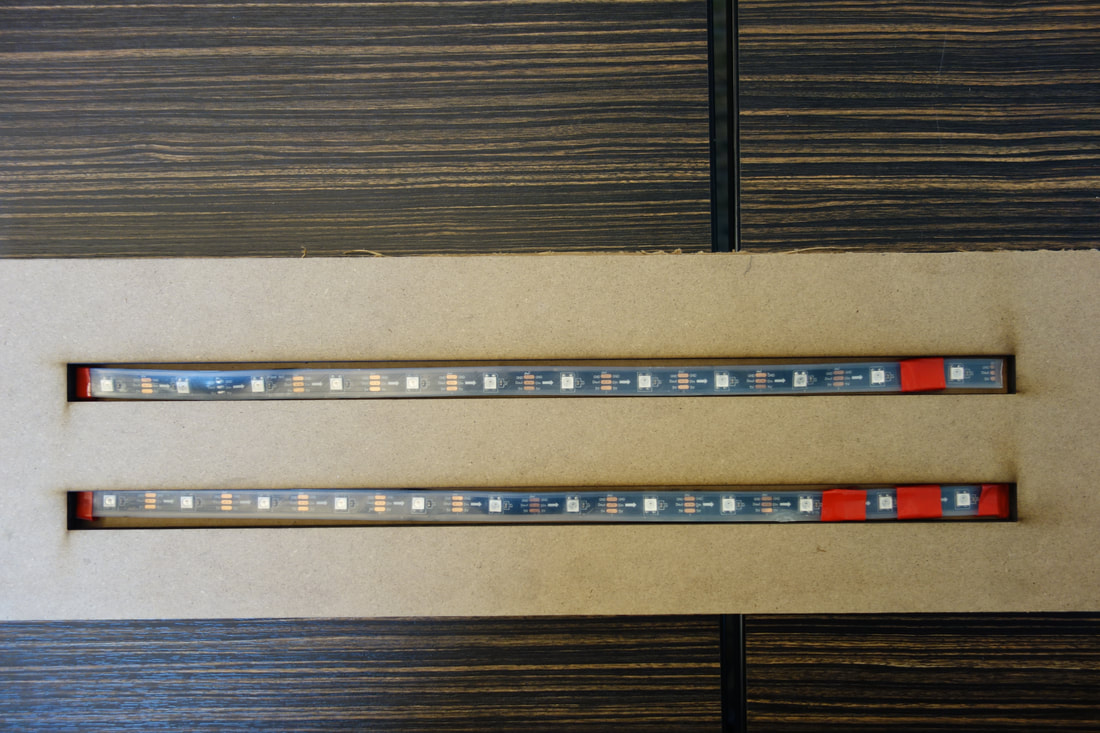
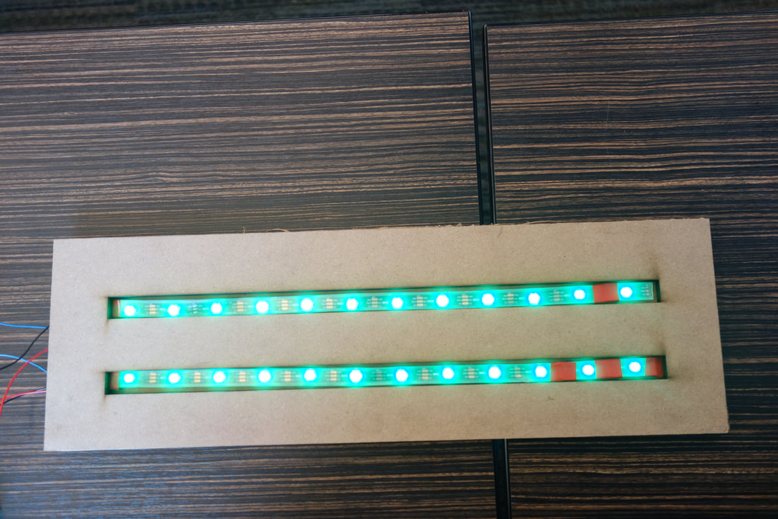
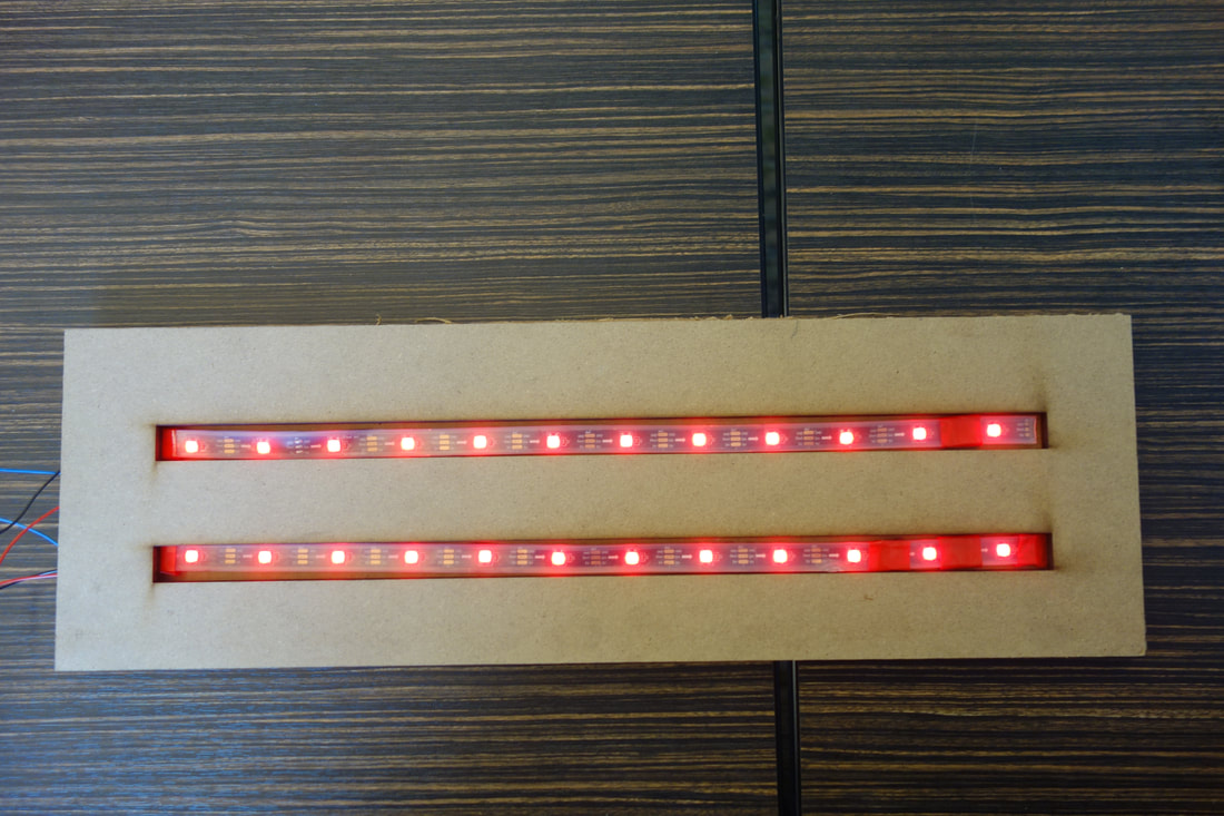
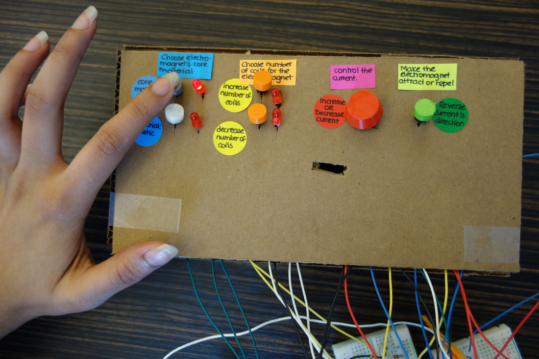
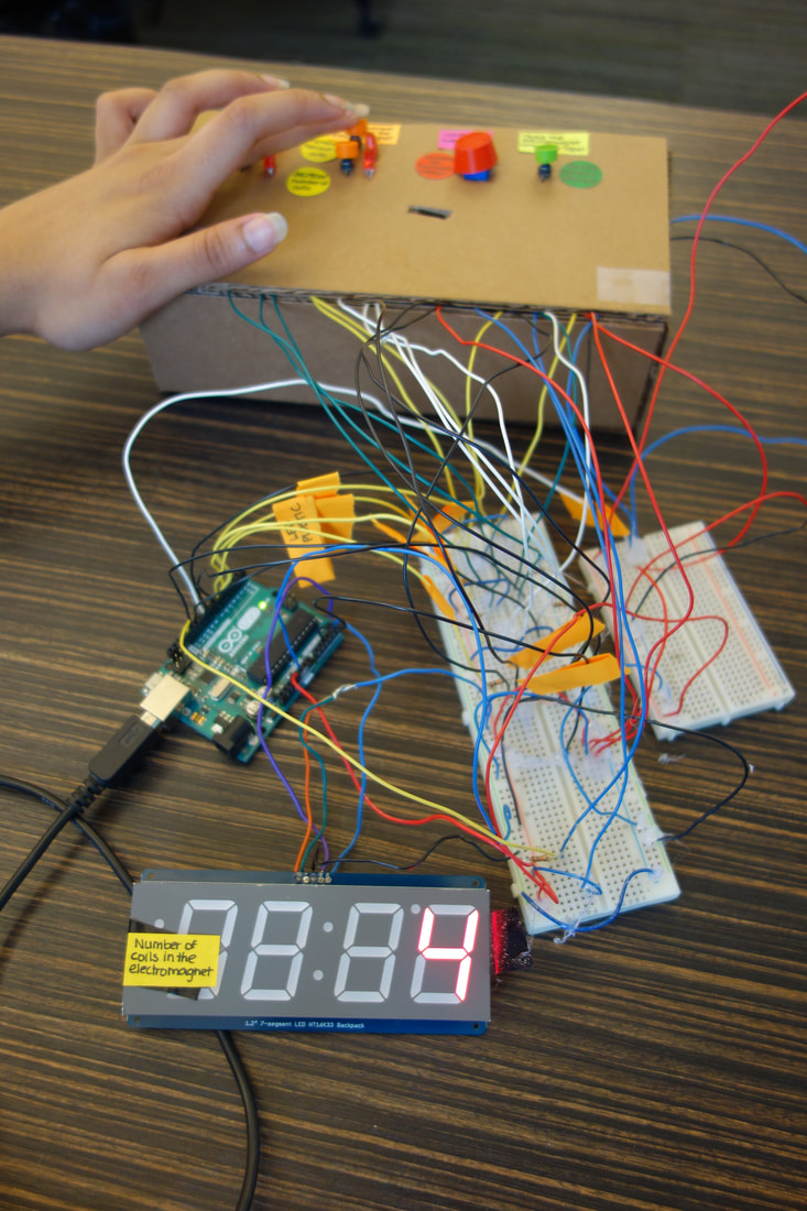
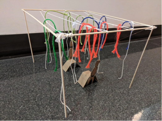
maglev 2.0: redesign of the interaction with a chicago museum of science and industry Exhibit
Tangible Interactions Class
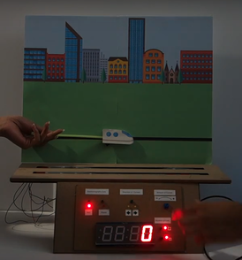
MagLev 2.0 Prototype (involved Wizard of Oz tactics)
Contribution:
|
This project required my teammates and I to improve the interaction experience for a museum exhibit of our choice. We chose to redesign the MagLev exhibit at the Chicago Museum of Science and Industry (pictured below). We wanted to redesign this exhibit as we discovered, from observations and interacting with the exhibit ourselves, that it wasn't very interactive, it had 2 other sub exhibits related to electromagnets that made it seem disjointed as a whole, and it didn't seem to be able to educate on how electromagnets work.
Out main goal was to be able to educate visitors about how electromagnets work and how they are applied to the MagLev train technology.
|
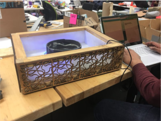
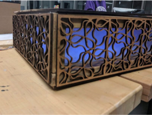
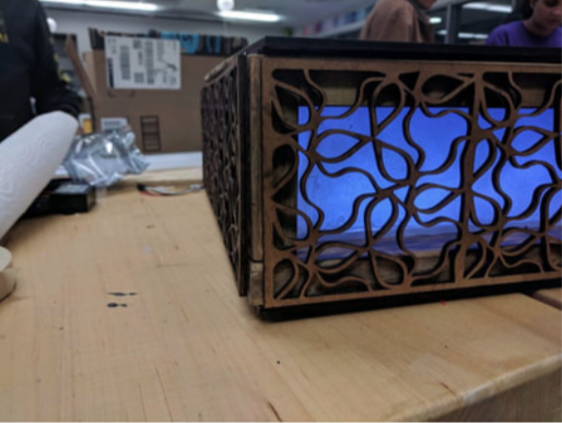
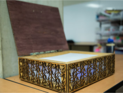
EMOTIONAL BOX: A BOX THAT EVOKES FEELINGS OF CALMNESS AND RELAXATION
Designing Product Interactions Class
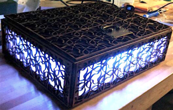
Breathe. Meditate. Relax
Contribution:
|
This project involved having to design an interactive box that would elicit the feeling of relaxation in the user when opened.
For this box, my team and I wanted to tap into multiple senses in order to make the user feel relaxed. As the beach tends to be the place of choice for many people when they want to relax, we chose to include certain elements from the beach experience.
|
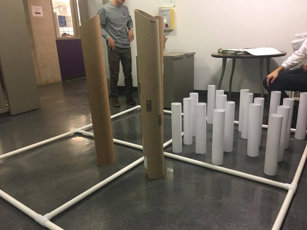
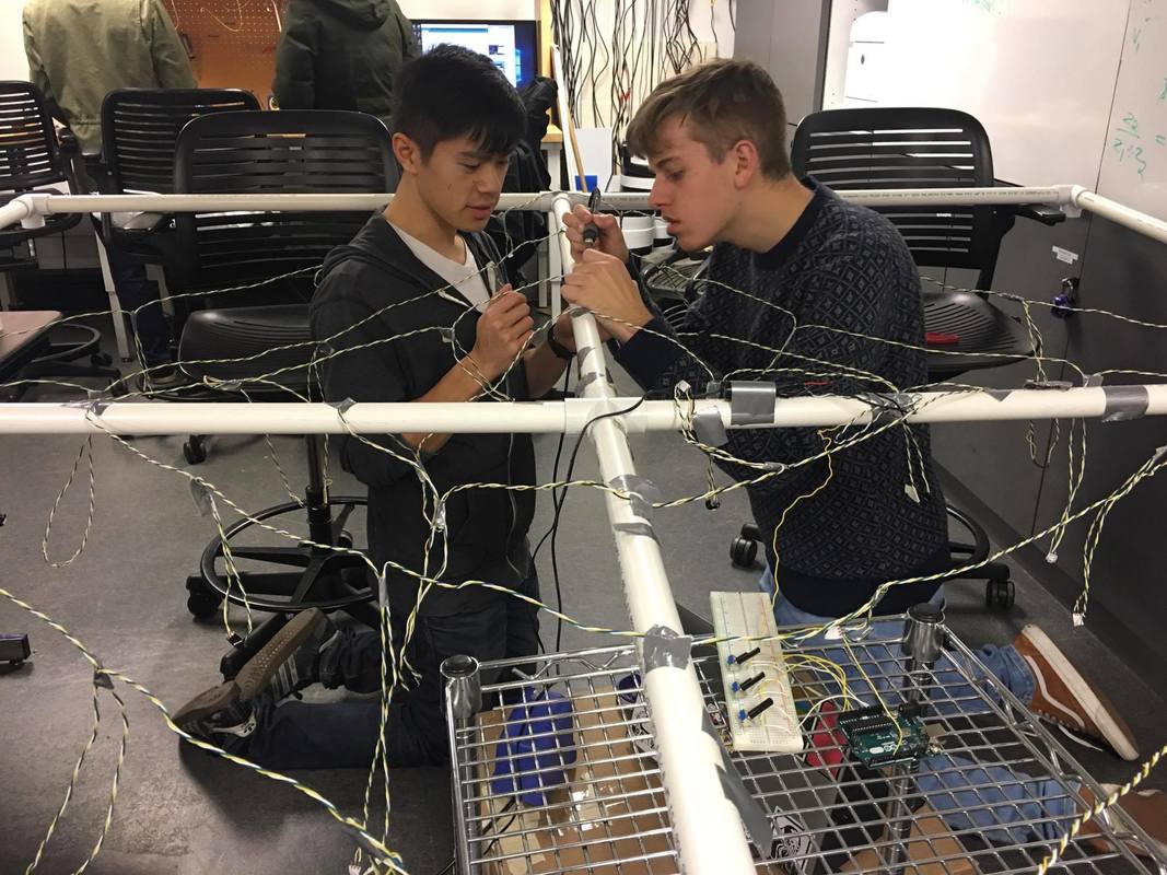
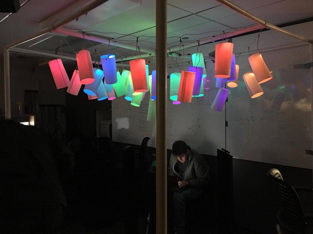
HUE CUBE: A LARGE SCALE SENSORY EXPERIENCE THAT FOSTERS COLLABORATION TO OVERCOME A CHALLENGE
Designing Product Interactions Class
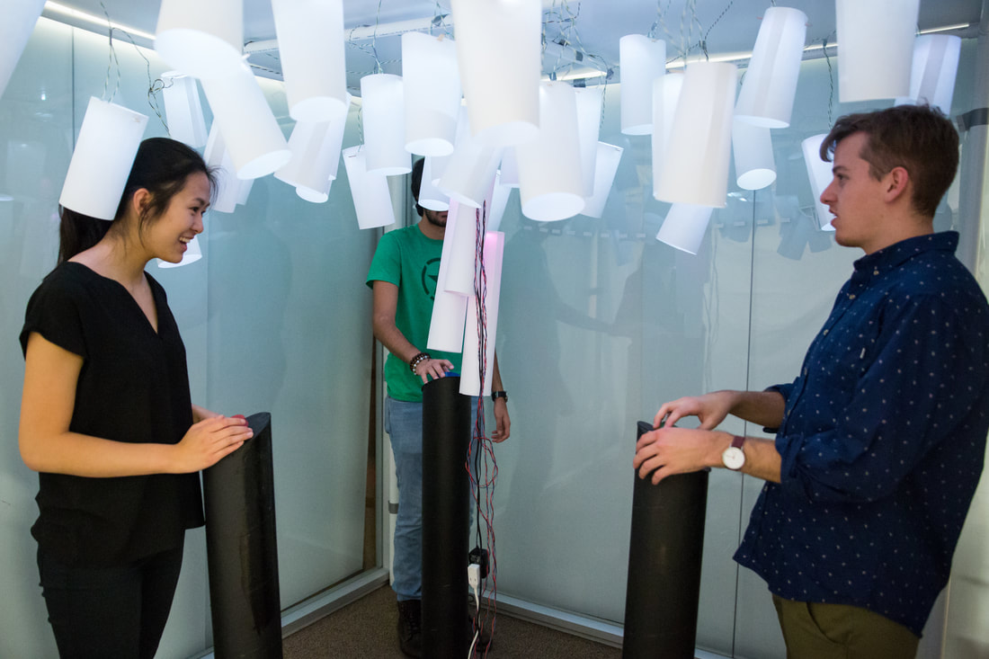
Hue Cube in action
Contribution:
|
The HueCube is an experience that is intended to encourage people to talk to each other and collaborate to overcome a challenge, leaving them confident and connected upon reflection.
For this project, my teammates and I were interested in creating an immersive experience that incorporated interactions on a micro, mess, and macro level. This experience includes components such as:
|
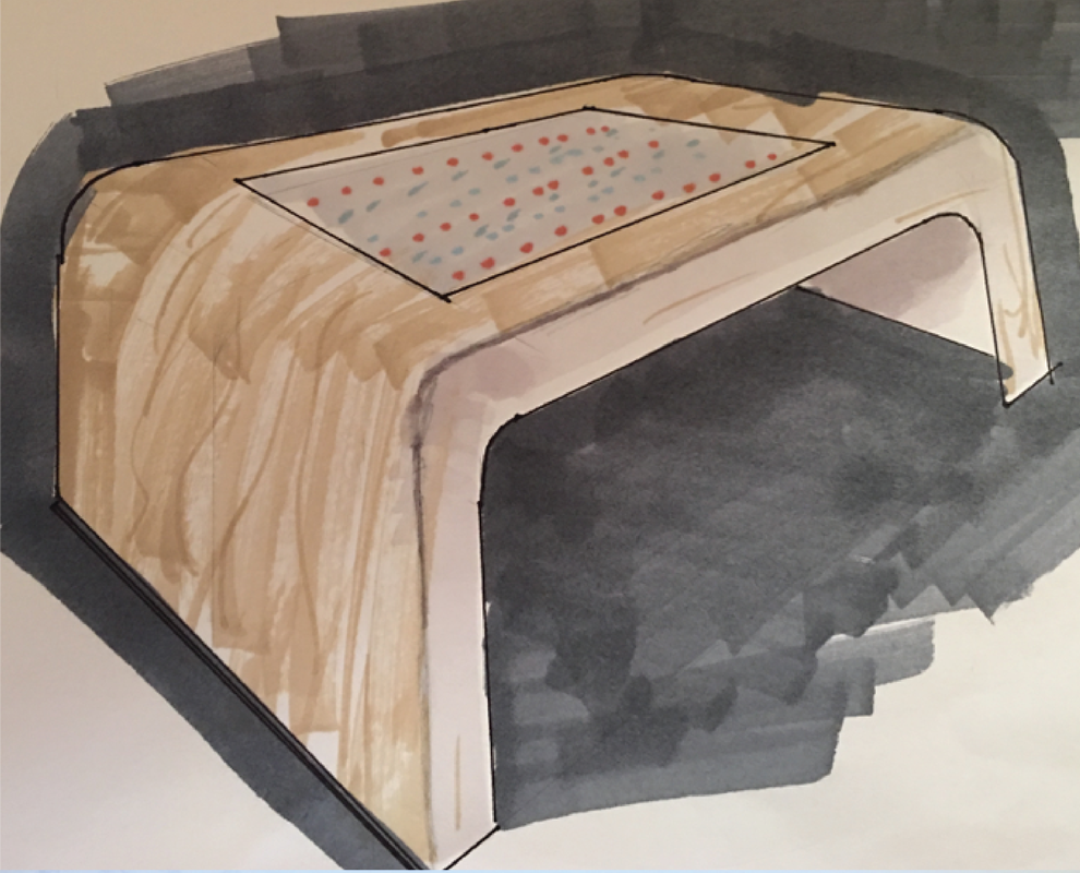
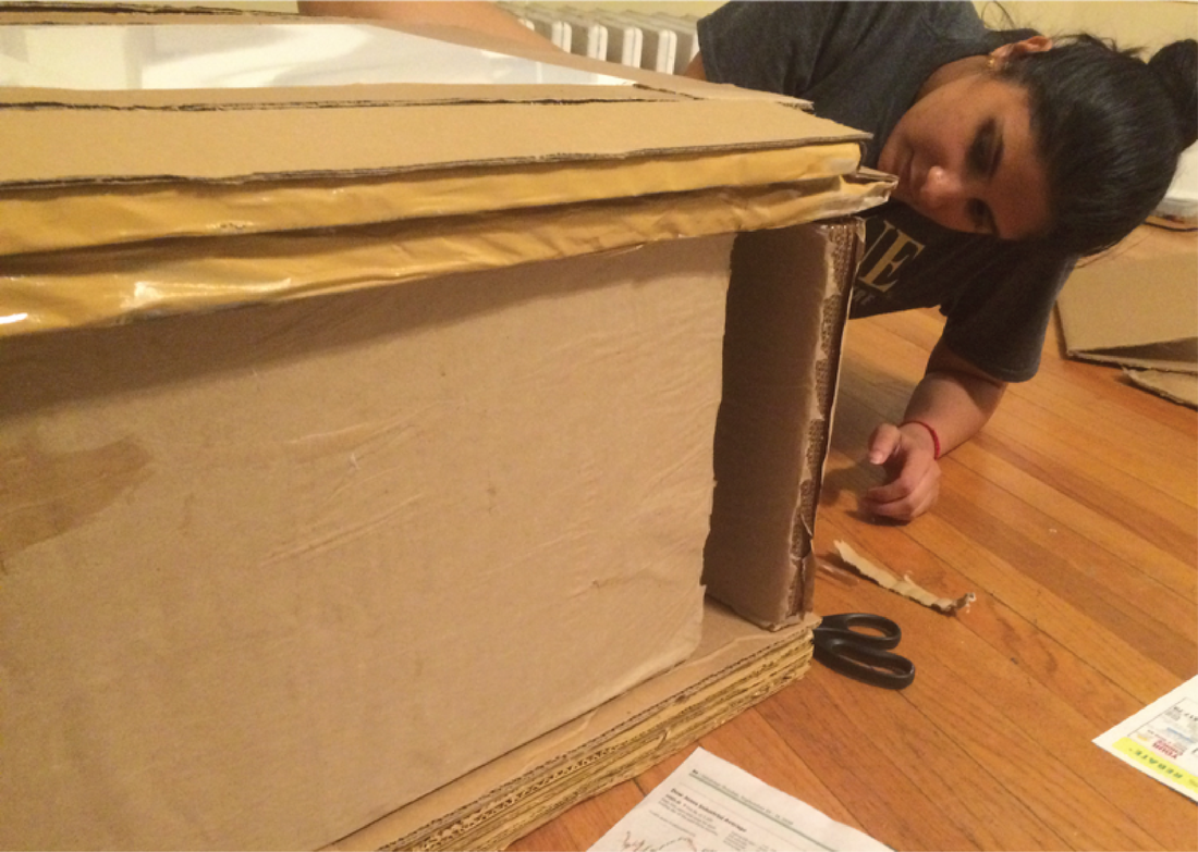
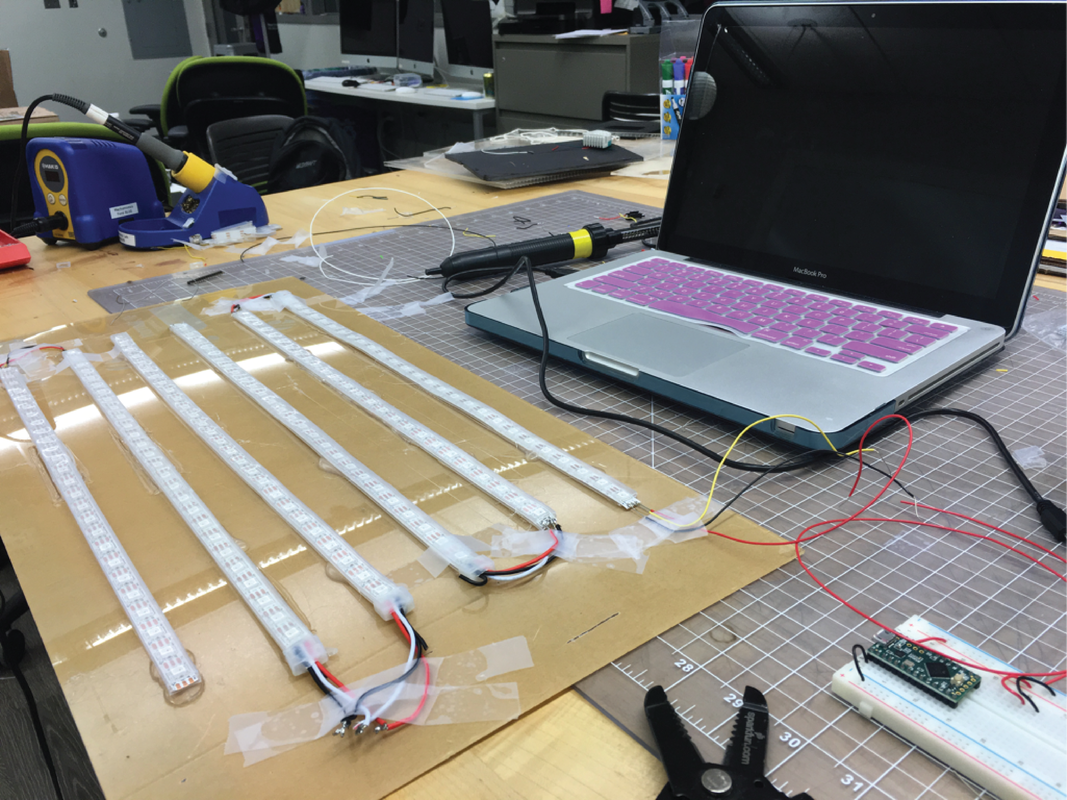
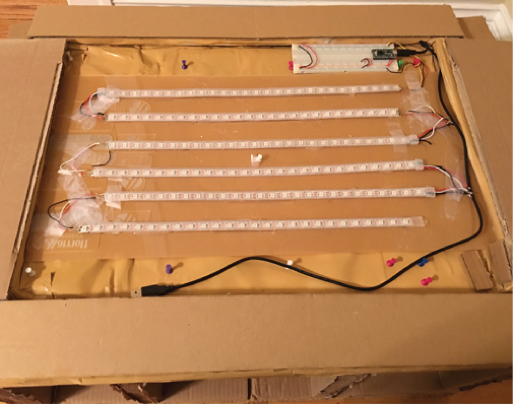
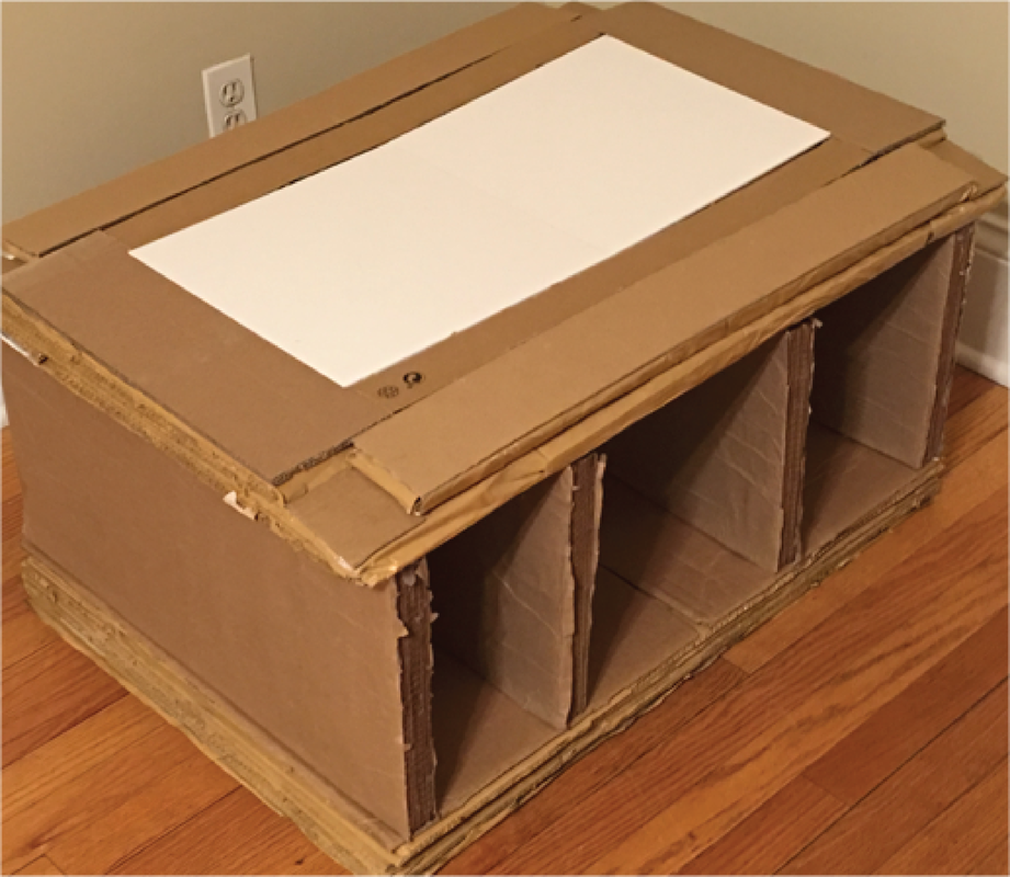
Tae.bil: Coffee table made entirely out of cardboard
Having just moved into a new apartment, I was left with a large number of cartons and packaging material. Instead of purchasing a coffee table, I decided to make use of this material I had and build one myself. In order to have some more fun with it, I added my own little spin by building in a light show feature.
|
|


|
|
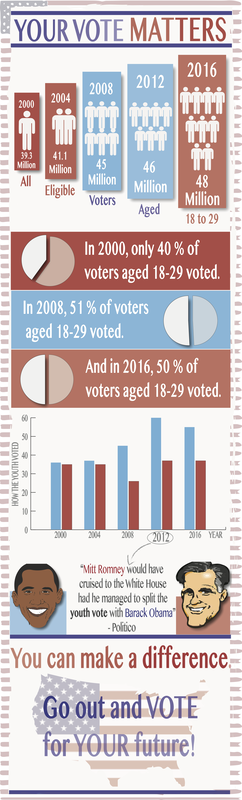
young voters infographic poster and video
Design Communications Class
The prompt for this assignment was to create poster and video infographics that would encourage young adults to vote in the presidential elections (2016).
|
|
august smart lock animation
Vital Storytelling Class
My team and I were tasked with creating an animation that depicts the emotional user journey of a chosen smart home device. The device we chose to work with was the August Smart Lock.
Contribution: Story Generation, Story Boarding, Sketching
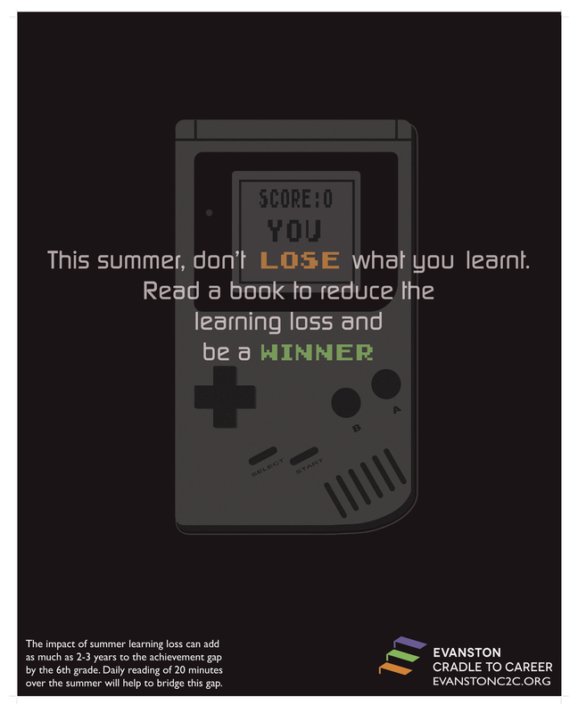
evanston cradle to career poster
Design Communications Class
I designed a poster for the non-profit, Evanston Cradle to Career, in order to raise awareness about summer learning loss experienced by school going children.
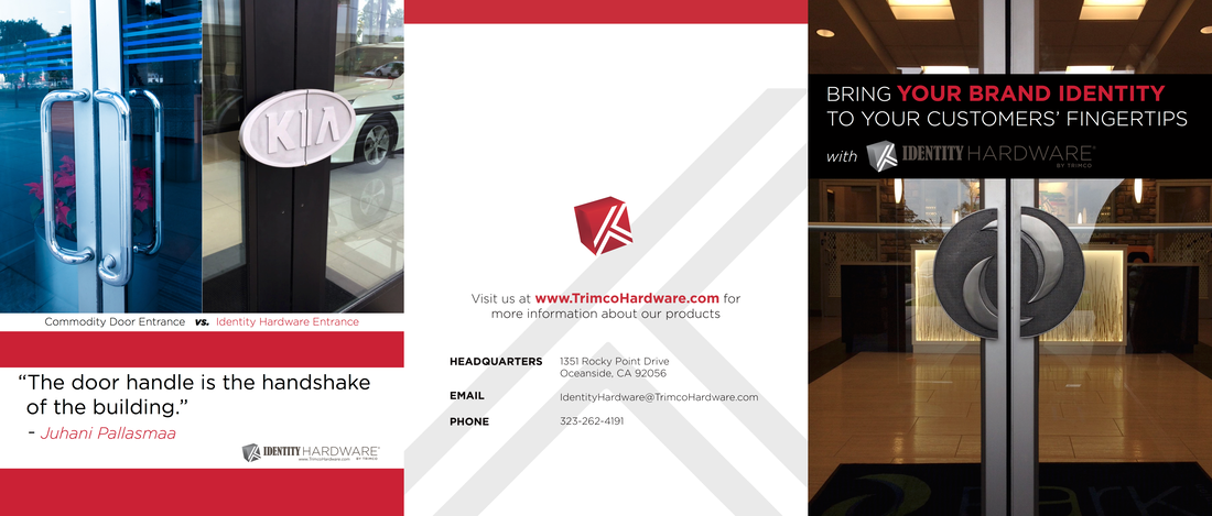
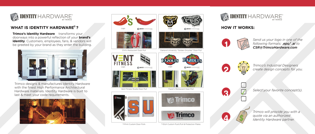
trimco hardware marketing material
Summer Internship
During my time at Trimco Hardware, in addition to my assigned project work, I contributed towards creating and redesigning the marketing material for their new products.
(This brochure contains 3 panels and 2 pages)
(This brochure contains 3 panels and 2 pages)
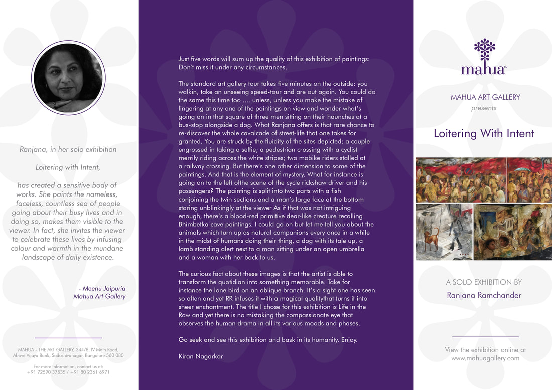
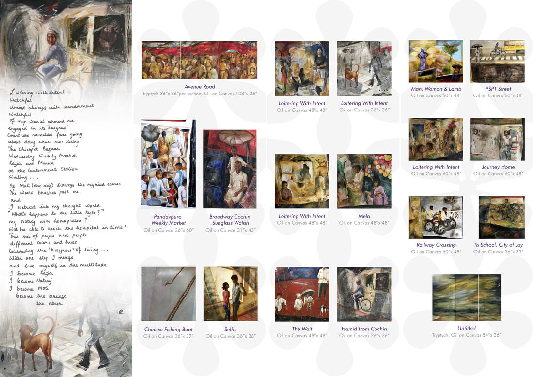
"Loitering with intent" - art exhibition brochure
Freelance Work
I developed a brochure that showcased the artist's creations, and used the gallery's branding for color and various elements.
(This brochure contains 4 panels and 2 pages)
(This brochure contains 4 panels and 2 pages)
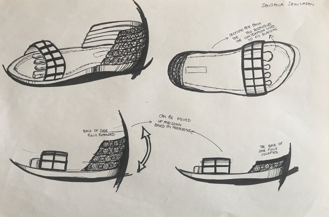
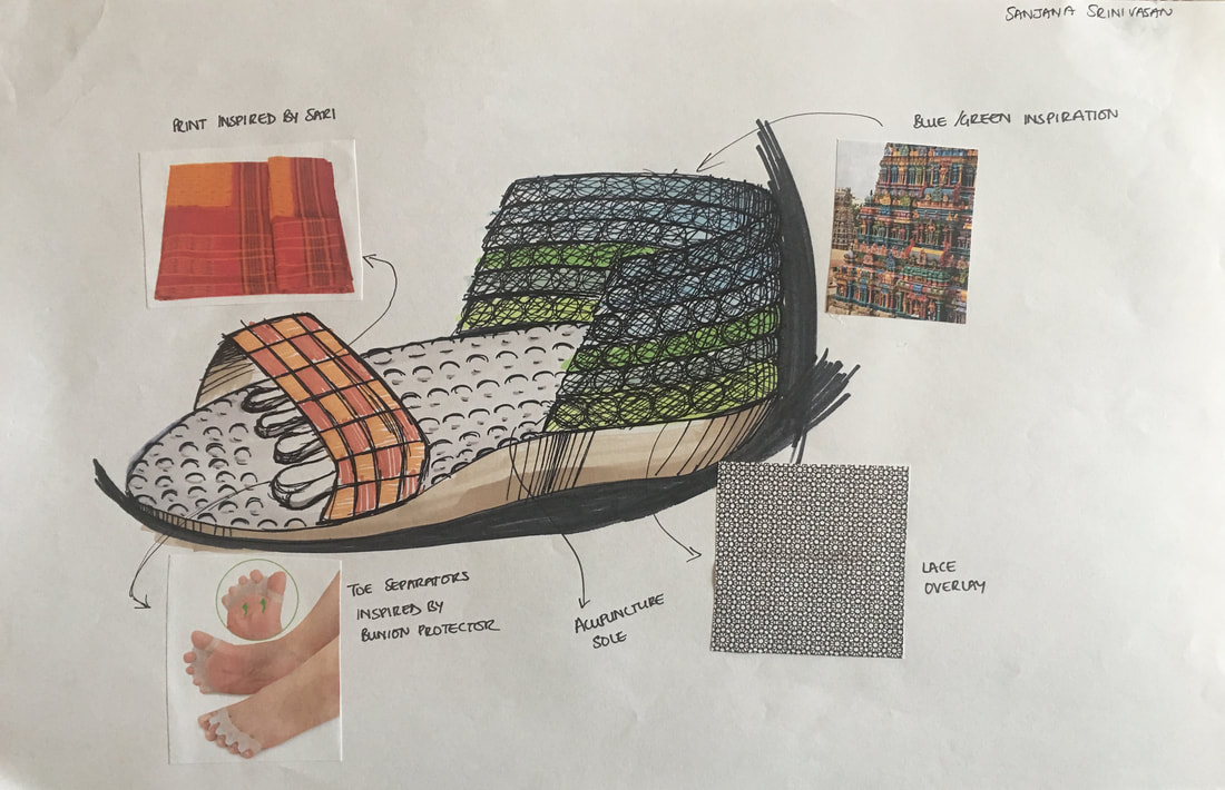
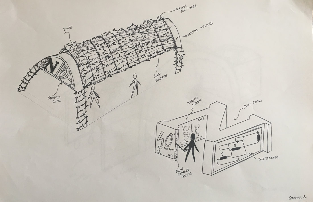
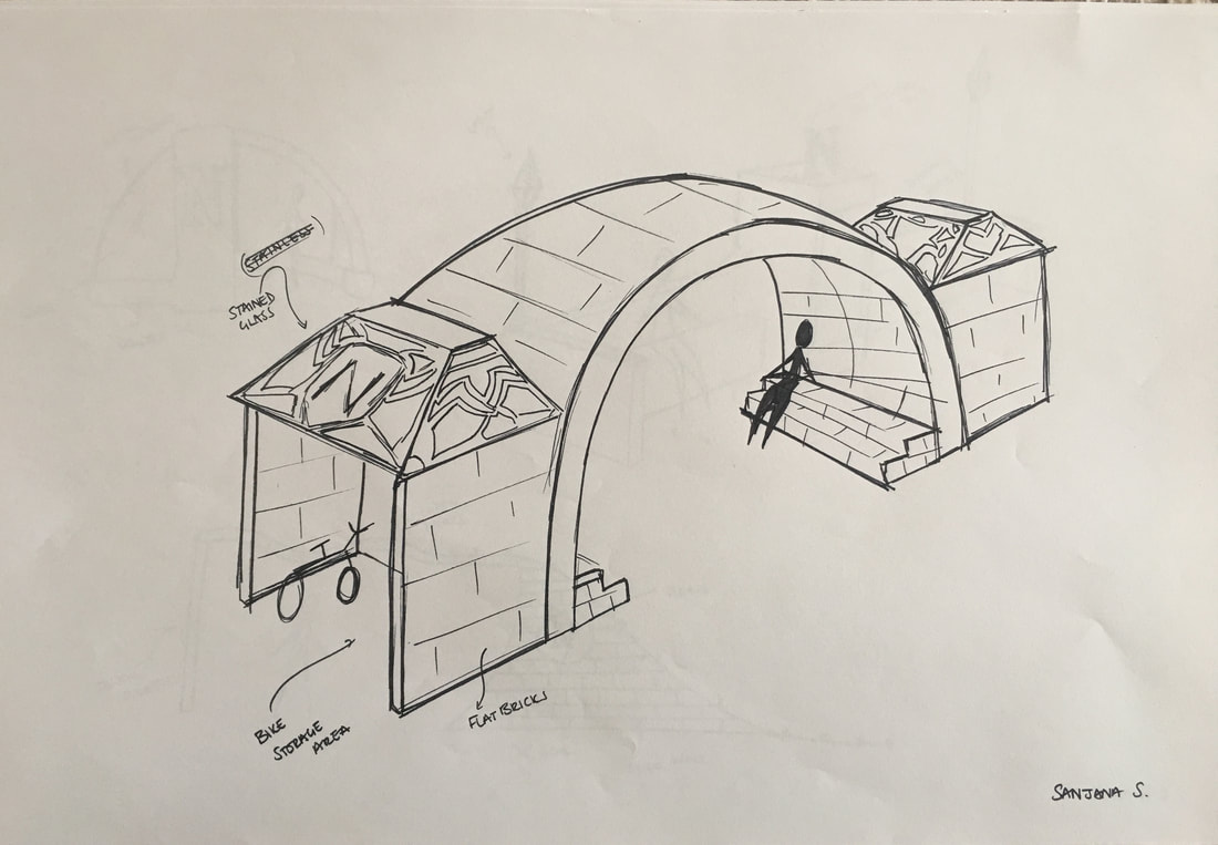
JUST FOR FUN


|
|
|
|
|
Sanjana Srinivasan
Portfolio
Portfolio
